When Art Meets Data: Flowers as Visual Metaphor

Annie Liao
Posted on July 5, 2020

When it comes to data visualization, we have grown accustomed to the good old charts and maps. Seldomly do we pause and realize that these are merely shapes, serving as visual metaphors to help us digest information with more ease.
So I was delighted to find Shirley Wu's Film Flowers project, which uses flowers as a medium to visualize top summer blockbusters.
Granted, it does not seem as easily digestible as a simple chart would. From an artistic standpoint, though, it definitely stands out as an alternative approach to data visualization.
Inspired by the brilliance of combining data with aesthetics, I decided to use the same visual metaphor for my first d3 data visualization.
Same Dataset, Different Interpretations
Popular baby names have been one of my favorite annual reports. Naturally, the most common way to visualize such data would be bar charts.
I also found this cool map, which leverages animated GIFs to display the most popular names over the years.
Popular Baby Names, Reimagined as Flowers
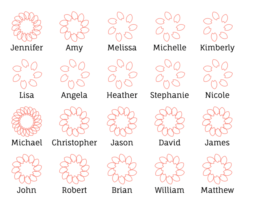
Similar to Film Flowers, in my Baby Name Blossoms project, I used petals to quantify data: the popularity of the names.
The magic behind this visualization is D3's quantize scale, which allowed me to transform popularity (d.count) into the number of petals (numPetalScale):
const countMinMax = d3.extent(data, d => d.count)
const numPetalScale = d3.scaleQuantize().domain(countMinMax).range([7, 10, 12, 15, 20])
Since the data I grabbed were the top 10 names for both genders, the values share more similarity than, say, the values of Film Flowers' IMDb votes, making it a bit challenging to show big variations between the names.
So, how might we add features that distinguish between them? What makes each name unique? While asking myself the very question, I noticed that Film Flowers use colors to display different genres for each movie.
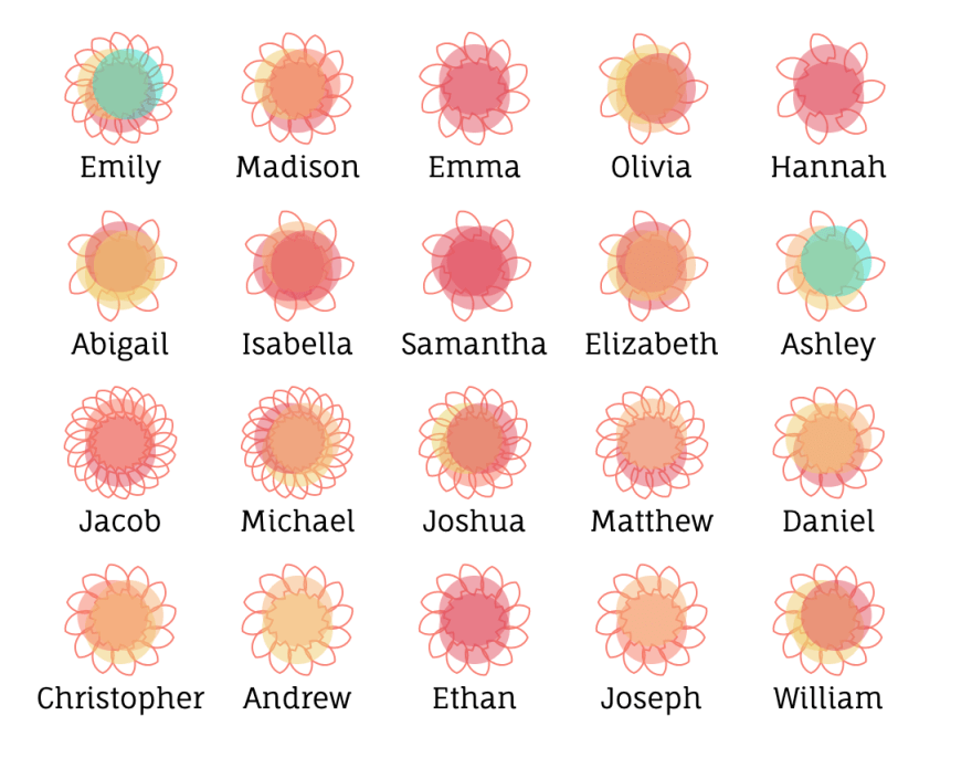
Perhaps I can use colors as well? How about taking the vowels and painting them accordingly?
Here, I used D3's ordinal scale to connect vowels with a range of colors:
const vowels = ['a', 'e', 'i', 'o', 'u', 'y']
const petalColors = d3.scaleOrdinal().range(['#E44F5D', '#F6B06E', '#EFCB64', '#F8765C', '#E5D35F', '#1DDCCA'])
  petalColors.domain(vowels)
Then, inside the function that converts each dataset into flower scale, I passed in a new object containing the vowels of each name:
  const flowersData = _.map(data, d => {
    const numPetals = numPetalScale(d.count)
    const name = d.name
    const vowelGenres = name.split('').filter(char => vowels.includes(char.toLowerCase()))
    return {
      name,
      vowelGenres,
      petals: _.times(numPetals, i => {
        return {
          angle: 360 * i / numPetals,
          petalPath
        }
      })
    }
  })
And finally, I appended the circles(s) inside the flowers.
Thanks to the varying vowels in each name, now we can see more contrasts between individual names. The resulting visual effect was more than satisfactory :)
Lessons Learned
As magical as d3.js can be, there were plenty of unexpected side effects that turned my little 3-day project into a weeklong one.
The biggest unexpected challenge for me was layout.
I originally used flexbox for Baby Name Blossoms' CSS structure. However, the SVG element didn't seem to work well with the responsive flex design.
As this is a React project, I also thought of leveraging any existing library, which led me to react-svg-flexbox. Unfortunately, it didn't deliver. To make matters worse, its babel-eslint version conflicted with the existing one in my project, causing the initial errors during deployment.
Looking at the Film Flowers, which actually laid out specific widths for each section, I hastily reverted back to using relative/absolute positioning for this project.
Nonetheless, I feel proud of the end product and will keep exploring new ways to visualize information with an artistic mind.
Special thanks to @jessesbyers for also inspiring me with her amazingly built COVID-19 World Tracker!

Posted on July 5, 2020
Join Our Newsletter. No Spam, Only the good stuff.
Sign up to receive the latest update from our blog.


