Annie Liao
Posted on August 1, 2020
Having focused on learning the development aspect of web development over the past year, I find it refreshing to revisit the design portion of the field. The enlightenment came from a recent chance conversation with a senior engineer, who was looking for a developer with a keen eye for visual consistency.
Here are some takeaways from Codecademy's Color Design course:
Color Theory
 (Image source: 99designs)
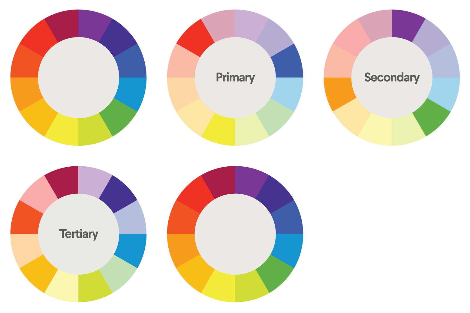
Assuming that we've already forgotten about the color wheel in art classes, it is composed of three color groups:
- Primary colors: red, blue and yellow
- Secondary colors (mixing two primary colors): green, orange and purple
-
Tertiary colors (mixing primary and secondary colors):
- Red-orange (Vermillion)
- Yellow-orange (Amber)
- Yellow-green (Chartreuse)
- Blue-green (Teal)
- Blue-purple (Violet)
- Red-purple (Magenta)
All colors on the color wheel have warmth values, namely warm (ranging between red and yellow) and cool (range between blue, purple and green).
To create a wider range of colors, we can also use tints (adding white) and shades (adding black) to our color palette.
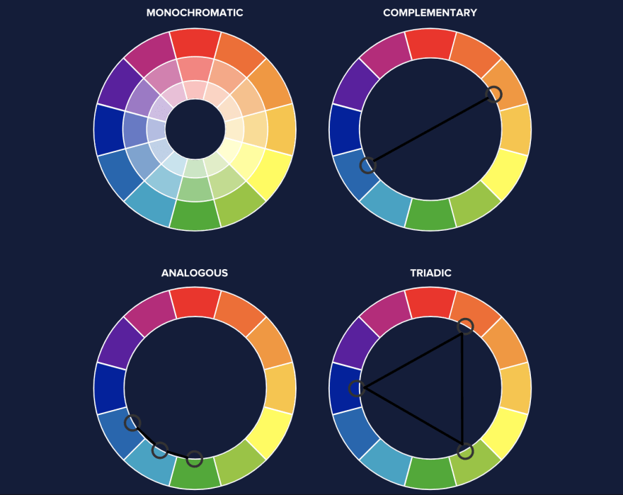
Speaking of color palettes, there are generally four color schemes we can use to achieve harmony on the website:
 (Image source: Codecademy)
- Monochromatic: Using the same base color
- Complementary: Showing high contrast in color-pairing
- Analogous: Apply three or more colors that are adjacent to each other on the color wheel
- Triadic: Creating a triangle of colors within the color wheel
Last but not least, we should also account for color psychology, which refers to how colors trigger a user's emotional responses. For instance, the color red evokes passion and danger, while the color blue is often associated with calmness.
UI States
 (Image by Gal Shir)
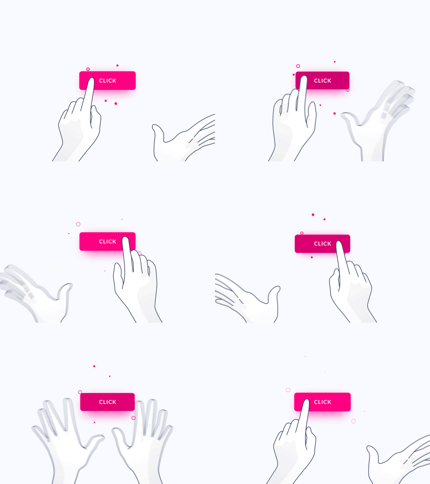
When applying colors to UI design, we need to take into account different states, or user actions, on the targeted component of the website.
For instance, the two common states of user interaction on a button are the hover state and the disabled state.
Similarly, form inputs also have several states:
- default: when the page loads, before user interaction
- active, or selected: when the user highlights a field (usually achieved by changing border color)
- disabled: indicates the field cannot be edited (grayed out)
Accent vs. Semantic Colors
While it's important to have a clear, dominant brand color for our website, we can also use different visual signals in our color palette to reflect the content hierarchy or any special indicator.
Accent colors are used when we want to draw the user's attention. For instance, a call-to-action button or form inputs.
Semantic colors provide additional indications to the user when something goes right or wrong. Some common designs for such indicators are red alerts, green submission success, and yellow warnings.
Accessibility
 (Image source: Smashing Magazine)
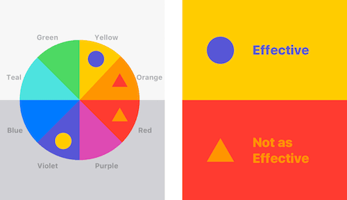
Finally, to make sure our UI components are accessible, we should provide additional indicators other than colors to convey information.
For example, in addition to using the color green to indicate submission success, we should add a text label ("success!") or checkmark icon.
There are also plenty of accessibility checking tools we can leverage, such as Color Safe, Adobe Color Accessibility, and Cloudflare.
I hope this post gives you a brief overview or quick refresher on color design. In terms of determining color schemes, my personal favorite has been Colormind.io.
Is there any resource you use regularly for color selections or references? Let me know in the comments!

Posted on August 1, 2020
Join Our Newsletter. No Spam, Only the good stuff.
Sign up to receive the latest update from our blog.
![10 Best UI/UX Books that Every Designer Should Read [2022]](https://media2.dev.to/dynamic/image/width=1000,height=420,fit=cover,gravity=auto,format=auto/https%3A%2F%2Fdev-to-uploads.s3.amazonaws.com%2Fuploads%2Farticles%2F7v9grk3hh10sxgmojzwn.jpg)

