Heuristic Analysis: How To Improve Users’ Experience In 10 Steps

KWAN
Posted on February 7, 2024

Find out how to evaluate and improve your product, website, or app in terms of UX using a method called heuristic analysis.
As more people are using interfaces, User Experience is becoming a big deal!
In this article, we’ll dive into the process and rules of heuristic analysis (also known as Nielsen’s Heuristics) in User Experience, which basically is a way to evaluate how user-friendly a product or website is.
But first, if you don’t know what user experience is about, we very recently published an introductory article about the theme, check it, here.
Heuristic Analysis – Why is That Important?
Want to make sure your app’s design gives the best experience to your users? There’s a method called heuristic analysis or heuristic evaluation that can help. It lets you check how user-friendly your app is and make sure it’s just as awesome as you imagined when you started building it
To understand the importance of applying heuristic analysis in projects, it’s relevant to highlight the issues that arise when heuristics are not applied. Among them, we can mention the accumulation of usability problems throughout the previous processes, leading to design rework in the advanced phase. This results in delays to the project’s defined deadlines and financial expenses related to labor and potential harm to the project’s processes.
Heuristic Analysis – The Theory
In 1990, heuristic analysis was proposed by Nielsen and Molich with the aim of identifying usability problems during the development of user-interfacing interfaces. This analysis consists of checking out an interface using some usability recommendations called heuristics. These heuristics basically are guidelines for making interfaces and user interaction better. The whole point of the evaluation is to spot any issues that make the system harder to use.
Nielsen’s 10 Usability Heuristics
1. Visibility of System Status
It is the responsibility of design to ensure that the user is always informed about what is happening in the system through timely feedback, aiming to encourage open and continuous communication with the user.
In the figure above we can notice how the system informs the user about the current stage and helps them understand the previous and following steps, by indicating that they are in the payment screen. In other words, this way the end user can understand the system’s current state.
In the picture above, we can see that little checkmark icon next to the topics. It basically tells the user that their choices have been saved by the system. And the progress bar is there to let you know that even though you might have to wait a bit, the system is still processing the task.
2. Match Between System and The Real World
Design has the responsibility of using language that is accessible to users, considering familiar words, phrases, and concepts instead of local or internal dialects. It recommends that designers should consider that what may be familiar to them does not necessarily mean it is familiar to the user.
There are two important things to consider. First, the system should use everyday language that people easily understand. Second, the system should make things look familiar by using objects and activities that we’re used to in the real world.
In this image, we can notice that the interface of the compass application on the iPhone resembles a real-world compass, even though it is implemented in minimalist design, as it still retains remarkable elements of the physical world object.
3. User Control and Freedom
Users often make mistakes and require an “emergency exit,” meaning something that allows them to undo an undesired action without having to go through a lengthy process.
An example of this can be seen in the image below, where there are two exits. The first one represents a button to go back to the previous screen, while the other exit offers the user the chance to continue an action that they may have accidentally finished. Both examples provide the user with control to correct any erroneous action.
4. Consistency and Standards
The interface should follow the conventions of the platform and the industry. In simpler terms, it should be evident to the user that words, situations, and actions carry the same meaning as they do in other systems. By not doing this, the designer would otherwise force the user to learn something new.
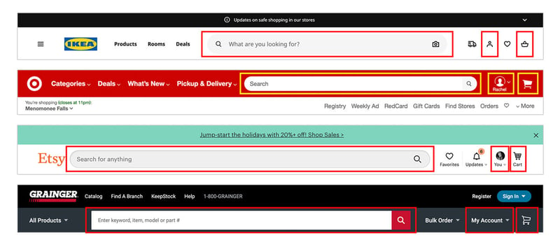
In the image above, we can see how the search bar is standardized across various systems. This helps users easily understand its function without having to adjust to a different format than what they’re used to.
5. Error Prevention
Even though it’s important to give clear error messages, the design should do its best to prevent problems. To make that happen, we need to either eliminate susceptible to error situations or double-check them and give users a chance to confirm their action before continuing.
An example of this heuristic is evident in the image below, where a calendar shows the past dates disabled for selection. This effectively prevents the user from mistakenly choosing an option that the system considers as an error.
6. Recognition Rather Than Recall
The user’s memory load should be minimized to the point where they don’t have to remember information across different interfaces. Additionally, when necessary, the information required for system usage should be visible or easily retrievable.
The image represents a list of previous purchases, which allows the user to recognize the items that have been added to the list without requiring them to remember the specific details.
7. Flexibility and Efficiency of Use
According to Nielsen, there are multiple ways to achieve a task, and it’s up to each user, regardless of their experience level, to choose the method that suits their preferred way of using the interface. This highlights the importance of flexibility in the processes of each interface.
As an example, keyboard shortcuts, touch gestures, and customizations can accelerate the system usage. The keyboard shortcut for copying and pasting content from one place to another (Ctrl+C + Ctrl+V) replaces the mouse usage.
8. Aesthetic and Minimalist Design
Interfaces should only display information that is relevant and typically necessary. Each element present in the interface competes with truly important information, which can reduce its visibility and undermine the focus on elements that should be emphasized.
That makes us understand why it’s important to make sure the design puts the spotlight on the essential content. We don’t want unnecessary elements to distract users and take away their attention from the information they actually need. It’s important to remember that what’s considered essential content depends on the goal of the system.
9. Help Users Recognize, Diagnose, and Recover From Errors
Error feedback messages should communicate clearly with the user, using plain language instead of codes. The messages should accurately identify the problem and provide helpful suggestions for a solution.
In the picture below, there are two error messages from the same system. They provide different levels of information about the problem. The image on the left is a good example of this heuristic, since it gives a detailed explanation of the error and offers a useful suggestion. On the other hand, the error message on the right is more general and don’t give an explanation at all about the error, which can make it harder for the user to understand what went wrong.
10. Help and Documentation
It is ideal for a system to be understandable without the need for additional documentation or explanations. However, it’s possible that some users might struggle to complete their tasks or use the interface effectively. That’s why it’s important to have help content and documentation that is accessible and consistent, so users can easily find the assistance they need.
The system should provide clear instructions, tooltips, contextual help, or easily accessible documentation to assist users in understanding how to navigate the interface and accomplish their tasks. This helps ensure that users can find the necessary information and support when needed, improving their overall user experience.
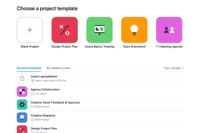
In the first picture, you can see different templates for users to choose from. This allows them to explore various design options and pick the one that matches their preferences or specific requirements. It helps users understand the visual choices available to them.
In the second picture, there’s a description of technical documentation about the system being discussed. This documentation offers in-depth information about the system’s functionalities, features, and provides guidance on how to use it effectively.
In the context of the Help feature, there are two classifications: Proactive Help (first image), which aims to help users become familiar with an interface, and Reactive Help (second image), which is meant to provide answers to questions through technical documentation or feature tutorials.
Both Proactive Help and Reactive Help have the same goal of assisting users in their interaction with the system, but they differ in their approach and timing. Proactive Help focuses on preventing potential issues by offering guidance beforehand, while Reactive Help deals with addressing questions or issues as they come up.
HEURISTIC ANALYSIS: how to improve users’ experience in 10 steps – Final thoughts
As we could see, there are 10 usability heuristics that are recommended to be considered when implementing an interface, such as: keeping users informed about what is happening in the system; using familiar language concepts; allowing users to easily correct errors and navigate through the system without getting stuck; using conventions to maintain consistency across the interface; preventing errors by designing the interface to be error-free and to provide detailed error messages; reducing the user’s memory load by making information visible and easily retrievable; offering multiple ways for users to achieve tasks; keeping the interface clean and relevant; providing clear error messages and suggestions for resolution; and finally, offering easily accessible and comprehensive help materials.
Don’t forget that Nielsen’s 10 usability heuristics is a method to evaluate the user-friendliness of the interface you’re using by considering important principles which allows the users’ navigation to be as smooth as possible. This powerful tool can be used by companies to improve the user experience, minimize errors probability, and ensure consistency in design.
If I got you interested in the subject, don’t hesitate to explore more about this by checking the official documentation of the heuristics.
Article written by Laís Ortiz and originally published at https://kwan.com/blog/heuristic-analysis-how-to-improve-users-experience-in-10-steps/ on July 20, 2023.

Posted on February 7, 2024
Join Our Newsletter. No Spam, Only the good stuff.
Sign up to receive the latest update from our blog.


