Konstantin Stanmeyer
Posted on October 10, 2022
During my first two end-of-phase projects at Flatiron School, my contributions to my group's repository consisted of unorganized code, second-guessed, sloth-paced GitHub usage, and other unproductive habits, all of which I wanted to turn around during my Ruby unit.
To make sure I had the highest chances of reaching this goal, I decided to teach myself my way around Whimsical. This is a planning web-service that utilizes a 2D space to view realistic features on a web page, plan ideas with a team, and to generally create a visible workflow to help with the web-dev process. I initially thought this goal would be difficult, but it proved to be intuitive with the great tools provided by the website, and provided no real harm for my many many rounds of trial and error.
Now, a short synopsis of why this website lightened the process to make a full-stack, basic web application, and snippets of code to show the idea-to-product workflow from a more technical side:
The Back-End
To start, our first assigned deliverable for this project was to create a user story, as well as create the backend schema that our data will eventually be stored in. The basic premise of this website was to let the user select a food delivery service, then order dishes from any of the restaurants their specific service provided. The full user story can be found in the GitHub repository's README.md which will be linked at the bottom of this post. Here is the backend schema:
And here is how the schema turned out inside of our project:
create_table "deliveries", force: :cascade do |t|
    t.string "name"
  end

  create_table "dishes", force: :cascade do |t|
    t.string "name"
    t.string "ingredients"
    t.boolean "vegetarian?"
    t.boolean "appetizer?"
    t.boolean "entree?"
    t.boolean "sides?"
    t.boolean "dessert?"
    t.boolean "drinks?"
    t.string "image_url"
    t.string "price"
  end

  create_table "middles", force: :cascade do |t|
    t.integer "dish_id"
    t.integer "restaurant_id"
  end

  create_table "orders", force: :cascade do |t|
    t.string "restaurant_name"
    t.integer "price"
    t.string "image_url"
    t.string "dish_name"
  end

  create_table "ratings", force: :cascade do |t|
    t.string "name"
    t.string "description"
    t.integer "star_rating"
    t.integer "restaurant_id"
  end

  create_table "restaurants", force: :cascade do |t|
    t.string "name"
    t.string "category"
    t.integer "delivery_id"
    t.string "image_url"
  end
Next, I wanted my group wanted to have a complete visual set up, so that once we started creating the actual website, we could reference something instead of spending hours thinking. I'll begin with the home page, and go in order of the user experience, while also showing the contrast with the end result.
Home Page
This page was entirely done on the front end, and like all other components in this React project, was styled with vanilla CSS. The idea was the create a static page where the user could see all five delivery service options, and also have access to some other functionalities. This includes additional routing to the orders page (showing past orders), about page, and contact page. Here is the initial wireframe, as well as how to page ended up:
Before:
After:
Due to time constraints, and technical difficulties with gems and node packages, some features were taken out as you can see. In that one, for example, the zip-code slider, which would've taken ages to set up with somewhat intuitive logic. These slight differences are consistent throughout the wireframes, most of which were obvious overshots of goals.
Restaurants Page
Now, after the user has selected a delivery service, they are taken to the next page, which displays all of the restaurants provided by their choice. This is where the order bar is also introduced, and where the user is given the option to enter their address, which will then give them a randomized delivery fee. They also have the ability to search for a specific cuisine, but the search bar functions for restaurant names too. Here's this page's comparison:
Before:
After:
Dishes
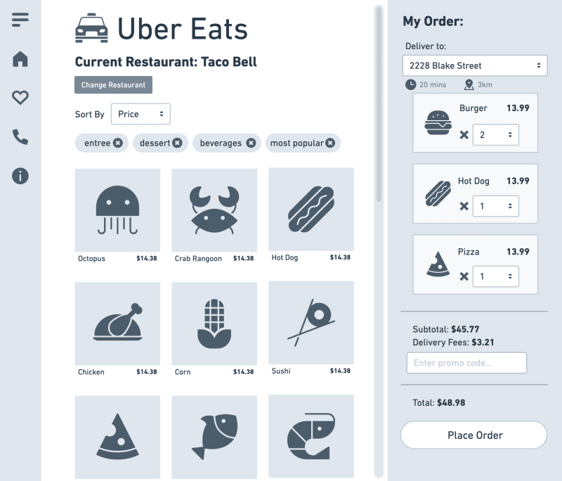
Once the user decides which kind of cuisine they are in the mood for, they get taken to the dishes page, which shows them all the possible options provided at the restaurant. With this and the restaurants page, the Whimsical board made this entire process insanely fast, basically having all the visuals done and copying what we were looking at; Translating it. We knew where to put names, values, all of our flexboxes, div's; It just made pretty much everything more streamlined.
Before:
After:
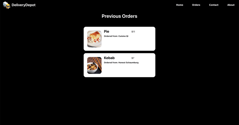
After the user places an order, their dish of choice gets sent to the back-end, and used in our fetch request for the orders page:
There was actually no board made for this one, until after finishing the page to create a complete mind-map to always have reference to. It was somewhat of a last-second addition, barely finishing it just minutes before presenting our project. And, crazy enough, without a reference, this was one of the longest processes to style, even though the end result was quite simple. To me, and to say it again, the biggest advantage of using a service like Whimsical is to avoid the long, grueling though process sessions, just to think of a basic idea. That same process can be doe 10x faster on a platform besides your code editor and in your CSS file. Use it! Here is also the final, complete board, and our additional task-board used to keep track of tasks daily, especially who was doing what:
ooooooo look how empty and done all of those tasks are :)
Takeaways
I think that with an improved concept-to-product process under my belt (in terms of visuals), my room for improvement lies in my actual code, and the processes happening to produce those visuals. This project took a staggering 983 lines of CSS, which, alone shows there is a drastic need for improvement. Variables are probably the best option, and creating reusable classes to cut down on the repetition. But, the improvement isn't only needed on the front-end but the back-end too. A lot of fetch request issues occupied my time during this 5-day project phase, especially where "include" statements weren't returning data the way I wanted, and methods will most definitely help. Having started Rails this week, I already see ways my style is more adequate for the framework, and I'm increasingly excited the more I dive into the language. :)
Links
Project Partners:
https://github.com/ericahashert
https://github.com/edwarddickey
Repos:
Back-End: https://github.com/ericahashert/phase-3-sinatra-react-project

Posted on October 10, 2022
Join Our Newsletter. No Spam, Only the good stuff.
Sign up to receive the latest update from our blog.


