Introduction
A couple of years ago, I happened to play a game called Cuphead. When I finished it, I thought that I would soon forget about it and switch to something else. But everything turned out to be wrong. I liked the style of this game so much that I didn't want to just forget about it. And so I decided to find a couple of GIF images on the internet and create different kinds of CSS Cards for them.
Well, let's get down to the show.

DEMO
For those who do not want to read the entire post, I can suggest taking a look at the finished project right away.
You can also download the project from my GitHub repository. (There is also a demo on GitHub Pages).
Graphic cards in the style of the Cuphead video game.


Description
This site is an example of work created specifically for the portfolio. If you want to take a look at it, then you can follow the link given below.
Use technology.
The following technologies were used to create this project:
Task-Manager

Software platform

Preprocessors


Libraries
Package manager

Plugins
To develop the project through gulp, I used the following types of NPM plugins:
…
Full Page Demo (GitHub Pages)
01. Ribby 🥊

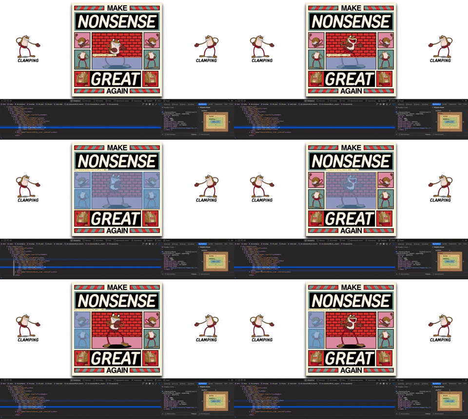
The first card is dedicated to one of the first bosses in the game, a combat toad named Ribby. This card is made in the video of a boxing ring (you can see the tight ropes in the background).
When creating this card, simple geometric shapes such as triangles and cubes were used. You can edit each element on the card as you like (color, size, font, etc.).
This also applies to other cards.

02. Croaks 🥊

Croaks is another of the bosses in the game, who is the brother of Ribby. During the battle, they are together and you need to resist their joint blows.
The card consists of simple elements. There is also a gradient in the background, which forms a brick wall.

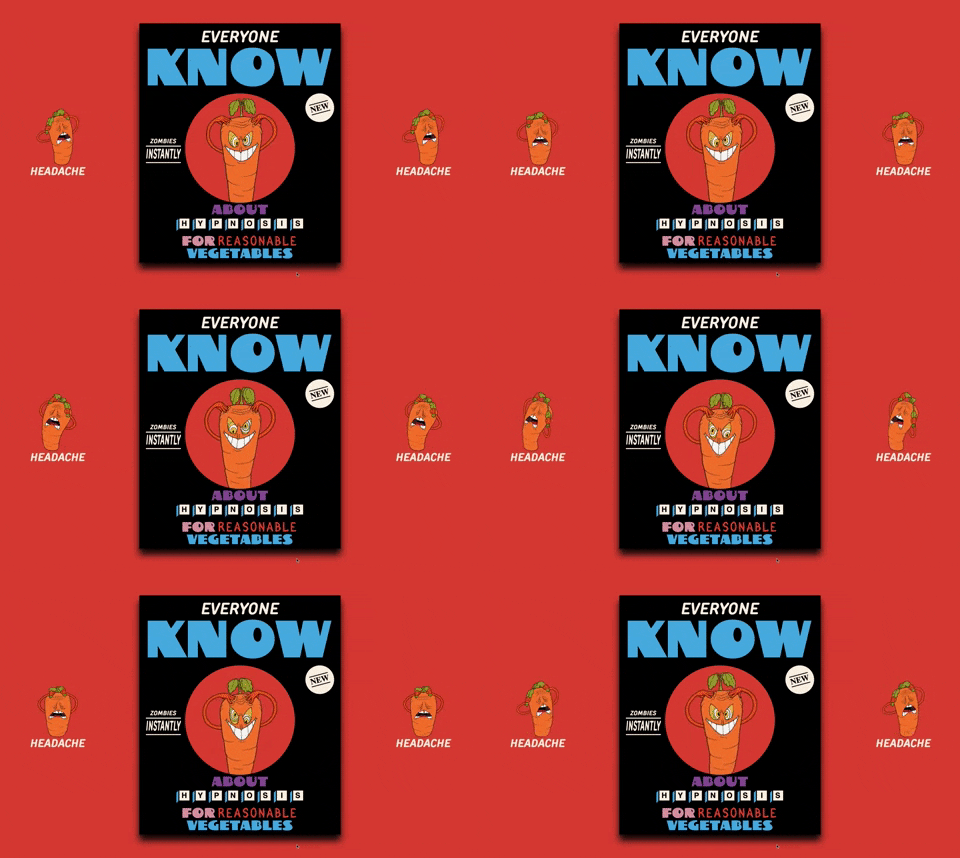
03. Chauncey Chantenay 🥕

Chauncey Chantenay is a large, anthropomorphic orange carrot with lanky arms and yellow and white eyes.
The design of this card is completely formed by fonts.
There are also cubes that you could see in the first card.

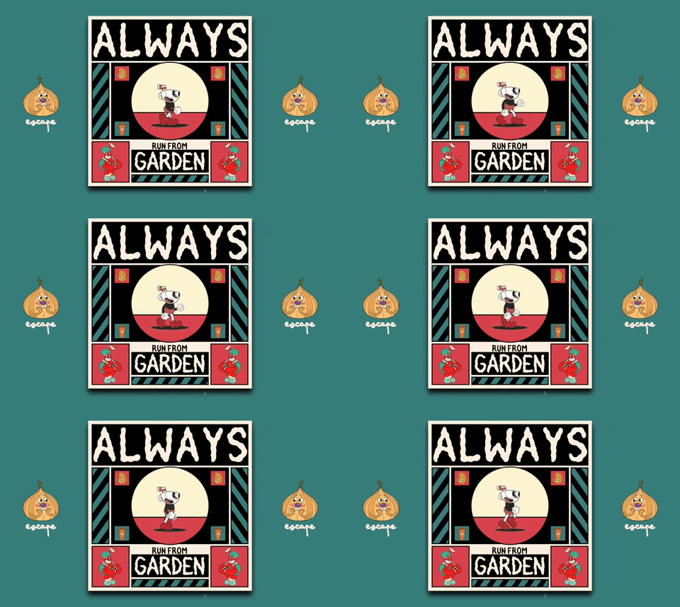
04. Cuphead ☕️

A simple, but at the same time very good card, which depicts the main character of the game Cuphead.
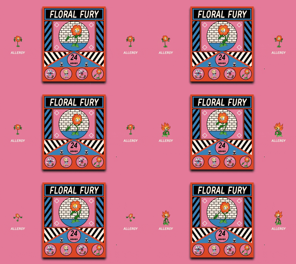
05. Cagney Carnation 🌸

Cagney is sneaky. He seems to delight in catching his enemies off guard with his appearance, posing as a harmless and adorable flower before roaring loudly and showing his true colors.
This card uses several triangles, inside of which animated linear gradients are placed.

06. King Dice 🎰

King Dice is the right-hand man of the Devil and the secondary antagonist of Cuphead.
The card consists of the simplest elements with images of the character.

07. King Dice: Casino 🎰

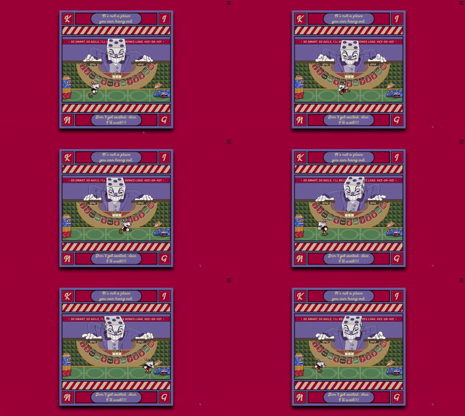
The most difficult card in its implementation. The card is an implementation of one of the last levels of the game, which is made in the form of a roulette table on which you can place your bets.
The most difficult thing in this card was to create a table on which the King Dice character relies.
To create it, I used a gradient that forms the illusion of soft upholstery for the table surface. There is also a chain of lots, each of which you can edit separately as you like.

It was also necessary to make a playing table surface on which the main character would run. After creating it, it was necessary to create a perspective for the surface, which affected the depth of the image.

Conclusion
For me, this was a purely creative project, I did not try to create something insanely complex in order to impress someone. Just being impressed by the style of the Cuphead game, I decided to create these cards.
The End
Thank you for paying attention to my post. You can also follow me on Twitter, where I also publish many of my works.
Goodbye


