10 Examples of a Good 👩💻🧑💻 Developer Portfolio 💼 for Your Inspiration 🦄

Roden
Posted on June 18, 2021

Introduction
Hello, Friends. Today, I would like to show you the portfolios that I found on the Internet. You know, I think that a good presentation of yourself is sometimes much more important than your professionalism (within reason, of course). And this also applies to beginners who still have a little development experience and can prove themselves by creating their own website, where they will be able to post their work in the future. In my opinion, this is better than just using github or other services for this. Your own portfolio will give you the opportunity to present yourself and your work the way you want.
Your personal portfolio gives you personality.
You can also read my post where I created a page for project presentations (I think you might like it) + there is a Demo on CodePen

🔥Awesome Developer Portfolio Page for your Projects 📱 (responsive)
Roden ・ Jun 6 '21
Well, ladies and Gentlemen, let's get started.
Brittany Chiang

I really like the portfolio of this developer, because it is very concise and it seems that there is nothing superfluous in it. It is also very memorable and contains extremely useful and important information. It has a very nice design with a very good color scheme.
Riccardo Zanutta

A good portfolio with a beautiful minimalist style and nice animations.It is definitely worth paying attention to as an example for inspiration.
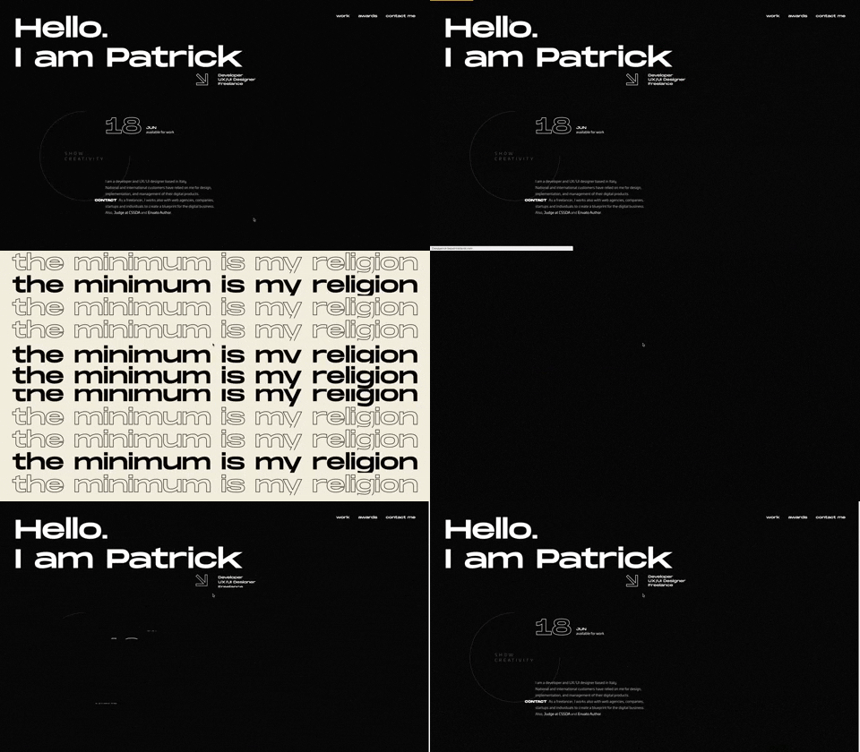
Patrick David

An excellent portfolio of an Italian developer and UI / UX designer. The site has an amazing design. The site also has a lot of beautiful animation and a very unusual preloader.
Fabian

You can say ," What did you find on this site?" Personally, I liked this portfolio for its design focused primarily on the font. This is one of those designs where the font plays a dominant role and sets the rest of the style. Moreover, such a site is not very difficult to create, it can appeal to those who do not really want to bother creating a complex design for their site. But you will have to worry about finding the font ;)
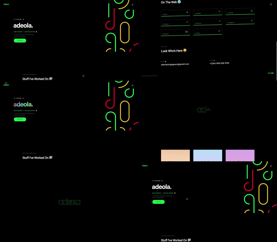
adeola.

Portfolio of a Frontend developer from Lagos. A very nice one-page site, which has a beautiful animation. I think many people may like it because of its unusual style.
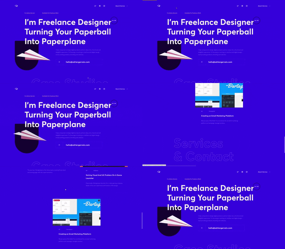
Adrien Gervaix

Portfolio of a French UI / UX freelance designer. On the site you can see beautiful svg elements and also a number of attractive animations.
SANJOO

Portfolio of a freelancer from India. The site is designed in the same style as the Fabian portfolio. Here, too, the design is dominated exclusively by the font.
Matthew Williams

Quite often found portfolios on the Internet. If you have ever searched the Internet for examples of good portfolios, then perhaps you could come across this example. The portfolio is owned by Matthew Williams, who is a full-stack web developer. A very decent portfolio, but in my opinion slightly outdated in terms of design and site elements. But in general, it can be a good example, especially for beginners.
Jack.

Portfolio of a Polish frontend developer. The site has a beautiful and unusual animation, as well as seamless transitions between the pages of the site. The portfolio has a very minimalistic design, which is very well combined with the selected colors for the site.
Bruno Simon

Amazing portfolio of web developer Bruno Simon, which is made in 3d style with the help of three.js. (and perhaps some other 3d libraries). I'm sure you knew about it, but I think it's a sin not to add this portfolio to your list. It is perfect in everything from the design to the way it provides information (you can even have fun playing bowling or overcoming obstacles on the site). To find out information about the developer, you need to use this car to drive to the appropriate fields with information about the developer himself, as well as about his work. Also on the site there is a physics of elements and characteristic sounds when interacting with them. This is a great portfolio, which in my opinion is extremely difficult to repeat. I think that in this way the author wanted to separate his portfolio from the usual one-page sites, which simply show graphs with developer skills (I never understood why they were needed).

The End
Well, that's it, thank you friends, for your time. I hope that this collection will help you and your inspiration to create your beautiful portfolio. (Please just don't use skill charts).


Posted on June 18, 2021
Join Our Newsletter. No Spam, Only the good stuff.
Sign up to receive the latest update from our blog.


