Jordan Bowman
Posted on October 27, 2020

We like to apply labels to users: they’re irrational, lazy, unpredictable, rushed, and so on.
To some extent that may be true—we aren’t machines.
But research shows that users actually make decisions based on a set of predictable subconscious patterns.
To create satisfying digital experiences, UX designers should be aware of—and support—these cognitive habits.
Heuristics
Human beings use psychological tactics and biases to get to decisions quickly. These mental shortcuts are called heuristics. We use heuristics in everyday life, but we especially like using them with software.
We don't follow these patterns out of laziness or because we're scatter-brained. It's quite rational to take advantage of heuristics as a user because…
- In the digital world, there's very little penalty for being wrong. The cost of most errors is close to zero. Guessing wrong on a link and hitting the back button is still more efficient than reading the whole page to find an exact match.
- Carelessly clicking around is more fun because we get a small dopamine rush from each click.
- Web pages can be complicated. We'd rather make a decision and get on with our lives. It's a matter of trade-offs—a balancing act.
- The web enables us to move quickly from one decision to the next, at a much faster pace than the physical world. So that’s what we do.
Let's take a look at some of the most common heuristics that users employ.
Satisficing
A combination of the words "satisfy" and "suffice." It means to settle for the first reasonable option you find, without considering the whole set of possibilities. We don’t look for the right answer—we look for whatever is good enough.
Loss Aversion
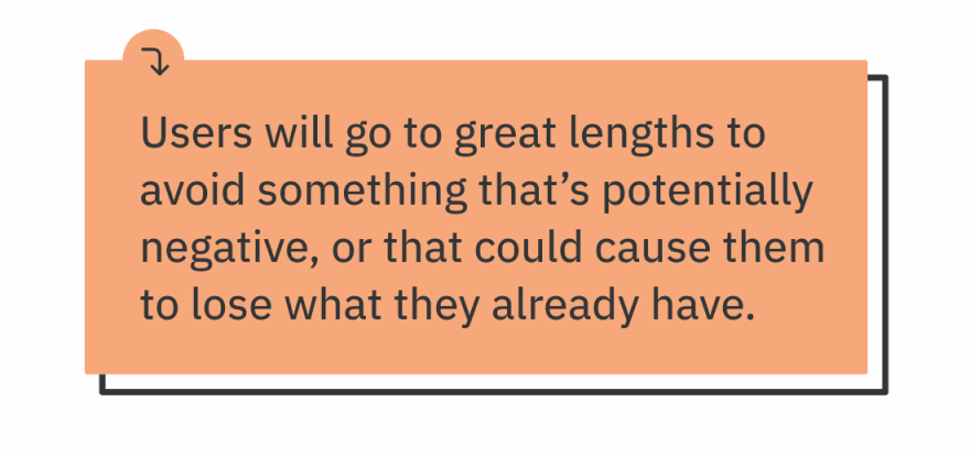
Losses loom larger than gains in our minds. It is thought that the pain of losing is about twice as powerful as the pleasure of gaining. We put in more work and take more risks to avoid losses than we do to make gains. Part of Prospect Theory.
Availability
People draw conclusions based on what comes to mind immediately. We give a lot of importance to things that we recall quickly and things we can already see right in front of us.
Decision Fatigue
Making a lot of decisions lowers a person's ability to make rational ones. It’s also exhausting.
Reference Dependence
Human beings do not have an innate way to determine absolute value. So we assign value by comparing one thing to another. We make judgments in relative rather than absolute terms.
Status Quo Bias
Unless there’s a compelling incentive, people are more likely to stick to the default. In other words, we tend not to change the established situation.
Hick's Law
The number of stimuli present influences the time and effort required to make a decision.
So what?
As designers, what do we do about all this?
Here are a few ways we can tailor our digital experiences to these heuristics.
Decrease your DPP
One helpful exercise is to look at what we can call our DPP: Decisions Per Page.
Take an important page from your interface and count the number of possible decisions a user could make on that page. This includes actions (which always require a decision) or information that leads to a decision.
I'm willing to bet the number is higher than you would have guessed.
If the DPP is too high, what do you do?
Reduce visual signals
Start by reducing the number of colors and fonts. Using more than four meaningful colors causes the “rainbow effect” which disorients the brain and creates an impression of ugliness.
Movement is distracting. Use animation sparingly and only for a specific purpose.
Build a design system. It ensures consistency between elements, and prevents users from having to re-learn the interface on every new page.
Optimize the default experience
Be aware that many people will never use fancy customization options. Make sure the general default experience provides for all the important task flows.
Forms provide lots of opportunities to be helpful. For example, we could pre-populate fields with the most common value or a realistic example. This representative value helps the user understand how to complete the field and what the expected response is. Not to mention it will save most users time and decision-making energy.
Prioritize for the user
Since many users aren’t going to accurately prioritize things on their own, we should do some of that work for them. The ultimate goal is that they can glance at any page and know instinctively which items are most important.
Knowing what to prioritize requires that you learn about your users, their goals, and their main workflows. Think about what is essential (vs. what is optional) and what moves the user forward.
We can give the user visual clues to create a clear hierarchy. Our brain assigns importance to things based on size, color, imagery, contrast, white space, and alignment.
Evaluate your content
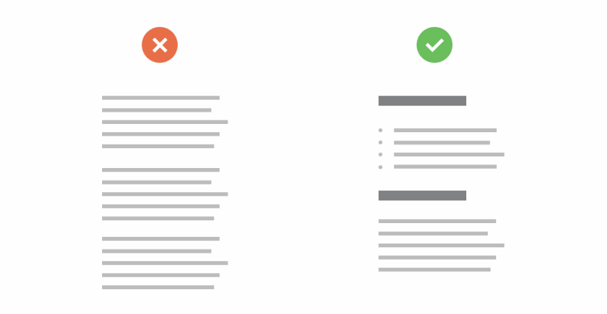
Remember almost all users scan—they don’t read. Classic principles of good writing, including descriptive headings and inverted-pyramid structures, help users get meaning from content.
Some common red flags include a lack of headings and big, long blocks of text. Call attention to important information using bulleted lists and bold or italic fonts. Take the time to craft your microcopy.
Consider the post-click experience
What happens when a user clicks on something? What's the next thing they see and how does it connect to where they just were? How does it fit into their whole journey through your interface?
It could be easy to think of each page in isolation. But remember pages aren't individual silos—they're pieces of flows. It's all a series of connected actions.
Give good information scent with link labels so users know where they’re going. Allow them to gracefully recover from clicking on the wrong thing to eliminate the “cost” of clicking. Make sure they’re always moving forward.
Tying it off
Remember: we never truly know what an individual user is thinking until we research. When in doubt, test it out.
What are you going to do differently with your products to better support these heuristics?
Thanks for reading. Check out the Twitter thread, and consider sharing it with someone who would find this useful:

Posted on October 27, 2020
Join Our Newsletter. No Spam, Only the good stuff.
Sign up to receive the latest update from our blog.
Related
November 27, 2024


