The AI Alpha Geek: It starts with EDA! - Part C

Joy Ada Uche
Posted on October 31, 2020

Here, we would explore the numerical features in this dataset - Age and Fare. Let's look at the code example below -
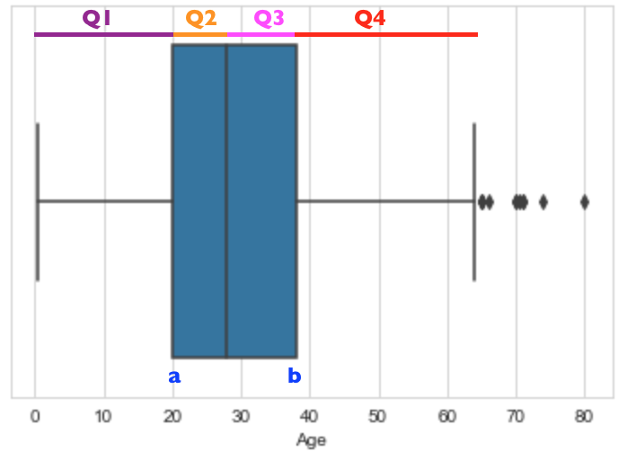
Looking at the Age feature, the box plot in Line 1 above outputs the below:
Above is a box plot or sometimes called a box and whisker plot. It is a good way to visualize the spread of the Age variable. Some interesting stuff to note from the plot is -
- It seems most people that boarded the Titanic are between the age of 20 and 40.
- The protruding lines on both sides shaped like T are the whiskers.
- The line that divides the blue box is actually the Median of the dataset - So by looking at the plot, it seems the median Age is close to 30.
- The range of this variable is the largest value in the dataset (the rightmost point of the whisker) minus the lowest value in the dataset (the leftmost whisker point).
- Q1, Q2, Q3, and Q4 are the 1st, 2nd, 3rd and 4th quartiles of the Age variable - note that Q1 is the same as the 25th percentile, Q2 is the Median of the dataset, which is also called the 50th percentile, while Q3 is the same as the 75th percentile.
- The IQR (interquartile range) is b - a, which is the difference between the Q3 and Q1.
- Any points you see after the whiskers of the box plot above are referred to outliers. Outliers are data points that are extremely high or low, which makes them far away from other data points. Kindly note that not all outliers are bad data - what if they were not incorrectly entered? Hence, there is a need to investigate the reason behind any outliers before actually going ahead to handle them.
Essentially, the box plot can be seen as the visual representation of the summary statistics table showed in part b, as it graphically shows most of the statistics.
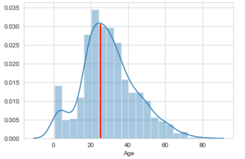
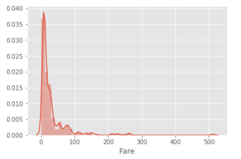
Moving on to the distribution plots for the Age and Fare features produced by Lines 2 and 5 above can be seen below -
From above, it seems the Age feature distribution almost looks like the mirror image to itself from both sides of the centre line. The left side of the distribution is roughly a mirror image of the right side (vice versa). So, it has a roughly normal distribution, which means there are far more data near the mean rather than being far from it - it is a roughly symmetric distribution i.e the area under the curve is roughly equally distributed on either side of the centre line.
The Fare feature, on the other hand, is skewed to the right. We can see that the tail of the distribution is to the right-hand side, hence this is called a right-skewed distribution or a negatively skewed distribution. Here, the area under the curve is shifted to the left side. The tail of the Fare distribution above represents outliers - Now do you see how skewed distributions and outliers are related? Also, from the distribution plot for the Fare variable, it seems a lot of people went for the cheaper ticket.
Understanding these distributions also plays a role in efficiently handling missing data. For example, when there are outliers, using the mean to fill in missing values is not ideal because outliers skew the mean, so we may want to go for the median statistic instead.
Sure hope you enjoyed this piece. Stay tuned for the next part of this series as we go-ahead to explore feature relationships to squeeze out more insights from our data! 😉

Posted on October 31, 2020
Join Our Newsletter. No Spam, Only the good stuff.
Sign up to receive the latest update from our blog.


