The AI Alpha Geek: It starts with EDA! - Part B

Joy Ada Uche
Posted on September 30, 2020

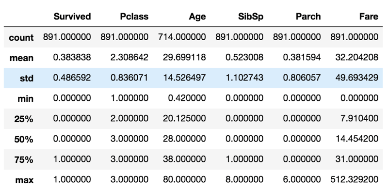
Before we start exploring each individual feature, let's take a look at some statistics for the dataset produced by train_df.drop('PassengerId', axis=1).describe() below:
In the summary statistics above, looking at the Age feature for example:
- the count is 714, which tells us there are 177 missing entries since the total entries are 891 - we would need to deal with this later on when handling missing values,
- the mean age is 29.699, which is the average age of passengers who were aboard i.e the value 29.699 was the typical or normal age of the passengers aboard,
- the std (standard deviation) of 14.526 tells us that most of the passengers are in the age range (29.699-14.526) to (29.699+14.526),
- the min age is 0.42, which tells us the least age is for a baby on board,
- the 25th percentile is 20.125 years shows that 25% of passengers is less than 20.125 years,
- the 50th percentile, which is the median is 28 years, tells us that half of the passengers onboard are below 28 years old - seems most of the passengers were young,
- the 75th percentile, which is 38, tells us that 75% of the passengers are less than 38 years, and
- the max age is 80 years, which is the age of the eldest passenger onboard - luckily, it seems there are no aliens onboard.
Now, it's time for some univariate analysis - this is just descriptive analysis of one variable at a time which it helps us understand the data distribution for that variable and even detect outliers. Let's start with the categorical variables -
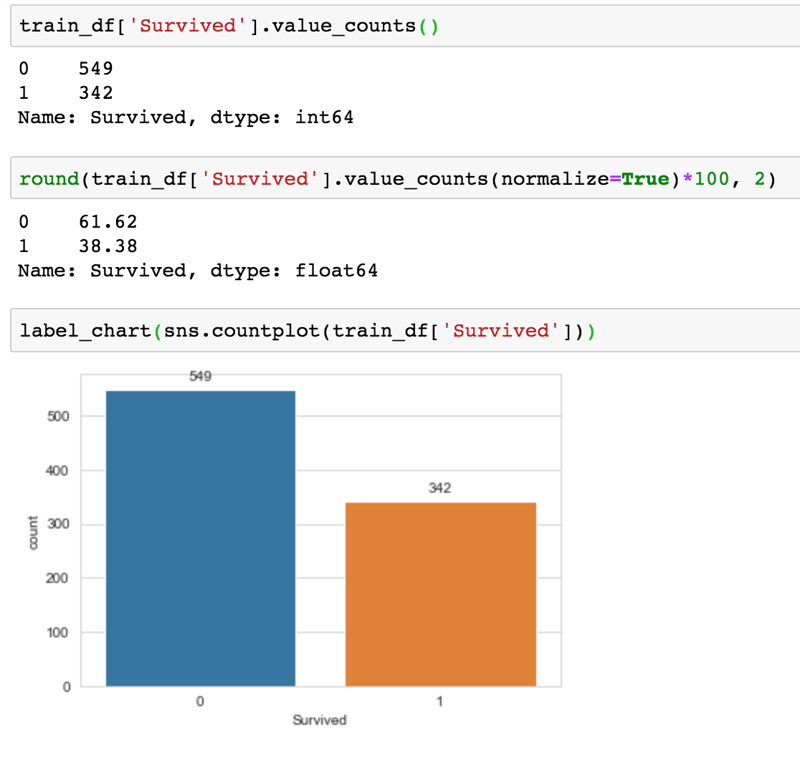
In the code example above, taking a look at the output for the target variable, Survived, below -

- value_counts() is used to get the counts of unique values for this column - and it seems a lot more people did not survive. Note that it is not a perfectly balanced dataset but this is not a case where the number of those who didn't survive is far more significant than those who survived.
- to get the percentages of each class (i.e survived - 1 and deceased - 0), set the normalize parameter of value_counts() to True.
- to have a better view of the count for each class, we use count plot via Seaborn. The label_chart() is just a helper function to label the chart.
Let's see some insights gathered from the code output from eda_part_b.py above -
- For the Pclass feature, it seems a lot more people that were on board are in class 3 and from Part A of this series, we saw that these are people in the lower socio-economic class, which seem to mean most onboard got the cheap ticket,
- Seems more males boarded when you look at the Sex feature, as 64.76% of passengers are males,
- Most passengers boarded from the Southampton port, and it seems most passengers came alone since most have 0 siblings and/or travelled with just a nanny.
So, all these give us more insights to explore further - Stay tuned for the next parts on this topic, on this same series, where we go-ahead to explore individual numerical variables for patterns. Wish you an awesome October!

Posted on September 30, 2020
Join Our Newsletter. No Spam, Only the good stuff.
Sign up to receive the latest update from our blog.
