Building a mental health crisis app, Day 3: Login Page part 2

JC Smiley
Posted on December 28, 2020

The app is called “Help Me” and is designed primarily as an “SOS” (distress signal) to a selected circle of trusted people when someone is going through a mental health crisis. The user can send a message with their location to one person or everyone in their community. The goal is to build a trusted community around the user with private conversations and a system to show their emotions. This will help the trusted people to be aware of the user's range of emotions.
Day 3 of Development
At the end of Day 2, I had several issues that I couldn't figure out regarding styling, making components, and using icons. Today's focus is on learning and solving those issues.
End of Day 2 Issue: Icon inside the Input field
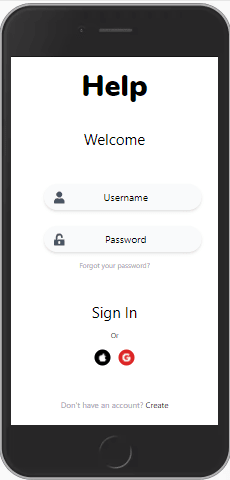
At the end of Day 2 I did a stand-up (Agile concept that prioritizes a daily team meeting) with my project's partner, Miguel Hernandez. One of my issues was having an icon inside the input field of the Log-in screen. He sent me a sample component as a solution from tailwindcomponents. Let's just say that it didn't work right out of the box. But it did give me a framework to start with and showed me that it could be done. This was my results:

Finding the perfect Icons
Afterward, I needed to install and use the incredible Fontawesome icons into the app. You can find this resource at Fontawesome.
End of Day 2 Issue: Making the Input fields reusable
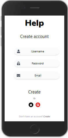
Another issue from Day 2 was the wireframe's design called for the same styled input field to be used in multiple screens. While my input fields looked correct, they weren't reusable as components. I decided to make a new component based on my initial input field. I was able to use the new input component to create the Registration screen.
This is the wireframe that I hope I am coming close to building.

End of Day 2 Issue: Adding a font family class to Angular
The wireframe's design call for using a non-standard font family Nunito for the page title. The fixed involved updating the font family object in the theme inside the tailwind.config.js file.
What's Next
- Tomorrow goal is to build out the user account setup screens and learn about Angular routing.
Stay on the lookout for a Day 4 breakdown blog post!!!

Posted on December 28, 2020
Join Our Newsletter. No Spam, Only the good stuff.
Sign up to receive the latest update from our blog.

