Building Front-End App Experiences with Clicks, Not Code

Jason Sun
Posted on December 5, 2020
(Heroku and Salesforce - From Idea to App, Part 4)
This is the fourth article documenting what I’ve learned from a series of 10 Trailhead Live video sessions on Modern App Development on Salesforce and Heroku. In these articles, we’re focusing on how to combine Salesforce with Heroku to build an “eCars” app—a sales and service application for a fictitious electric car company (“Pulsar”) that allows users to customize and buy cars, service techs to view live diagnostic info from the car, and more. In case you missed my previous articles, you can find the links to them below.
Modern App Development on Salesforce and Heroku
Jumping into Heroku Development
Data Modeling in Salesforce and Heroku Data Services
Just as a quick reminder: I’ve been following this Trailhead Live video series to brush up and stay current on the latest app development trends on these platforms that are key to my career and business. I’ll be sharing each step for building the app, what I’ve learned, and my thoughts from each session. These series reviews are both for my own edification as well as for others who might benefit from the content.
The Trailhead Live sessions and schedule can be found here:
https://trailhead.salesforce.com/live
The Trailhead Live sessions I’m writing about can also be found at the links below:
https://trailhead.salesforce.com/live/videos/a2r3k000001n2Jj/modern-app-development-on-salesforce
https://www.youtube.com/playlist?list=PLgIMQe2PKPSK7myo5smEv2ZtHbnn7HyHI
Last time…
Last session, we did some data modeling in Salesforce using point-and-click methods and also went over some of the data modeling and scalability features of the Heroku platform. If you remember from the last article, I absolutely think that proper data modeling at the outset is critical to setting up an app for success.
In this episode, we’re looking at a topic that is paradoxically both anathema to me_ and_ something that makes me love the Salesforce platform: creating front-end app experiences. I promise this will make sense as we get deeper into the article.
Ever since I first got into app development, designing and building front-end experiences for an app or website has probably been my least enjoyable experience. With back-end development, things either worked the way they should, or you had clear bugs or errors: there was no middle ground. On the other hand, I found front-end to be far too subjective of a topic for my liking—everyone had a different opinion about how something should flow, how it should look, whether to use rounded or square edges, which shade of blue would get more clicks, etc. Then, when you finally get to release the end product after much colorful debate, a group of users out in the wild invariably figures out a way to get confused by the front-end experience you worked so hard on.

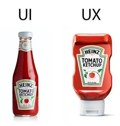
The fact that there is massive controversy over this meme is why I dislike working on both
However, I think my early distaste for front-end related things is actually something that drew me deeper into the Salesforce ecosystem. I was naturally attracted to the platform’s meta-data driven architecture that allows me to quickly get an app concept up-and-running with a working and extensively customizable user interface without having to write a bunch of front-end HTML, CSS, and Javascript. Many of my clients are very visual in the way they process information, and oftentimes they need something in front of them they can play around with and “kick the tires” on before they’re able to provide substantive feedback on ways we can improve their experience. Being able to prototype this way has saved me countless hours iterating on designs.
As a result, this session really had me thinking about how much one can do with the front-end experience of a Salesforce app before having to do anything with code.
Let’s look at some of those features in the context of our eCars app.
Personalizing and Branding the Salesforce App
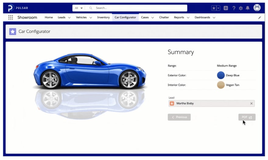
A nice feature that’s been added to the Salesforce Lightning Experience interface is the Themes and Branding section of the User Interface area of app setup. Without needing code to customize the color palette, banners, logo, and images, we can completely personalize a Salesforce app to match the branding of the company.

We can literally take theme customizations for a test-drive
You can try out this feature yourself in the context of the Pulsar eCars app by uploading the app package to a developer edition or scratch org. You can get the GitHub repo for the eCars app at the following URL and if you need a review on how to deploy a Salesforce app to a scratch org from a GitHub repo, you can refer back to the very first article I wrote on this series (link here):
https://github.com/trailheadapps/ecars
Creating Custom Record Pages Without Code
Being able to customize the theme colors, logos, and images is certainly a nice appetizer, but the main course is really when we get into the user interface components of record pages without having to use any code. Lightning Experience has really taken this to the next level as well—those of you too new to have known Classic Experience might not fully appreciate all the new features Lightning offers.
For the eCars app, we get to design, from scratch, a record page for the standard Lead object. Regardless of which object we’re working with, displaying relevant information to the user in both a logical and functional way is paramount. With the Lightning record pages, we’re presented with a plethora of variations on how we can optimize things for the user, all without code:
Page Templates
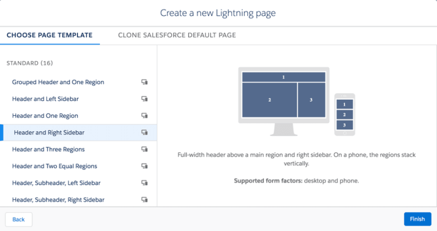
How should we organize information on the page? Do we need a header and two equal regions? A header, main section, and a sidebar? No header and three columns?
Even if none of the many out-of-the-box layouts work, we can create a custom page template that can be achieved with some light coding.

If none of these options work, you could be overthinking things
Drag-and-Drop Components
After the page regions are defined, we can simply start building out the record page using a number of drag-and-drop components such as tabs, record details, record highlights, related list items for the sidebar, etc. Basically, we can include anything that someone interacting with the record might need to access.
Page Activations for Different Use Cases
Once the page has been built and defined, we also have the option of activating it as a single org-wide default, or going a few levels deeper and then defining multiple versions of the same record page for different apps, user profiles, and record types. One user may need to see more, less, or different information for the same record. This reality makes defining multiple versions a handy tool to achieve that use case.
The page activations can even be as granular as desktop vs. phone for added optimization for the different form factors.
Even More Granular UI Elements Without Code
In addition to the customizations of the Lightning Record Pages, there are other, more specific ways to customize without code.
Compact, Search, and Page Layouts
If we need to customize which fields appear and in what order—in places like the Record Highlights component, the Global Search results, or the Record Details component— we can use drag-and-drop methods on the Compact Layouts, Search Layouts, and Page Layouts sections of the Object Manager in Setup. I use these frequently as they’re essential to organizing information for the users.
Dynamic Actions with Conditional Visibility
This is a relatively new feature at the time of this writing (only a few releases old), and it’s already helped me with those client requests that go something like, “Can we hide this button until so-and-so has filled out x,y,z or the record has gotten to this stage?” I used to hack this functionality together by creating a mess of record types and different page layouts, or I’d just code a custom visualforce page. But now, hiding/rendering actions is as easy as defining the filters for them with a few clicks.
The one consideration here is that this only works (currently) for desktop interfaces.
Dynamic Forms
Dynamic forms take the whole “conditional visibility” thing to a new level. This feature applies not just to buttons and actions, but to individual fields. Similar to the above use-case example for hiding buttons, sometimes a record just might present too many fields to the user at once. Dynamic forms solve this by allowing you to define under which conditions certain fields should be visible. As a result, users can go on about their business of filling things out and updating records. Then, as things progress, dynamic forms hide irrelevant fields and present new, relevant ones. This creates a nice, streamlined user experience.
One “gotcha” we have to keep in mind is that this is only available for custom objects, not standard ones like Leads, Accounts, Contacts, and Opportunities. That being said, I’m betting this will change soon enough.
Screen Flows – Multi-Step Wizards Without Code
Screen flows are probably one of the most powerful tools we can leverage when it comes to custom user experiences without crossing into the “code zone.” If an app builder needs to hold a user’s hand during a complex and multi-step design process, then the screen flow is the likely tool of choice. I’ve found that there is a bit of a learning curve with screen flows. Although it’s hard to design them nicely from the outset, once someone gets the hang of it, they’ll need very little time to build out a totally bespoke data-entry wizard user experience during those times when even dynamic forms don't get the job done.
And once Lightning Components get involved, flows can even launch and exchange information with Lightning Components in the middle of a flow. The possibilities really are endless.
Concluding Thoughts and Other Helpful Resources
As I said earlier, designing front-end experiences is not one of my strong suits. I’m pretty sure that if I had not found Salesforce on my app-building journey, I probably would have quit and found a different line of work, or I would have just become a purely back-end developer. The UI/UX tools and features on the Salesforce platform have instead helped me to deliver complete app experiences, front to back.
For more information and specific practice on some of the topics covered, check out the links to the Trailhead modules and resources below:
- Lightning App Builder
- Lightning Experience Customization
- Try Dynamic Forms and Actions
- App Customization Lite
- Build Flows with Flow Builder
- Custom Templates For App Builder
- Creating Record Types In Salesforce
In the next article, we’re going to shift gears and dive into some actual coding for the eCars app with Lightning Web Components.
If you haven’t already joined the official Chatter group for this series, I certainly recommend you do so. That way, you can get the full value of the experience and also pose questions and start discussions with the group. Oftentimes, there are valuable discussions and additional references available there, such as the slides from the presentation and links to other resources and references.
About me: I’m an 11x certified Salesforce professional who’s been running my own Salesforce consultancy for several years. If you’re curious about my backstory on accidentally turning into a developer and even competing on stage on a quiz show at one of the Salesforce conventions, you can read this article I wrote for the Salesforce blog a few years ago.

Posted on December 5, 2020
Join Our Newsletter. No Spam, Only the good stuff.
Sign up to receive the latest update from our blog.
