CSS flexbox cheat sheet (with examples)

Ibrahima Ndaw
Posted on December 6, 2019
Originally posted on my blog
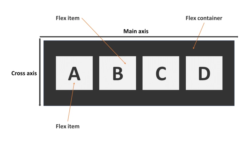
CSS flexbox makes it easier to design a flexible and responsive layout structure without using float or positioning.
Flex container
These following properties are applied to the flex container.
display
It transforms the container to a flexible one (flexbox) or inline flex container.
- flex: This value will transform the elements of the container to flex items.
flex-direction
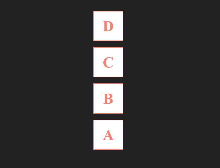
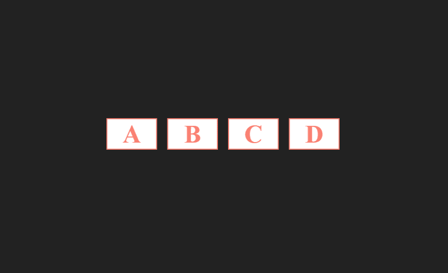
It specifies in which direction the main axis go.
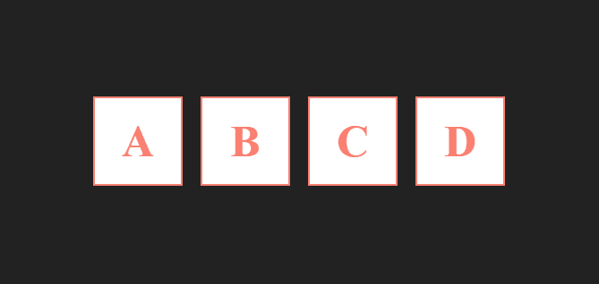
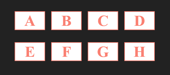
- row: it's the default, flex items will be displayed horizontally and the main axis will go from the left to the right side.
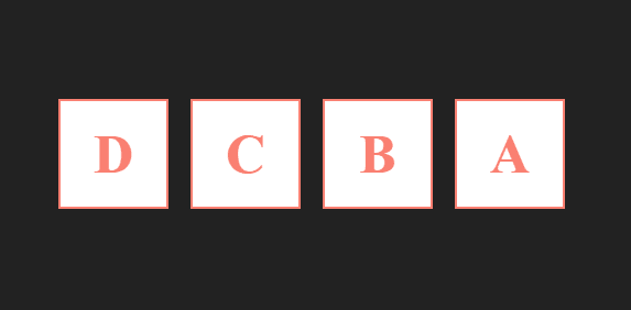
- row-reverse: it's the same as
row, except the order will be inverted and the main axis will go from the right to the left.
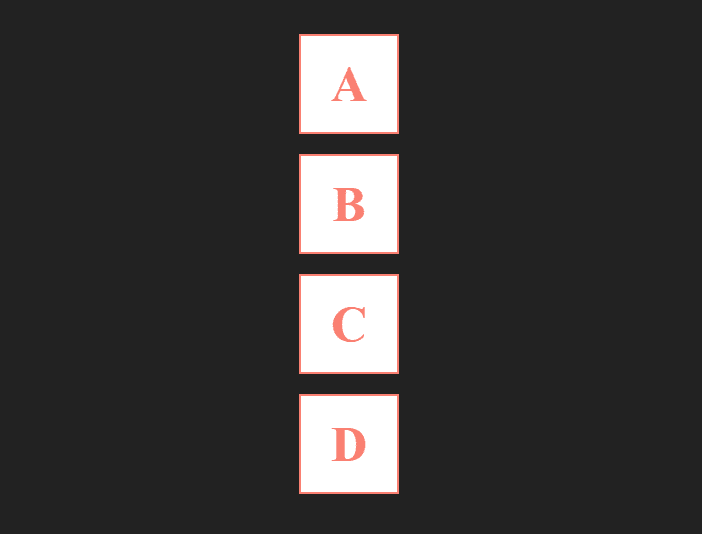
- column: flex items will be displayed as a column (vertically) and the main direction will go from top to bottom.
- column-reverse: it's the same as a
column, except the order will be inverted and the main axis will go from bottom to top.
justify-content
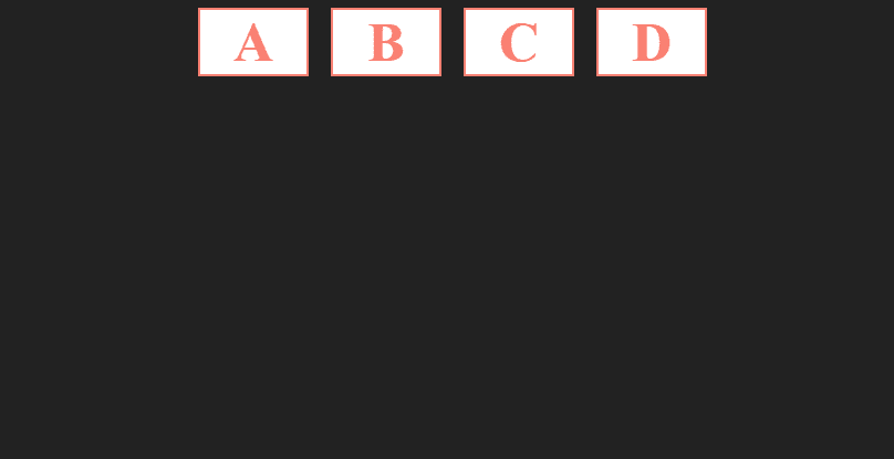
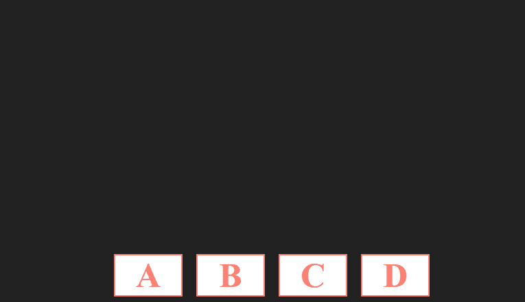
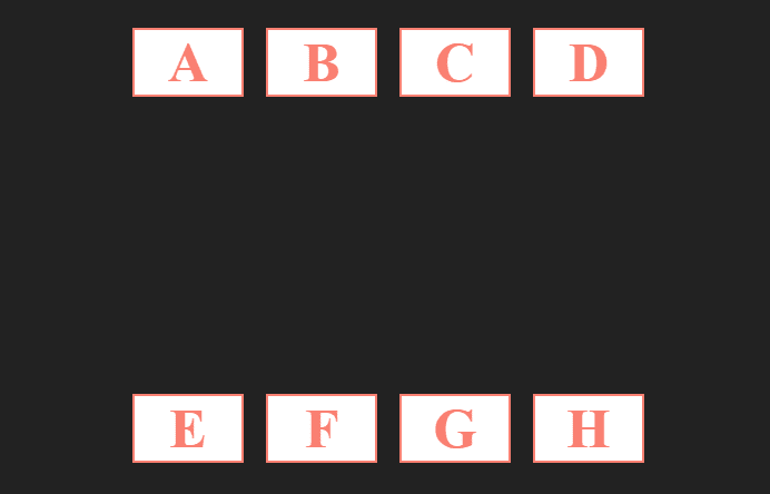
It's used to control how the items should be positioned following the main axis.
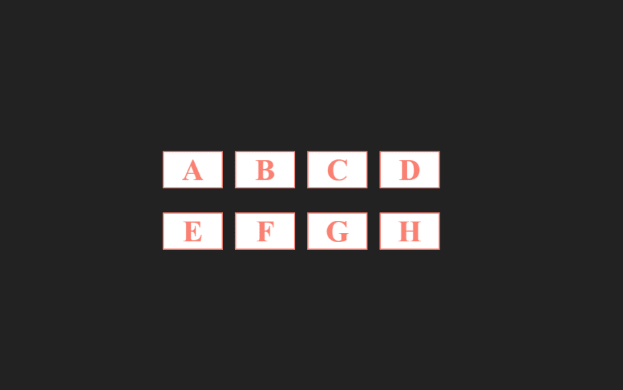
- center: This value will center all the items.
- space-between: It will distribute the available space evenly between the items.
- space-around: It will give each flex item the same amount of space on both left and right.
- space-evenly: This value ensures that the space between flex items will be the same.
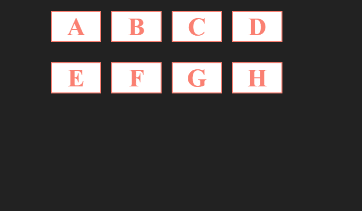
- flex-start: it's the default, the items will be positioned at the start of the flex container.
- flex-end: the items will be positioned at the end of the flex container.
align-items
It's used to control how the items should be positioned along the cross-axis.
- stretch: it's the default, the flex items will be stretched along the cross axis.
- center: This value will center the items along the cross axis.
- flex-start: the items will be positioned at the start of the cross axis.
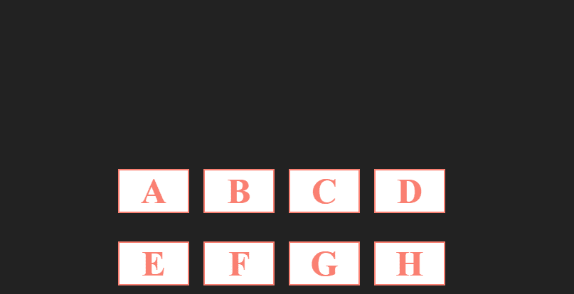
- flex-end: the items will be positioned at the end of the cross axis.
flex-wrap
- wrap: This value will put the overflowing items into a new line.
flex-flow
The flex-flow property is a shorthand property for setting both the flex-direction and flex-wrap properties.
e.g: flex-flow: column wrap;
align-content
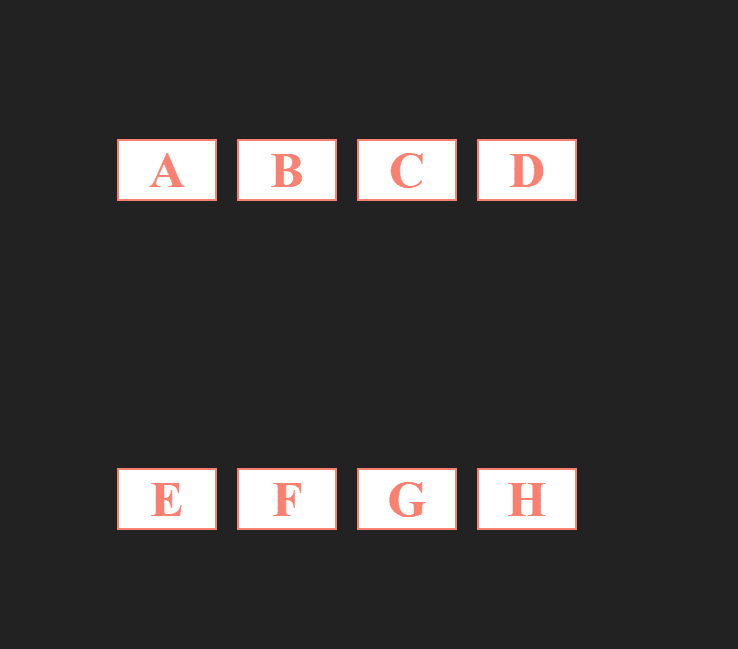
It does the same job as align-items, except this property aligns the flex container along the cross-axis if extra space is available.
Notice that the property will be applied only if the number of flex containers is more than one.
- stretch: it's the default, flex containers stretch to take up the remaining space.
- center: This value will center the flex container along the cross axis.
- flex-start: the flex container will be positioned at the start of the cross axis.
- flex-end: the flex container will be positioned at the end of the cross axis.
- space-between: It will distribute the available space evenly between flex containers.
- space-around: It will give each flex container the same amount of space on both left and right.
Flex Item
These following properties are applied to the flex item.
align-self
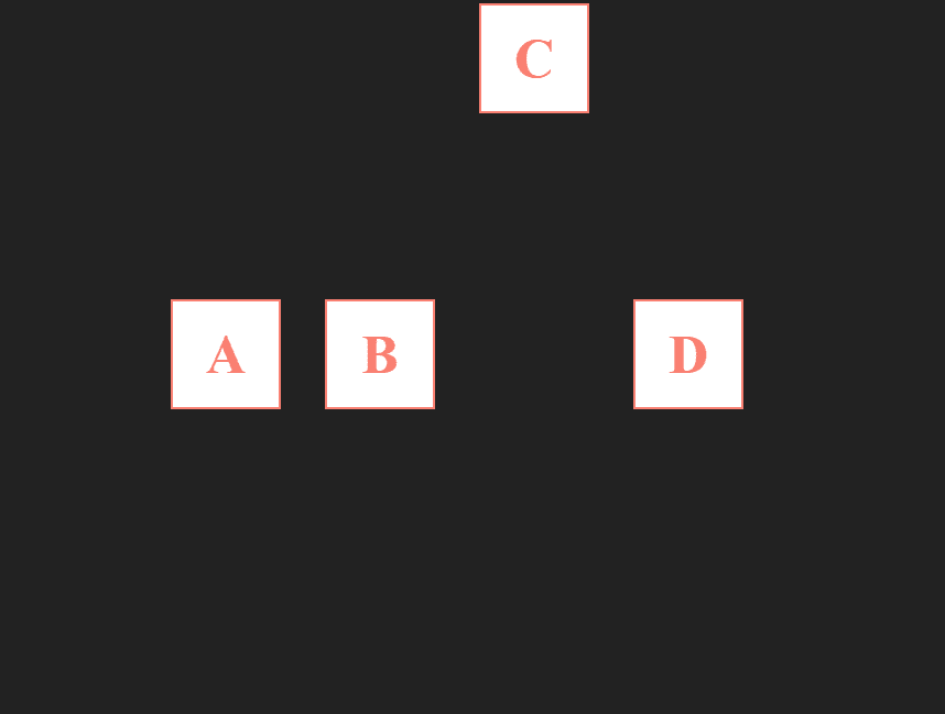
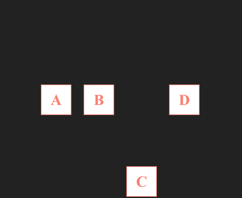
The property align-items sets the default alignment for all the flex items, align-self enables us to override this default alignment for an individual item.
auto: it's the default.
center: This value will center the flex item towards its container.
- flex-start: the flex item will be positioned at the start of the cross axis.
- flex-end: the flex item will be positioned at the end of the cross axis.
- stretch: the flex item will be stretched along the cross axis.
order
The order property controls the order in which children of a flex container appear within the flex container. The value must be an integer.
e.g: order: -1;
flex-grow
It gives the flex item the ability to grow. The value must be positive.
e.g: flex-grow: 1;
flex-basis
It sets the flex basis, in other words the width.
e.g: flex-basis: 30%;
flex-shrink
It controls how a flex item can shrink.
flex-shrink:0 it will not shrink
flex-shrink:1 it will shrink.
e.g: flex-shrink:0
flex
We can simplify flex-grow, flex-basis flex-shrink with flex followed by them values.
e.g: flex: 0 30% auto

Posted on December 6, 2019
Join Our Newsletter. No Spam, Only the good stuff.
Sign up to receive the latest update from our blog.
