No Fuss Dark-Mode Toggle with React & Styled-Components! 🌞↔️🌖

Chris Hansen
Posted on August 18, 2021

Have you noticed dark mode is pretty standard lately?
Well, that's because it's badass!
Let's achieve this new standard of awesome by utilizing styled-components and React!
It's super easy to implement, so let's get straight to it! 💯
Resources
👉 Demo
👉 Repo
Some things I'm expecting you to know
- Development Environment
- Basics in React
- Basic S(C)ass
1. Fresh React project
Let's clean up the file structure ~ if you want. I deleted all unnecessary files for this project. Removing App.css and all testing related files. Be sure to remove necessary lines of code in index.js. I also cleaned up the boilerplate between the header tags.
2. Install and Import styled-components
With a fresh project, let's now install and import styled-components.
-
yarn add styled-componentsor npm install --save styled-components
Let's now import styled-components like so:
import styled from 'styled-components'{% raw %}`
```
---
## 3. Let's create a simple landing page with styled-components
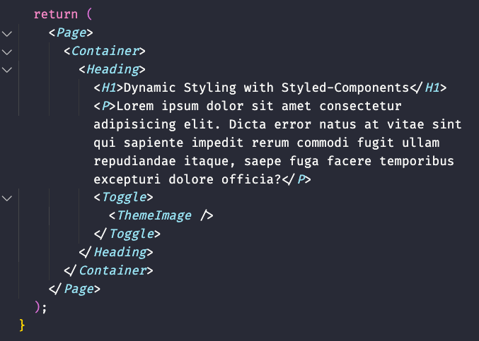
In our `App()` let's return a `Page`, `Container`, `Heading`, `H1`, `P`, `Toggle`, and `ThemeImage` component, respectively. It should look like so

---
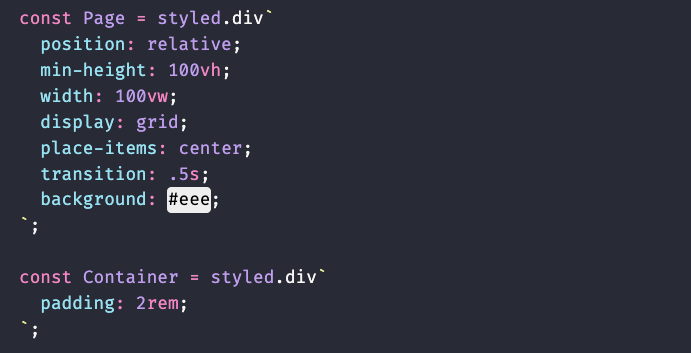
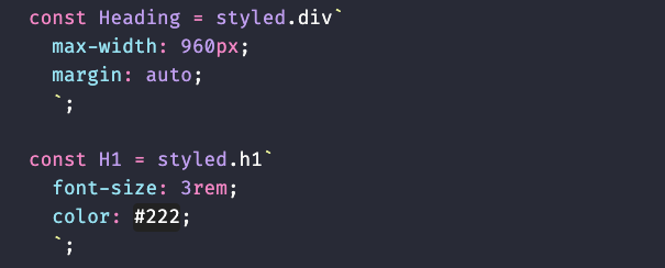
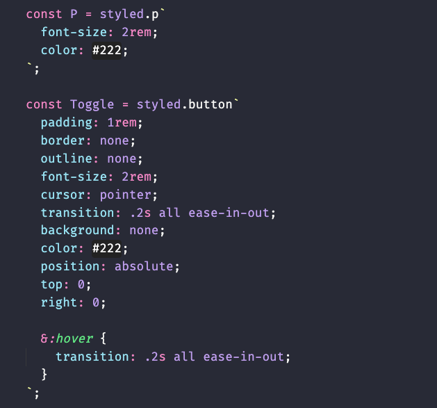
## 4. Now that we have our layout, let's create each of our components
`Page` and `Container`

`Heading` and `H1`

`P` and `Toggle`

`ThemeImage` is the component that will contain our toggle state images

---
## 5. Let's create state for our toggle component
In order for us to to toggle between light and dark mode, we need to hold state. Let's begin by importing the useState hook. `import {useState} from 'react'`. Then add it to your `App()` component like so:
```javascript
const [isDarkMode, setDarkMode] = useState(false);
```
Next let's add the logic that will toggle between light and dark mode for our button `Toggle` component.
```javascript
const handleToggle = () => {
setDarkMode(!isDarkMode);
// console.log(isDarkMode);
}
```
This functions only responsibility is to toggle the opposite of what the current state is. In other words, if the state is currently `true`, toggling it will become `false`. If `false` it becomes `true`.
---
## 6. Update our `Toggle` component
Now that we have a function that can toggle our light ~ dark state, let's update our `Toggle` component like so:
```javascript
<Toggle onClick={handleToggle}></Toggle>
```
---
## 7. Import images to display the active theme
If we want to show our users the current and next theme, we can do so visually with the use of a Moon and Sun image. Let's import the images at the top of our code like so:
*images are available in the repo*
```javascript
import Moon from './images/moon.png';
import Sun from './images/sun.png';
```
Then lets update our `ThemeImage` component like so:
```javascript
<Toggle onClick={handleToggle}>
<ThemeImage src={ !isDarkMode ? `${Sun}` : `${Moon}` } />
</Toggle>
```
Here we are updating the `ThemeImage` components src attribute as it is an instance of `img`. We are also conditionally setting the image with a simple ternary operator while also utilizing template literals.
I'll explain with some pseudocode. You can read this like `if stateIsNotDarkMode ? render Moon : else render Sun.`
---
## 8. Let's update some style properties in our components
We're almost done! Let's update the `background` and `color` properties in a few of our components
First, Let's change the `Page` components background style to:
```css
background: ${props => props.light ? "#eee" : "#333"};
```
Secondly, let's change the `H1` components color style to:
```css
color: ${props => !props.light ? "papayawhip" : "#000"};
```
Lastly, let's change the `P` components color styles to:
```css
color: ${props => !props.light ? "#eee" : "#333"};
```
Here we are conditionally styling our background or color properties based on the prop that we pass into our components. If the component contains the `light` prop, render this color, else render this color.
---
## 9. Pass in our default Theme to our components with the `light` prop
All we have to do now is update our components in the layout with the default `light` prop. Like so:
```javascript
return (
<Page light={!isDarkMode ? true : false}>
<Container>
<Heading>
<H1 light={!isDarkMode ? true : false}>Dynamic Styling with Styled-Components</H1>
<P light={!isDarkMode ? true : false}>Lorem ipsum dolor sit amet consectetur adipisicing elit. Dicta error natus at vitae sint qui sapiente impedit rerum commodi fugit ullam repudiandae itaque, saepe fuga facere temporibus excepturi dolore officia?</P>
<Toggle light={!isDarkMode ? true : false} onClick={handleToggle}>
<ThemeImage src={ !isDarkMode ? `${Moon}` : `${Sun}` } />
</Toggle>
</Heading>
</Container>
</Page>
);
}
```
Here I am also conditionally rendering the `light` prop to either be true, or false, depending on on our state.
---
## Conclusion! 👏
Congrats! That's a wrap on **No Fuss Dark-Mode Toggle with React & Styled-Components!** Hopefully, if everything went right, you were able to implement a badass dark mode into your project, in 9 simple steps!
Please don't hesitate to hit me up on [Twitter](https://twitter.com/hyggedev) in regards to any questions, concerns or if you just wanna say hello!
---
## Are you a beginner web developer!?

How to stay focused 🔍 as a self taught Frontend Web Developer 💻
Chris Hansen ・ Jul 29 '21
#beginners
#webdev
#productivity
#devjournal
💖 💪 🙅 🚩

Chris Hansen
Posted on August 18, 2021
Join Our Newsletter. No Spam, Only the good stuff.
Sign up to receive the latest update from our blog.


