Data Visualization with Python pt. ii

Hugo Estrada S.
Posted on January 16, 2021

The notebook of this lecture is in my GitHub repo:
https://github.com/hugoestradas/Data_Visualisation_with_Python.git
Part 1: What on earth are "Histograms" <?>
Suppose you're in charge that a website always load fast and one day the average page loading time in... lets say June is significantly slower than the previous 5 months.
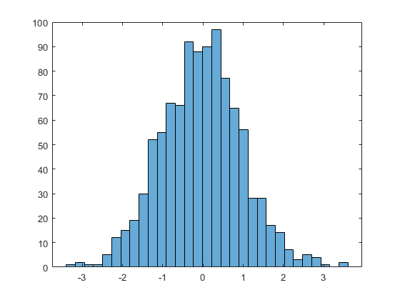
This type of scenarios are where the histograms really shine, because they show a kind of history in their graphs.
Histograms helps you understand the distribution of a numeric value in a way that cannot with mean or median alone.
Part 2: Histograms with Matplotlib
Let's import Pandas and Matplotlib:
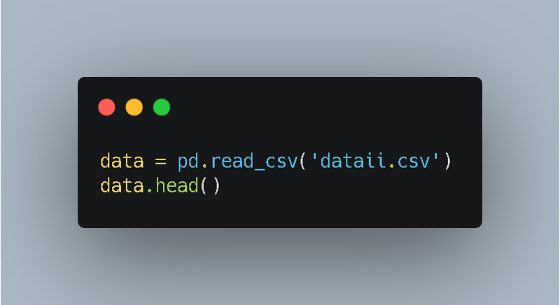
For this example I'm going to be using a larger dataset called "dataii.csv", let's import it:
For this part, I'll create histograms using the 'subplot()' function.
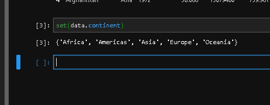
To check which continents are included within the data I'll use the 'set()' function:
And this returns the following output, showing all the continents grouped:
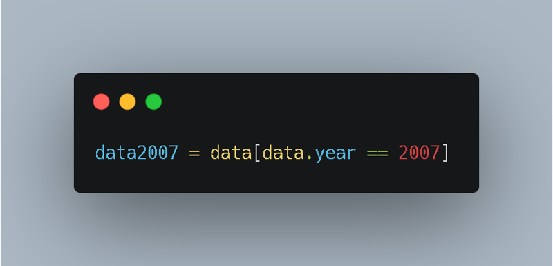
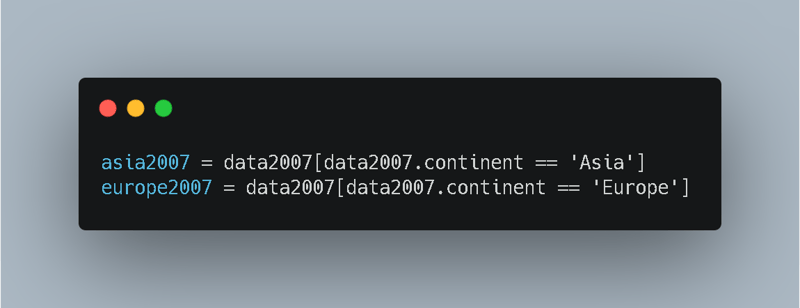
Now, for example, if you need to select the data of Asia and Europe in 2007, first you need to select the data for 2007:
Then select the data for Asia out of the 'data2007' variable, and then the same procedure for Europe:
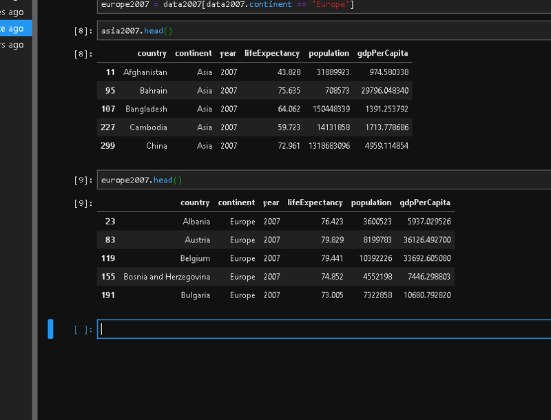
Check both 'asia2007' and 'europe2007' with the 'head()' function:
To check how many countries are in these two newly created datasets let's use the 'set()' function:
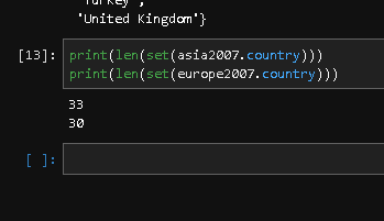
If you don't want to see the complete list of countries, instead only the number of countries for reach data set, use the 'len()' function combined with the 'set()' function:
Use this combined with the 'print()' function for both datasets, ant this should be the output:
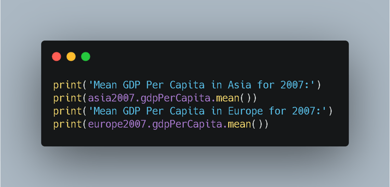
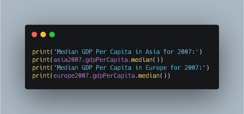
Let's now find the mean and median of GDP per Capita in Asia and Europe in 2007:
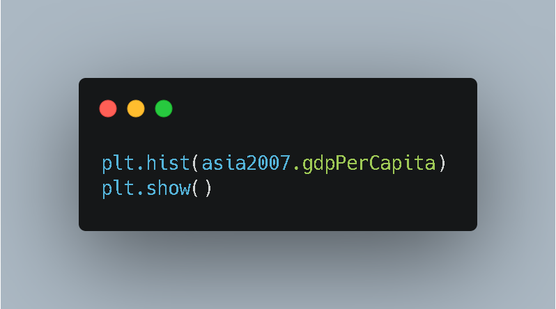
To create a histogram of GDP per capita in Asia, type:
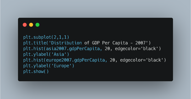
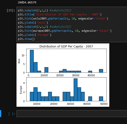
Now, to compare this histogram of the GDP Per Capita of Asia with the GDP Per Capita of Europe, both of 2007, lets use the 'suplot()' function:
And the result is the following histogram:
Part 3: Comparing Complex Histograms
Now, let's compare Europe and America's life expectancy in 1997.
There are many ways to solve this problem, but my approach is the following:
First select only the data of 1997:
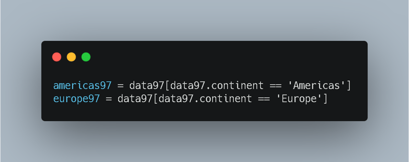
Then, from newly created dataset ('data97') extract America's and Europe's data:
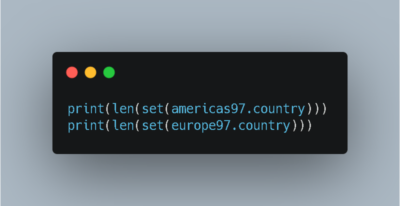
Now, to check the number of countries in each new dataset:
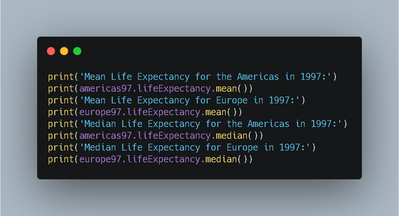
Now to get the mean and median life expectancy of each new data set:
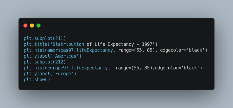
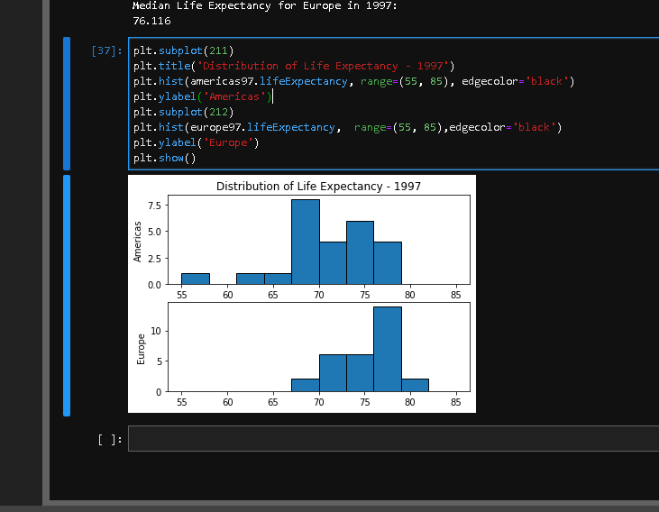
Now, finally to compare both datasets in histogram:
Being the final chart the following:

Posted on January 16, 2021
Join Our Newsletter. No Spam, Only the good stuff.
Sign up to receive the latest update from our blog.

