Naya Willis
Posted on December 6, 2020

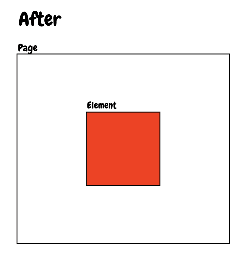
1. Center an element directly on a page
Before Centering Styles are applied
page {
     height: 100vh;
     width: 100%;
     display: flex;
     align-items: center;
     justify-content: center;
}
Child elements being flexed must be block level elements.
After Centering Styles are applied
2. Add shadow to an image directly (Image must have transparent background (PNG))
img {
     filter: drop-shadow(5px 5px 4px #b6b6b6);
}
Result:
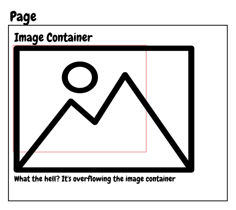
3. Properly sizing an image.
Have you ever added an image to your html file and it just took up space on almost the whole page?
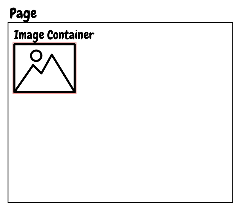
When working with images, it is good to have an image container. When you set a fixed width to that image container, and then set the actual images width to 100% it will then take up 100% of its parent container.
Fix:
div.image-container {
     width: 200px;
}

div.image-container img {
     display: block;
     width: 100%; // of the image containers 200px width
}
Result:
4. Use the CSS properties border or outline like crazy!
To get a visual representation of your website layout or where all, or some of your elements are on a page use
border: 1px solid <some color>
or
outline: 1px solid <some color>
This tremendously helps you to save time guessing where everything is.
The outline property doesn't impact the layout of other elements around the element with the outline property defined. So outline may be better to use.
5. Bring out elements with box-shadow
I feel like everyone should learn a little something about box-shadow. It really makes your website stand out. I would suggest learning about the property and its value. Once you understand it, then check out this website that autogenerates box shadow code for you.

Posted on December 6, 2020
Join Our Newsletter. No Spam, Only the good stuff.
Sign up to receive the latest update from our blog.


