Nayden Gochev
Posted on November 8, 2019

Disclaimer : I am a big fan of comics !
First time when when I saw http://dev.to for some reason the style of it reminded me so so much of comics (that as I said I love) !
So at some point several days ago I switched to Minimal Light Theme for more clear look, but it was not my thing :(
You know there are themes right ? Anyway this theme is good but I don't know, something was missing and it was not cartoony and fun and comics enough maybe.
I am not a frontend guy, I have 0 knowledge in CSS even -1 and I am proud of it! I hate the DOM and I hate styling it with anything especially CSS, but I just had to see how it will look in a bit more... comicsish style?
So I used Stylus plugin for chrome to inject a bit of CSS into the page, basically just changed the border-styles and some alignments.
/* feeds view */


.sidebar-profile-snapshot {
    border: solid black !important;
    border-color: black !important;
    border-width: 3px 4px 3px 5px !important;
    border-radius: 95% 4% 92% 5%/4% 95% 6% 95% !important;
}

.sidebar-nav-header{
   text-align:right;
}

.widget {
    border: solid black !important;
    border-color: black !important;
    border-width: 3px 4px 3px 5px !important;
    border-radius: 95% 2% 162% 3%/9% 96% 2% 99% !important;
}

.widget header {
    text-align:right;
}

.single-article  {
    border: solid black !important;
    border-color: black !important;
    border-width: 3px 3px 5px 5px !important;
}

/* article view */

.article article{
    border: solid black;
    border-color: black;
    border-width: 3px 3px 5px 5px;
}

.inner-comment{
    border: solid black !important;
    border-color: black !important;
    border-width: 3px 3px 5px 5px !important;
}

.primary-sticky-nav-author{
    border: solid black !important;
    border-color: black !important;
    border-width: 3px 4px 3px 5px !important;
    border-radius: 95% 4% 92% 5%/4% 95% 6% 95% !important;
}

.primary-sticky-nav-element{
    border: solid black !important;
    border-color: black !important;
    border-width: 3px 4px 3px 5px !important;
    border-radius: 95% 4% 92% 5%/4% 95% 6% 95% !important;
}
And YES I put !important everywhere cuz... it's only for me! My precious!
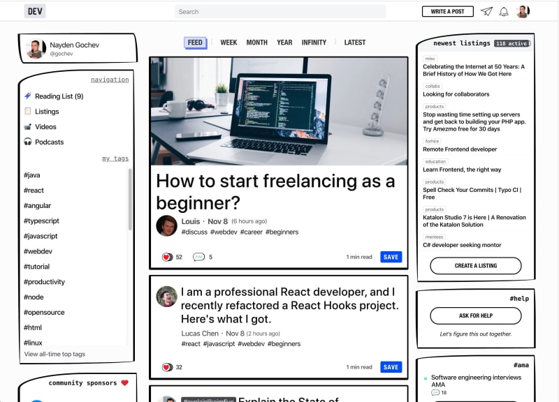
Anyway I think the results are quite good and I will use it this way from now on, but what do you think, should someone KNOWING how to do it properly can and will create a theme ?
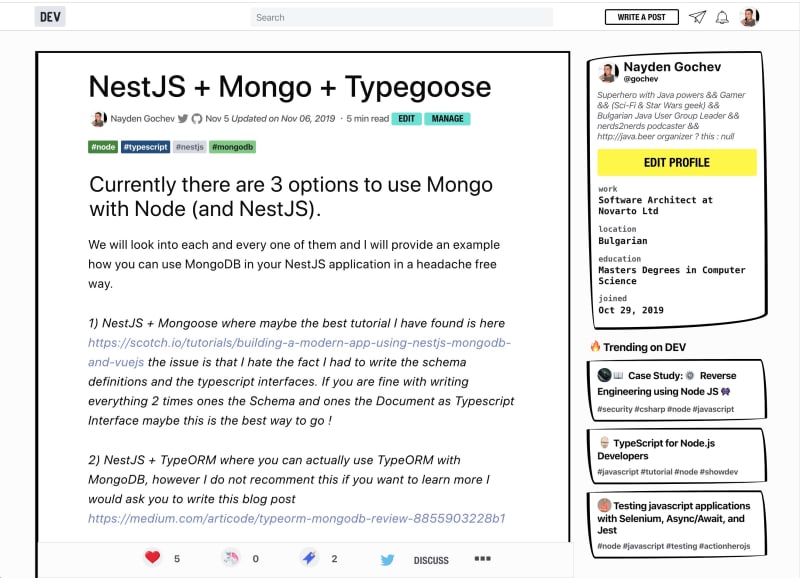
And a single article page:
Also I tried to change the fonts.. I would love to have the Bangers font for the h4 headings but didn't had any luck :D
@font-face {
  font-family: Bangers;
  src: url(https://fonts.googleapis.com/css?family=Bangers);
}

h4{
    font-family: Bangers !important;
}
Adding this for some idea doesn't work, the HTTP request is made properly the font is downloaded but...
at the end I would LOVE something like this for the right side :
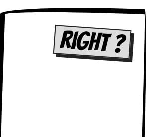
It would be cool, but without CSS knowledge and for around 30mins this was my limit :D
Cya all, I will love to hear your thoughts - back to the backend and debugging Java.
Oh yes... I forgot I was experimenting here before applying CSS to DEV.TO
here we have the Bangers fonts and etc I was curious how to make the borders.
UPDATE.
Ah I am an idiot, it looks the value of @font-face src was incorrect it works in a link since it gets added in a style as stylesheet pf anyway, so
@font-face {
  font-family: 'Bangers';
  font-style: normal;
  font-weight: 400;
  src: url(https://fonts.gstatic.com/s/bangers/v12/FeVQS0BTqb0h60ACH55Q2A.woff2) format('woff2');
}
Works (the url above was incorect) !
so VERSION 2 !
- Changed the sidebar titles
- Changed the shape of buttons
- Changed my name and username
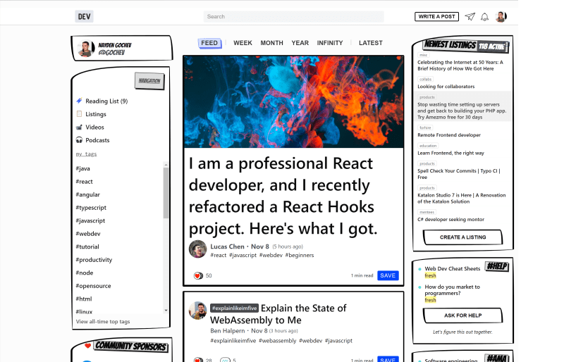
I think this 2 screenshots show most of it:
I LOVE the new and improved header:
And the full look:
And what I added to the previous CSS:
/* feeds view */
@font-face {
  font-family: 'Bangers';
  font-style: normal;
  font-weight: 400;
  src: url(https://fonts.gstatic.com/s/bangers/v12/FeVQS0BTqb0h60ACH55Q2A.woff2) format('woff2');
}

.sidebar-profile-name{
    font-family: Bangers !important;
    font-size:12px;
}

.sidebar-profile-username {
    font-family: Bangers !important;
    font-size:20px;
}

.widget header h4{
    font-family: Bangers !important;
    font-size:25px;
  transform: rotate(2deg);
  margin:15px;
  padding:0 5px;
  float:right;
  background:#ddd;
  border:1px solid #222;
  box-shadow:3px 3px 0 #222;
}

.widget .cta-button {
        border: solid black !important;
    border-color: black !important;
    border-width: 3px 4px 3px 5px !important;
    border-radius: 95% 4% 92% 5%/4% 95% 6% 95% !important;
}

.articles-list .nav-chronofiter-link {
        border-radius: 95% 4% 92% 5%/4% 95% 6% 95% !important;
}

.sidebar-profile-snapshot {
    border: solid black !important;
    border-color: black !important;
    border-width: 3px 4px 3px 5px !important;
    border-radius: 95% 4% 92% 5%/4% 95% 6% 95% !important;
}

.sidebar-nav-header:first-child{
   text-align:right;
        font-family: Bangers !important;
    font-size:25px;
  transform: rotate(2deg);
  margin:15px;
  padding:0 5px;
  float:right;
  background:#ddd;
  border:1px solid #222;
  box-shadow:3px 3px 0 #222;
The full file (since the post is already too long) :
https://gist.github.com/gochev/1ee874a0bb6218ffcb652170ef3bb3a7
Anyone for up for how to make it a real theme thing ? :)

Posted on November 8, 2019
Join Our Newsletter. No Spam, Only the good stuff.
Sign up to receive the latest update from our blog.
