Geoffrey Ward
Posted on October 21, 2019

UI/UX in the 3rd Dimension
Usually, when software engineers and designers talk about User Interface and User Experience, we're talking about web applications. However, with a slate of new and exciting enhancements in the three-dimensional digital space, VR and AR are more prevalent than ever, with more mainstream adoption of these technologies happening every day. As such, we need to make sure that we are applying sensible and responsible practices to these digital spaces so that we can ensure that the greatest amount of users are able to interact with these programs comfortably and safely. Today we're going to look at some of those UI/UX concerns that will make for a reliable experience for all.
While most web applications are a decisively 2D affair, AR and VR exist in the 3rd dimension, and as such, require extra considerations when designing the processes for interacting with applications. In these regards, we can pull ideas from the best practices of industrial design and ergonomics, or 'natural' design. When a user moves to execute a command, does that command respond to movements that are natural in their intent? Does it recognize multiple ways to execute the command based on different users, with different accessibility profiles? These are all considerations that must be made.
Safety
Rarely do we consider a user's safety when designing two-dimensional applications. Why would we have to? It's hard to bump your shin on the corner of a Form Module. In a 3D space, however, we must make sure that the user has an expectation of safety when interacting with our applications. In many AR and VR applications, the illusion of immersion is predicated on an assurance of safety. Users cannot fully commit to the experience of the application if they are constantly worried about obstacles that exist outside of their headsets.
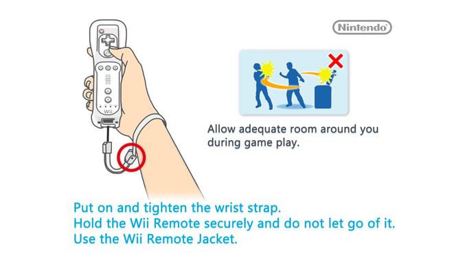
We can plan for our users' safety through a variety of measures. First, when possible, allow users to retain a vision of their surroundings. This is possible in AR environments through transparent headsets (such as what currently exists in Microsoft's HoloLens), or live-updating backgrounds in mobile devices, such as using the main camera on a phone to live display the space on the opposite side of the phone from the user, in essence turning the phone into a 'window' that can be peered through. In VR, this is harder to achieve, although some upcoming headsets do boast a 'live view' feature that will allow the user to render their surrounding inside the headset upon request. A simpler solution is to make sure the user has cleared more than enough space prior to use so that they can have an adequate arena to move around in. This is a simple solution, but effective. We all remember the warnings about minding our surroundings when booting up Wii Sports. A final solution is to ensure that the user doesn't actually have to move around in the space much, if at all. Not all applications should require the user to move around in a virtual space - in fact, for some users, this is the least preferred way of interacting with the app. Which brings me to my next point-
Inclusivity
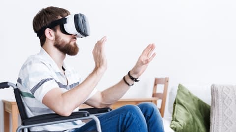
It is our duty as developers to ensure that the experiences we craft are accessible to the greatest amount of people. It's important that we take into account the myriad of differences in the capabilities of different user profiles. Websites are not immune to this either, and accessibility in web design is finally beginning to be a normalized concern in UI/UX. Whether it is designing for color-blindness, lack of dexterity or even total blindness, web designers are now more aware than ever of the various challenges certain users face when trying to interact with applications. In 3D spaces, these accessibility concerns increase tenfold. It is irresponsible to design an app where full movement is required, as not all users are able to move about freely. Thusly, options must be put in place so that users can opt to remain stationary while interfacing with the app. People with prosthetic limbs may have issues recreating certain gestures, so hand tracking technology needs to be implemented carefully, with a variety of fail-safes to catch these issues. Traditional accessibility concerns, like coding for color-blindness, are still important to consider. It goes without saying that strobe effects, while terrible on websites, are a complete nonstarter in VR for people prone to seizures.
Other unique challenges have presented themselves already. There are reports of face-tracking apps that have trouble recognizing users with specific skin tones. There are applications that require voice commands but do not recognize certain accents. Can a user in VR/AR who has dwarfism still move around in a space designed for people of average height? These are issues that must be addressed when designing virtual 3D spaces.
Comprehension
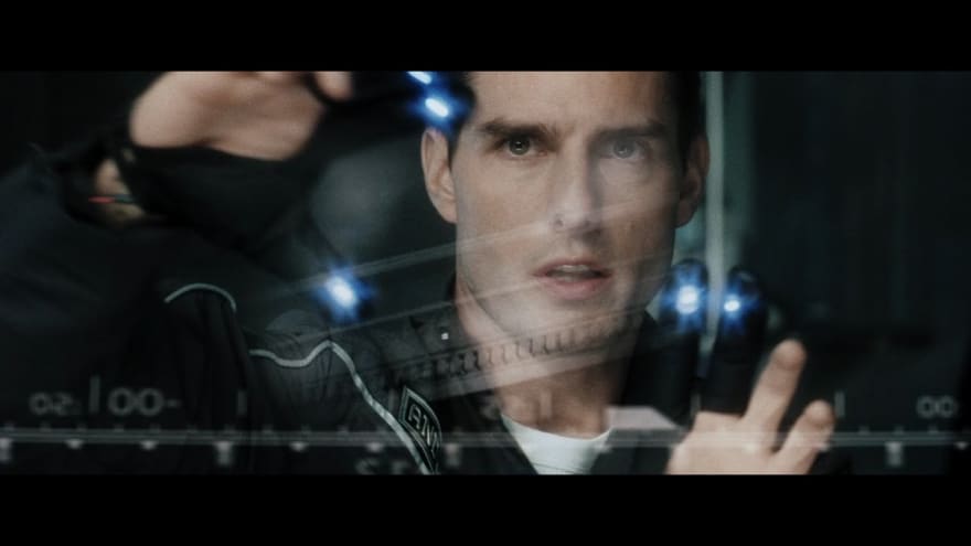
This one is a little harder to nail down, but it loops back to the idea of 'natural' design. Do the spaces we create make sense to the user? Are elements laid out in an intuitive way, so that the user can make sense of their surroundings quickly upon initialization? A website that has been designed poorly can be frustrating. A virtual experience that has been designed poorly can be absolutely disorienting. We must take care to create spaces that are comfortable for the user, that are rendered and react in predictable ways (even if the reactions themselves are unrealistic or fantastical). Anyone who designs systems for traversing 3D spaces dreams of Minority-Report-style interfaces. But we must be careful that we do not sacrifice sensible layouts and designs at the expense of flashy grippable menus or three-dimensional pop-ups. As cool as it is in the movies, does it make sense to move to another menu by wildly swinging our arms back and forth?
Interactivity
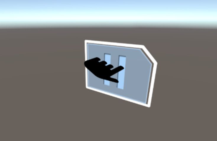
This one is a much easier concept to plan for. If there is a button on a website, it should respond in some noticeable way to being clicked, so that the user is able to register that they've successfully interacted with that element. AR and VR spaces are no different. If I find myself standing next to a virtual telephone, my first instinct is to reach for it and try and bring it to my ear. The inability to do so breaks immersive design and jolts the user out of the experience. If there are elements that appear moveable, and this includes menus and data displays, the expectation stands that the user should be able to move them. Digital objects, when poked, should appear poked.
Conclusion
These are only some of the concerns when it comes to designing responsible three-dimensional virtual applications. There are many more to consider, at least as many as found in traditional software engineering, plus a litany of additional concerns. However, based on the Societal Burden Model of Accessibility, it is our duty as designers to make sure that the spaces we design are comfortable, welcoming experiences for as many people as possible.

Posted on October 21, 2019
Join Our Newsletter. No Spam, Only the good stuff.
Sign up to receive the latest update from our blog.


