How does Netflix personalise your experience?

Gbenga Ojo-Aromokudu
Posted on September 17, 2020
In this post I'm switching up my style, and I want to look look at another application through investigative lens, using what I've learnt in my developer journey so far. My focus is the personalisation aspect of Netflix.
For the duration of this post I'll be referring to the image that is displayed to represent each individual show a "cover", as I don't know what they're officially called by Netflix.
What's a Cover?
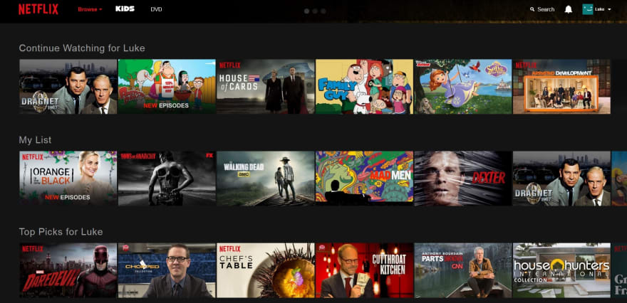
For those who don't know, here is what the Netflix homepage looks like:
(This is not my own Netflix homepage so you can't judge what I'm watching [sorry Luke])
Each piece of content has a cover, and when you hover over this, either a trailer, or clip will start playing. There is obviously a lot to be said about the choices of content that Netflix pushes to a particular user, based on previous watch history, as well as location - but I want to talk about the covers.
Have you ever noticed that the covers for a show that you are watching change over time?
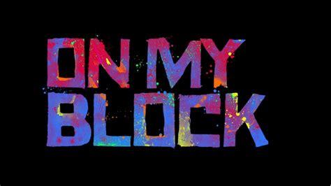
For example, here are some of the alternative covers for On My Block:
Now on face value, this might not seem that groundbreaking - why is it a big deal?
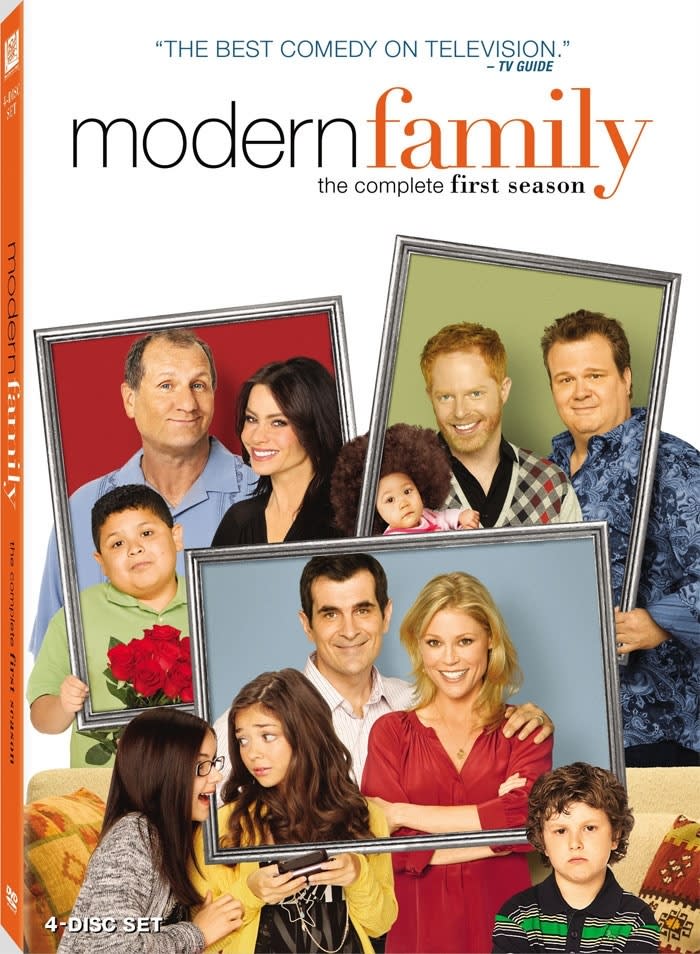
I thought that it might just be changing with each season, just like many traditional network TV shows release a poster per season, which subtly remind viewers which stage of character development they are currently at:
(You can see that there are more characters, the children have grown up etc)
However, I later realised that it wasn't quite so simple - the covers changing didn't line up exactly with my (rapid) progression through the seasons, so there must have been another explanation.
Testing 1...2
Applying my digital advertising knowledge made me realise: They must be A/B testing!
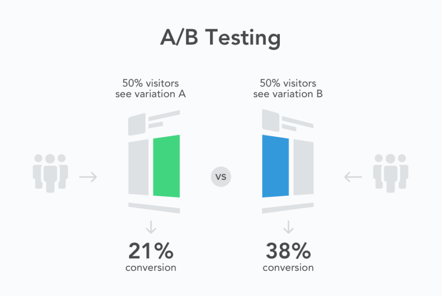
An A/B test is essentially when web traffic is randomly split into 2 categories, in order to assess the impact of one variable.
For example, you could show 2 different adverts to 2 randomly assigned, equally sized groups of users, and compare the number of purchases made within each group to assess the effectiveness of each ad.
Now in the context of Netflix, it's fairly similar: if they have 3 different "covers" for a show, they can observe how users interact with the content based on the cover, and draw conclusions from this data.
Scenario A:
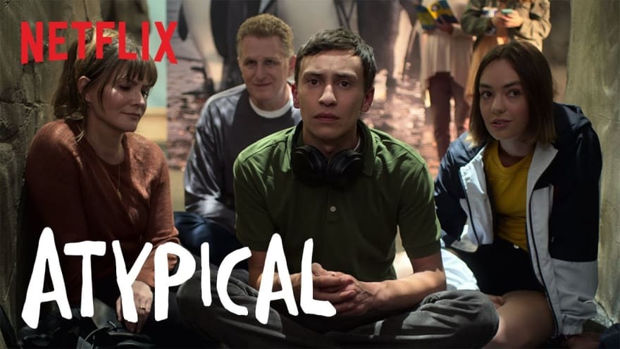
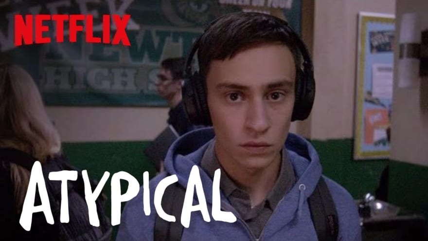
You see this cover for Atypical, you hover over to watch the trailer, you think it looks interesting, and then you check the episode list to see how much commitment this might be (at least this is how I do it).
You decide to add it to your List for later, as you're really into your K-drama at the moment, but you would like to watch it later.
*2 weeks later *
You browse your list, and see Atypical waiting there for you, you and you hit play and binge the whole thing over a weekend.
Scenario B
You see this cover for Atypical, you hover over to watch the trailer... and you stop halfway through because from the cover it looks like a dark crime drama, but the trailer shows you were wrong. You're bored and you keep looking for something good to watch.
Scenario C
You see this cover for Atypical, and scroll past it without even really registering what you saw.
So, I'm sure you see my point now - different covers can illicit very different responses in the same type of user, even when keeping their preferences fixed, and only changing the initial, most superficial representation of the content.
Disclaimer: I do actually like this show, so my intention is not at all to bash the way it's been presented. The image choices were arbitrary for the purposes of demonstration, I like all characters equally. Apart from Evan who is my favourite and objectively the best character.
Let's go deeper
Why is this of any significant? There are 2 stages I would like to split this into: the data generated from A/B testing, and the way this informs your personalised version of the product.
The Data
Netflix knows what time of day you log in, what you watch, how long you watch for in a session, how many episodes you binge at a time, even your completion rate on content that is shown to you as a suggestion based on what you had already watched. Aside from the actual user input such as adding content to your List, and liking or disliking, there are so many datapoints that likely have a bigger impact on what your Netflix experience looks like.
Your Netflix
At the end of the day Netflix wants you to engage with their content. So it's in their interest to suggest content that you will watch. And this is what they do.
Given all the data that has been collected about you, people that are assumed to be like you, and their preferences, Netflix will not only try to push specific content to you, but also in a specific manner.
Have you ever looked at the title of a section of Netflix recommendations and thought : "Wow, that's a specific title"? Same here, but it likely is done with a view to increase our chances of clicking, than if the content were interspersed amongst more generic titles like "Comedy".
Back to the covers
Netflix covers, like books and many other media formats, are designed to entice you to engage with the content. The difference here is that the cover can change based on the time of day, your viewing history, location, language settings and a whole host of other parameters, to be optimised to maximise your chances of clicking. Now, I don't have access to any of Netflix's data, so don't quote me, but I would guess that personalising covers probably increased viewing rates by at least 20%.
By implementing a fairly simple change at likely a negligible cost, Netflix is able to improve the service for its 2 main stakeholders.
Users: spend less time trying to assess if they will enjoy content
Producers: Stronger view percentages/completion rates.
This raises an interesting implicit assumption I have made so far - everyone wants their content to be seen only by people who they think will engage with it based on data that is already available.
If this were the case, however, no one would find anything new on Netflix.
In reality, predictive models are likely made based on the perceived similarities between content, and other users to determine if you are a strong match for the content. Then if you are a strong match it may be suggested to you. On top of that there are likely some randomized suggestions added to catch anomalous users. Finally, there are some producers want their content pushed to a higher volume of users rather than quality.
Putting my Developer hat back on
Now, from my knowledge of React, I would hazard a guess that when a user opens the homepage, sevaral components mount, and including the containers for particular piece of content, showing the cover. Each container might use a function that references the App's state to see who is logged in, in order to inform the choice of cover shown to the user.
So, in Summary
Your Netflix looks different to mine (shock). Now you have an understanding of why this might be, and some of the elements that are customised.
I haven't touched on it here, but there are potential downsides to this kind of mass customization, however if you've done your homework you will know that most of the main issues are covered given the context.
I might investigate this a bit further in a future post, where I can explain (from an outsider's perspective) how I might try to simulate this level of personalisation in my own React app - let me know in the comments if you would be interested in reading this!
PS - Music of the Moment
I forgot to add the music section to my last post. Terrible behaviour - so I'm including 2 live performances this time.
The first is the one and only Yebba:
The amount of times I have looped her Sofar Sounds performance? It's ridiculous
I genuinely cant choose a favourite song from her catalogue, and I can't wait to see what she does next.
Secondly, we have Nao.
Let me tell you something about Nao: this woman has RANGE. Who is doing it like her?
Also I have to take this moment to give Kwabs the praise he deserves. His 2015 album Love + War still delivers to this DAY.

Posted on September 17, 2020
Join Our Newsletter. No Spam, Only the good stuff.
Sign up to receive the latest update from our blog.
