Melbite blogging Platform
Posted on February 8, 2024
Now that you think about it, your first thought is probably, "What is this glassmorphism?" Alright, let us get started on defining this glassmorphism.
"Glassmorphism" is a design trend in user interface (UI) design that creates a frosted glass effect for digital elements. It involves using translucent layers, blur effects, and subtle shadows to mimic the appearance of frosted glass, giving the interface a sense of depth and dimensionality.
- Bla bla bla In other words, "glassmorphism" is the term for a design style in which items on a screen seem to be made of glass.
So, how should we approach this user interface?
The first step is, of course, to log into Figma.
Next create a new file and rename our existing one.
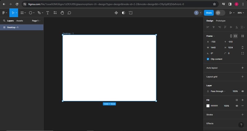
Using the toolbar, let us make a frame. I went with a desktop frame.
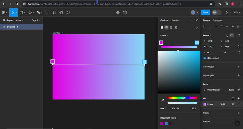
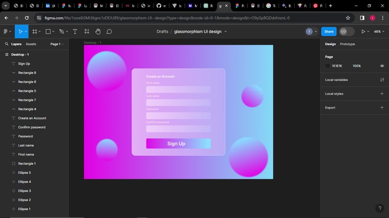
- Now let us draw a rectangle, make sure it fits inside the frame, and add a gradient color of your choosing, with horizontal gradient lines and your choice of colors added to the center of the frame.
it should look like the image above
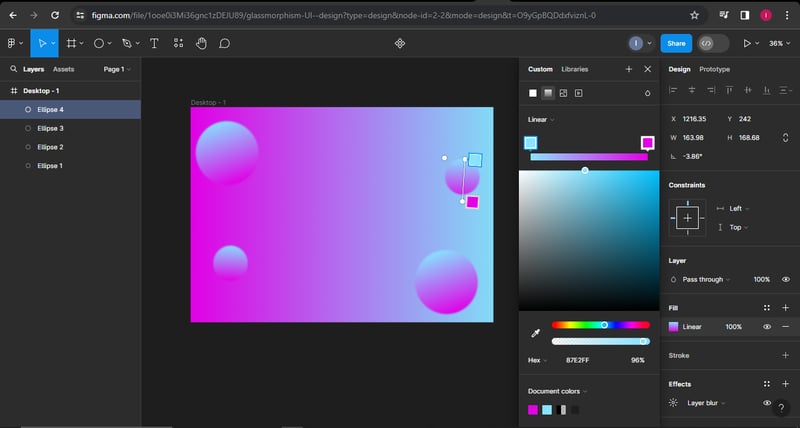
- Now let's add some circles and add effects to the circles such that they blend and look like glass or translucent hope That makes sense
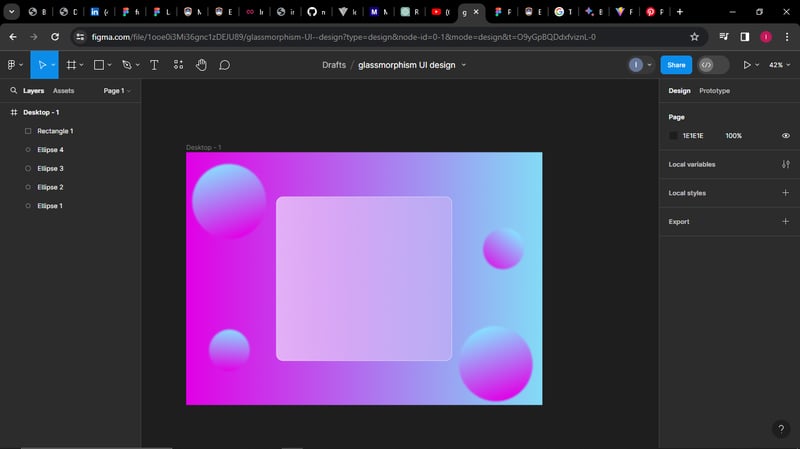
- And also add a rectangle for our sign-up and have the rectangle have a linear gradient of your choice the colors should be white (75% and 25%) with reduced opacity of 75%
- Now lets add content This is simple: add text and some input rectangles for the form This is how it should look.
and tada!!! there we have it

Posted on February 8, 2024
Join Our Newsletter. No Spam, Only the good stuff.
Sign up to receive the latest update from our blog.
