Using React to create a Micro Frontend

Anthony Viard 🥑
Posted on June 20, 2022

Disclaimer
This article has been written with the help of the ModSquad Community. The related live session is available here:
Introduction
Hi, fellow developers!
Having discovered micro frontend creation with Angular, we jump into another world with React. Remember, I’m trying to create a micro frontend using the web component specifications foreach of the following frameworks: Angular, React, and Vue.js.
Does React provide the best developer experience when creating a micro frontend social card? Let’s try it!
Create the React app
React offers a simple way to create React applications using the Create React App.
As seen in the previous blog, you need to have npm installed. You can then run the following command to create the application skeleton:
npx create-react-app react-social-card
Once complete, you should have a new React project available in the react-social-card folder.
Start it using the command npm start.
The default React page is reachable at http://localhost:3000.
Add the social card code
Before configuring the custom-element, we have to create the React social card component. After some research, here is an example of code we can use: https://codepen.io/leoraw/pen/ZjvRpL. Thanks to @leoraw for sharing this example.
Create the React components
The social card is split into two different React components: a button box and the card itself.
First, we create a new file for the button box in the components folder, name it ButtonBox.js and copy this code:
import React from "react";

const UiButton = props => {
   const classes = (props.isClicked) ?
     "ui-button clicked" : "ui-button";
   const number = (props.isClicked) ?
         (props.number + 1) : props.number;

   return (
     <button className={classes} id={props.text}
       onClick={() => props.onClick()}>
       <span className="ui-icon">{props.icon} </span>
       {number}
     </button>
   );
};

class ButtonBox extends React.Component {
   constructor(props) {
     super(props);
     console.log(props.likeIsClicked);
     this.state = {
       likeIsClicked: props.likeIsClicked

     };
   }

   toggle(index) {
     let state = {};
     state[index] = !this.state[index];
     this.setState(state);
   }

   render() {
     return (
       <div>
         <UiButton icon='♥' text='likes'
           number={this.props.likes}
           onClick={() =>
             this.toggle('likeIsClicked')}
           isClicked={this.state.likeIsClicked}/>
       </div>
     );
   }
}

export default ButtonBox;
Then, in the same folder, we create the SocialCard.js file and copy the following content.
Please note that this new component imports and use the previous one. Effectively, the internal architecture in the micro frontend allows us to use multiple components, and all the components are built into one custom element.
import React from "react";
import ButtonBox from "./ButtonBox";

const UiCard = props => {
 let {image, title, content} = props.content;
 return (
   <div class="card-wrapper">
     <div className='card-img'>
       <img src={image} />
     </div>
     <div className='card-content'>
       <h3>{title}</h3>
       <div>{content}</div>
     </div>
     </div>
 );
}

class SocialCard extends React.Component {
   render() {
     return (
       <div className='card-body'>
         <UiCard content={this.props.content}/>
         <div className='line'></div>
          <div style={{textAlign: 'right'}}>
             <ButtonBox
             likeIsClicked={this.props.likeIsClicked}
             likes={this.props.likes}/>
         </div>
       </div>

     );
   }
}

export default SocialCard;
Use the new components in the main App.js file
Once these two components are available, we can update the main App.js file and remove the old React demo code.
Update the App.js file by replacing the existing code with this:
import React from 'react';
import './App.css';
import SocialCard from "./components/SocialCard";

const cardDetails = {
   id: 0,
   content: {
       title: 'Shiba Inu',
       image: 'https://material.angular.io/assets/img/examples/shiba2.jpg',
       content: 'The Shiba Inu is the smallest of the six original and distinct spitz breeds of dog from Japan. A small, agile dog that copes very well with mountainous terrain, the Shiba Inu was originally bred for hunting.',
   },
   likeIsClicked: true,
   likes: 5
}

function App() {
 return (
   <SocialCard
     key={cardDetails.id}
     content={cardDetails.content}
     likes={cardDetails.likes}
     likeIsClicked={cardDetails.likeIsClicked}
     />
 );
}

export default App;
You can see here that we are instantiating a new social card component and giving it some data to display.
Now you can restart the application or refresh the page to see our social card appear. However, this is still a raw React application and we need to define the custom-element to finish our task.
Switch the app to a custom element
In the src folder, at the same level as the components folder, we create a new folder named custom-element.
Next, let’s create a new file named social-card-app.js to define the custom-element using the related API.
import ReactDOM from "react-dom"
import React from "react"
import App from '../App'

class SocialCardApp extends HTMLElement {
   connectedCallback() {
       this.mountPoint = document.createElement('span')
       this.render()
   }

   render() {
       ReactDOM.render(<React.StrictMode>
                   <App/>
           </React.StrictMode>,
           this.appendChild(this.mountPoint))
   }
}

customElements.get('react-social-card') || customElements.define("react-social-card", SocialCardApp)
The string “react-social-card” is used to define the custom-element tag and renders the React app using: <App/>.It’s analogous to Russian dolls: custom-element > React app > social card component > buttonbox component.
Then, in the file index.js import the custom-element and replace all the previous content with this code:
import './custom-element/social-card-app';
```
Then, in the following `public/index.html` file, replace the body with this:
```html
<body>
<noscript>You need to enable JavaScript to run this app.</noscript>
<react-social-card></react-social-card>
</body>
```
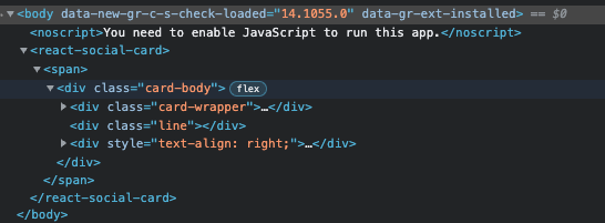
Reload your browser and check the HTML content:

The `react-social-card` custom element is used and loads the React app content.
**Congratulations! You’ve just created your first micro frontend using React!**
## Resources:
The code above is available on GitHub: [https://github.com/avdev4j/react-social-card](https://github.com/avdev4j/react-social-card)
Watch micro frontend videos on our YouTube channel: [https://www.youtube.com/c/EntandoVideos](https://www.youtube.com/c/EntandoVideos)
Join us on Discord to share and learn about composable apps: [https://discord.gg/SdMCvyzzHm](https://discord.gg/SdMCvyzzHm)

Posted on June 20, 2022
Join Our Newsletter. No Spam, Only the good stuff.
Sign up to receive the latest update from our blog.

