Personalizing Accessibility with Settings

Eevis
Posted on March 29, 2024

When users have different, even conflicting, needs for access, what should you do? For example, if one user needs less contrast while the other needs more, how do app developers provide the best experience for all? The truth is that it's often not possible without some personalization options.
In this blog post, I'll share some thoughts about personalization and accessibility, provide ideas on adding personalization options, and discuss setting up dedicated accessibility settings. In the following blog posts, I'll show concrete ways to personalize your app's accessibility.
Let's first examine the possible drawbacks of personalization and then dive deeper into accessibility settings.
Possible Drawbacks with Personalization
While I'd love to just say that "Personalization is easy! You should do it!" I recognize that there might be some disadvantages to it. Sometimes, personalization can add more work and complexity to the code, as developers must remember to check if conditions apply for certain things every time they develop a feature. So yes, it adds some additional work.
But on the other hand, isn't the goal of an app to be usable for its users? Sometimes, one solution doesn't fit all, and with personalization we can solve problems with conflicting user needs. We, as developers, sometimes go to great lengths to get some animation or piece of UI just right, which might take as much time as adding personalization options.
Of course, personalization is not the best approach for every situation. But I would argue that for many apps, providing options for users to personalize their experience would break down access barriers and make their experience more enjoyable, so it's time well spent.
Accessibility Settings as a Form of Personalization
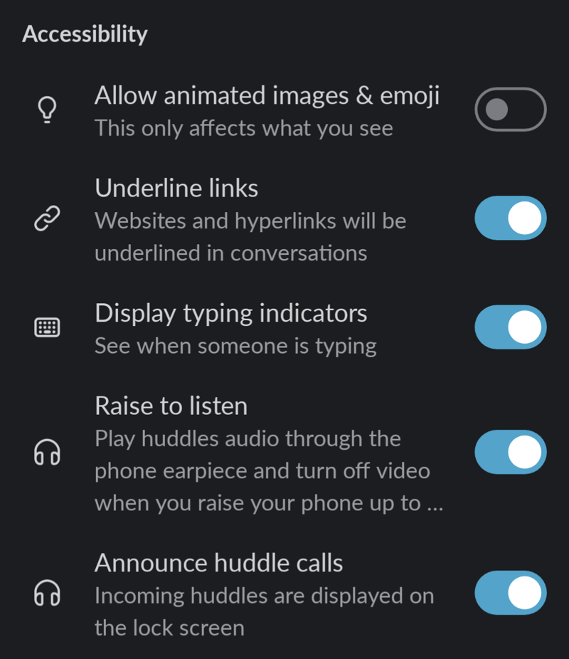
One way to give the user control is to add settings to handle the different aspects of the application. Some applications have done this well. For example, Slack has an accessibility section in their application preferences. It's a bit different for desktop and mobile, but this is how it, at the time of writing, looks like for their Android app:
Personally, I'm really grateful for two settings: The animation setting and the underlined links setting. The first one helps me avoid any symptoms, as animations can trigger them. The setting also helps me concentrate. I tested to enable the animations, and phew, there was a lot of movement with the emojis! On the other hand, the second one reduces cognitive load when I can easily see that a link is a link in the middle of a sentence in a message.
Slack also has an option to change the app's theme. It's part of another set of settings, "Look and feel". The setting is called "Dark mode", and it has three options: "System default", "On", and "Off". These options are great, as some users might prefer their phone in dark or light mode, but their apps in the other, for example, to help with legibility.
There are also other apps that provide these three options for Dark mode. For example, Instagram, Duolingo, and Storytel, and probably many others - those were just the apps I first checked.
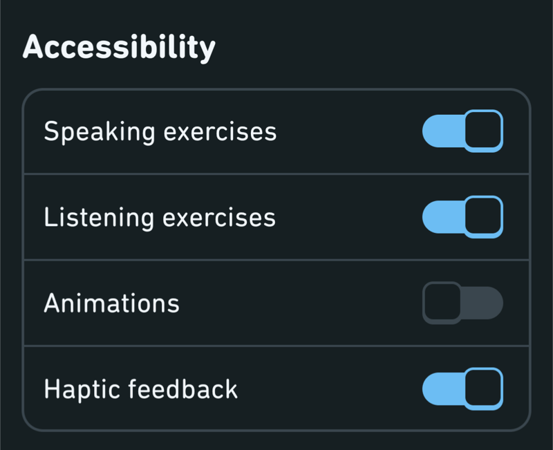
Speaking of Duolingo, they also have a dedicated accessibility setting section in their app:
They also have this animation-related setting, which is nice. However, personally, I think it would've been great if the setting wasn't on by default—or if it was set by default according to the operating system-level setting of removing animation. If you're now wondering what I'm talking about, I wrote a blog post about the "remove animations"-setting back about a year ago: Android, Animations and Reduced Motion
The Form of Accessibility Settings
While going through various apps in search of accessibility settings, I noticed that some of the apps include accessibility settings but don't annotate them as such. The dark mode example is also an excellent illustration of this behavior. In most apps I checked, turning dark mode on was not part of the accessibility settings if the app had a dedicated section.
I can see this as an advantage and disadvantage. On the other hand, when something is not labeled as an accessibility setting, more people might find it. Many users tend to disregard accessibility settings with the thought, "I don't need any accessibility settings," and do not even look at whether some settings would benefit them. But if they're not labeled as accessibility settings, these users might find them.
But, and here's a huge but: Not having the settings labeled as accessibility settings might mean that users who need those settings don't find them. While I was going through the apps I'm using, I noticed some of them have settings that would belong to accessibility settings, but because they're hidden in other settings, I probably wouldn't find them.
This all comes down to cognitive accessibility: Clear sections with headings help users find what they're looking for. Sometimes, it might be justifiable to have accessibility-related settings as part of other settings. However, in most cases, accessibility settings should be labeled as accessibility settings to be easy to find.
Okay, we've discussed why accessibility settings are a good idea for your app to personalize the experience. Now, you might wonder how to actually do this. You have multiple implementation options depending on your app's architecture, goal, and other factors. To help you with the decisions, I'll first discuss two considerations: supporting operating system-level settings and adding a custom settings section to the app. After that, I'll talk a bit more about the actual technical decisions.
Operating System Level Settings
Android's operating system provides a collection of accessibility settings. You can find them in Settings -> Accessibility. From a developer's point of view, these settings are one of two types: They either work out of the box, or developers need to implement the support for them.
The first type, out-of-the-box-working settings, don't usually require (much) work from the developer. A good example is the "Remove animations"-setting, which sets the ANIMATOR_DURATION_SCALE global constant to 0. Animator-based animations use this same constant, and animations are gone when it's set to 0. There are some exceptions where this setting is not respected out of the box, and if you're interested in learning more, the blog post I linked above has more info. Just remember to test that the app works correctly, even without animations.
For some other accessibility settings, app developers need to explicitly add support. One example is the "Time to take action"-setting, which controls the amount of time the user has to take an action. Android Accessibility Help's article "Change time to take action" mentions, "Note: Not all apps support this setting." This disclaimer is there precisely because it doesn't work out of the box, and the app developers need to add support for it. If you're interested in learning more about supporting that setting, I'm planning to write a blog post about it and how to support it in your app.
Custom Accessibility Settings for the App
The other option would be to add custom accessibility settings for the app. In the previous sections, I've discussed in what form these settings should be presented to the user, and I've suggested adding a dedicated section for accessibility in the settings. In the following blog posts, I will demonstrate how to integrate these settings into concrete use cases.
Some Technical Considerations
Android provides a nice tool for saving settings values: Preferences DataStore. In some cases, saving these settings to a database (like Room or SQLDelight) could be an option. It all depends on your app architecture and what you're trying to accomplish.
In my examples, I will use DataStore. There will be a settings screen with controls for different accessibility settings, and a way to toggle the selection on and off, or select from a broader set of options.
I will demonstrate the technical aspects more in the upcoming blog posts.
Wrapping Up
In this blog post, I've discussed personalization via accessibility settings, some possible drawbacks (but I would argue they are worth it), and ways to implement and support these settings in your app. While this blog post didn't go deep into technical aspects, others will follow. In the upcoming weeks (or months, depending on my life), I will at least write a blog post about adding a setting to toggle labels with icons, and adjusting the color scheme to a high-contrast one.
Do you use accessibility settings in apps? What are the good examples of these settings for you? What about the bad? Or, as a developer, have you ever implemented such settings?
Links in the Blog Post

Posted on March 29, 2024
Join Our Newsletter. No Spam, Only the good stuff.
Sign up to receive the latest update from our blog.


