Day 2 - Redesigning Nasa's Picture of the Day Webpage

Edward Naidoo
Posted on February 11, 2022
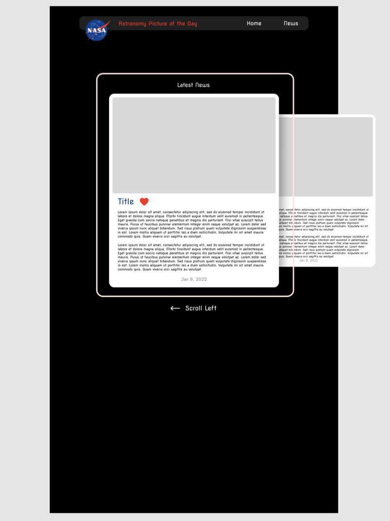
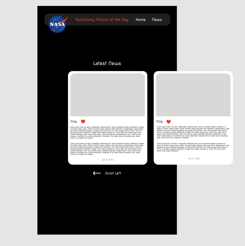
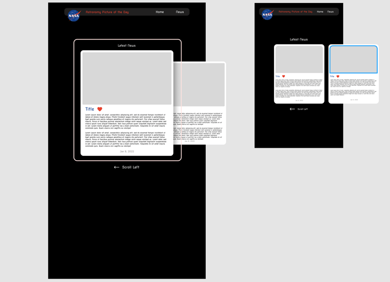
I have made two versions of the Figma file. One that will be 1920p wide and one that will be 1080p wide. This will be part of the responsiveness in this webapp. There will also be a mobile version too. To accomplish this, I scaled each component or object in the file to the change in scale, for example, I multiplied each 1080p objects by 1.78 because of 1920 / 1080.
Next I have adjusted each component or object to fit the right scale and after doing that, I have changed the logo and title from Spacestagram or something else to a more suitable name. That was from the previous project which I forgot to change. I have been thinking on the scrolling effect for each card there is because I want the content to fit well in the screen and I do not want it to be busy. So I am going to do some research and take some inspiration by people who did it better.
I have left the Nasa logo hanging on purpose as I while I was resizing everything, I accidentally came upon the logo hanging over the edge and it just reminded me of a website or a few websites on Behance and it looked awesome. I hope I don't get a copyright notice for having Nasa’s logo on this webpage, I’ll have to do some research and ask people around. In the mean time, I’ll go without Nasa’s logo but it will be there be there if it was allowed to be used. If i cannot use their logo, then I will have to make my own or use a free one where I won’t get into any trouble.
I am currently thinking on if the previous card (on the right) should be smaller than the current one so it draws focus on the centre point and hopefully make the webapp less busy.
There currently is nothing at the bottom of the page, so now I am thinking of putting the credits there and the ‘works cited’ if research in the science field gets included.
I do not know where to put the credits for the images taken on the card without drastically changing the look, so I’m thinking of redesigning the whole card but that will be done later into the process. Right now I am happy with the general look, the functions such as the horizontal scroll and the colour scheme.
What I have learned:
Today I have realized that changing the standard, such as the navbar to something else, really makes a huge change and more unique. This can make any of us stand out if we are unique relative to the people around us.
Once again, thank you for reading my material, more will come soon...
Apparently, the pictures are super squished, so for clarification this published post has the pictures with a proper height and width and I'm sure Dev.to is squishing that.

Posted on February 11, 2022
Join Our Newsletter. No Spam, Only the good stuff.
Sign up to receive the latest update from our blog.


