Dominik Gorczyca
Posted on May 8, 2022
While there are better tools to make layouts like flexbox and grid I will write a test in the future where you have to use float for layout purposes and because I have trouble understanding how float works I figured I could learn by explaining it on my blog.
Maybe it will be helpful to someone somehow, probably not though.
Fundamentals
Before diving into layouts let's start with simply floating around text.
This is what float is primarily used for, first we have an image and two paragraphs

Then we apply float:right styling to the image and we have a neat floating effect.
<img style="float:right" src="cat.jpg" alt="cat">
<p>This is a very pretty cat, and a very simple text. </p>
<p>This is another very simple text, but a bit longer. </p>
If we don't want second text to float on cat's left we can simply give it a clear:both style to ignore floating elements.
<img style="float:right" src="cat.jpg" alt="cat">
<p>This is a very pretty cat, and a very simple text. </p>
<p style="clear:both">This is another very simple text,
but a bit longer. </p>
Floating Blocks
Now, we can go into something sketchier which is floating as a layout tool. After some time figuring out how floats work I see it's not that hard. But I will explain some things that initially seemed quite quirky.
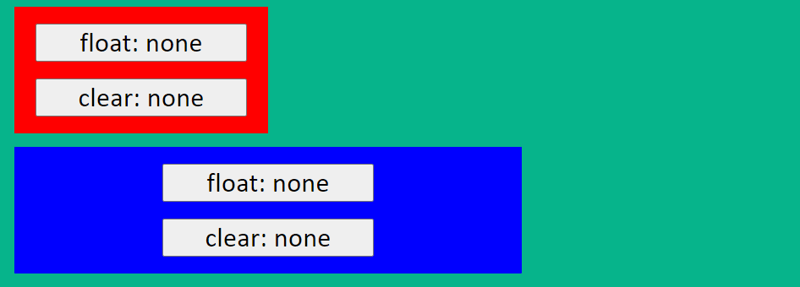
Here we have two simple blocks, neither has float for now.
Weird behaviour nr. 1 - when you give the first one float left, it moves a bit lower.
Weird behaviour nr. 2 - While content goes around floating element, block itself does not, that's why half of it is under the red block.
The change of position of first block is caused because float elements margin stop collapsing, because of that the block margin gives some distance from the top of the document and the first blocks margin is added additionally.
The second behaviour is just how float works with not floating blocks, that's why when creating layouts with floats one should give it to both blocks:
Another interesting fact is that when your second element is a flexbox item it doesn't go under the floating item (the problem with margin still remains so you should use float for the second item regardless)
Here blue element has display: flex;
Try it our yourself!
If you want to play around with floating blocks try this codepen (click on property buttons):

Posted on May 8, 2022
Join Our Newsletter. No Spam, Only the good stuff.
Sign up to receive the latest update from our blog.


