Designyff
Posted on July 7, 2023
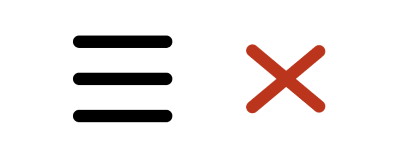
A step-by-step guide on how to create a menu icon that transforms to close icon on hover.
HTML
For HTML we’ll need a container with 3 div elements — one for each line.
Container will have a class “menu_icon”.
<div class="menu_icon">
    <div></div>
    <div></div>
    <div></div>
</div>
CSS
For CSS, first we’ll style the container.
We’ll display child elements in column using flexbox and add a little gap between them.
Then we’ll set the width to 8 px, which means that every line will be 8 pixels wide.
Since this element should be clickable, and should close a menu on click, we’ll set cursor to pointer.
.menu_icon {
    display: flex;
    flex-direction: column;
    row-gap: 2px;
    width: 8px;
    cursor: pointer;
}
Now we’ll style the lines.
First we’ll set height for each line to 1 pixel and background color to black.
Then we’ll round the borders by setting border-radius to 1 pixel.
And lastly, we’ll add transition of 200 milliseconds so that every change on hover (that we’ll set later) is smooth.
.menu_icon div {
    height: 1px;
    background-color: black;
    border-radius: 1px;
    transition: .2s;
}
Now we’ll style all 3 lines when “menu_icon” is hovered.
We’ll just add transition of 200 milliseconds to each line to make upcoming changes smooth.
.menu_icon:hover div {
    transition: .2s;
}
Now we’ll style the first line on “menu_icon” hover.
We’ll set color of this line to red by changing background-color, and we’ll rotate it a bit.
This line now represents half of the close button and will slowly (200ms) rotate and change it’s color to red.
.menu_icon:hover div:first-child {
    background-color: rgb(202, 34, 0);
    transform: rotate(40deg) translate(2px, 2.2px);
}
Now we’ll style the second line.
We’ll just set opacity to 0, to hide this element on hover.
.menu_icon:hover div:nth-child(2) {
    opacity: 0;
}
And lastly, same as on the first line, we’ll set third’s line background color to the same red and rotate it a bit.
First and last line should slowly rotate and form X shape, while second line should disappear.
.menu_icon:hover div:last-child {
    background-color: rgb(202, 34, 0);
    transform: rotate(-40deg) translate(2px, -2.2px);
}
Clicking on this element should close a menu.
And that’s it.
Thank you for reading. ❤️

Posted on July 7, 2023
Join Our Newsletter. No Spam, Only the good stuff.
Sign up to receive the latest update from our blog.


