Building A Portfolio: The Painful Way

Daniel McMahon
Posted on June 18, 2018
The Goal: Lets combine all the JS & React related things I've learned to date in one big project! What could go wrong?
The End Result: Website & Codebase
JavaScript is complicated... sorta
I've learned a lot of things about JavaScript over the past year on the job, things that anybody new to the field will no doubt also go through - here are some questions I faced along the way that some of you can no doubt relate to and will hopefully take some comfort in reading:
- What IDE should I use for programming in JS?
- What Plugins should I use to optimize my work flow?
- Whats a package manager and whats the big fuss between Yarn or NPM?
- What the hell is Webpack and why do I already hate it?
- ESLINT? Sure its nice in theory but have you tried setting up the config yourself - painful!
- Enzyme, Jest & Mocha - are you sure you're still talking about JS?
- Whats the difference between CommonJS, ES6 & ES2018?
Over the past year I've come to terms with the peculiarities of the language and can happily work alongside it. It is still very much a love hate relationship but having tackled multiple projects ranging from full-stack web apps, chrome extensions and publishing basic node packages I feel much more confident in my abilities using this language as a coding medium.
I felt so confident that I figured I would try demonstrate my knowledge and skills by creating a portfolio site on my personal GitHub to try out all the techniques I had learned and marvel at what monstrosity would come out.
KISS - Keep It Simple Stupid
Those who work in UX will know that in advance of any project you should ideally do mock up designs and user testing to deliver an optimal product to achieve maximum impact. This was a venture down the perfect road of what not to do... make it up as you go along.
I had an idea (a rough sketch) on a notepad that I would use as the basis for the site structure and figured I would work from there... so how did the process work out?
Coding Setup
First things first I had to setup the project from scratch. I used a basic create-react-app template to start with.
To make the development process streamlined I had setup my Atom IDE with Prettier for handling some automatic line indentation on save, and added my favourite City Lights theme to make the project easier on my eyes.
I set out building some basic reusable React components such as Cards, Headers, Footers and NavBars. In order to allow for multiple page functionality I ended up adding React Router and React DOM - not something I had really done with the create-react-app template before.
I ended up treating the individual pages as 'containers' as opposed to 'components' in order to make the code base more legible. It appeared a good way to segment what should be dumb stateless components from the more intelligent stateful page components.
Next up I wanted to try show off some of the libraries I had been using over the past year so I added in Styled Components & Grid Styled to help structure the individual pages layouts with custom styling.
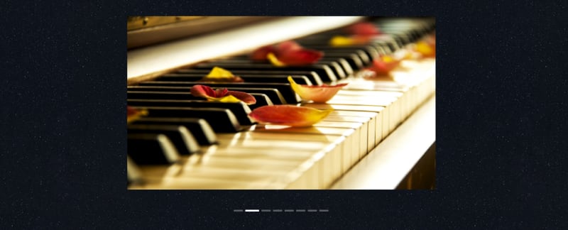
I decided to add in a tribute to a design library I had encountered during the past year with the inclusion of the Ant Design Carousel. I'd like to build my own Carousel in the near future but for now this felt like a good placeholder and the end result was quite satisfying.
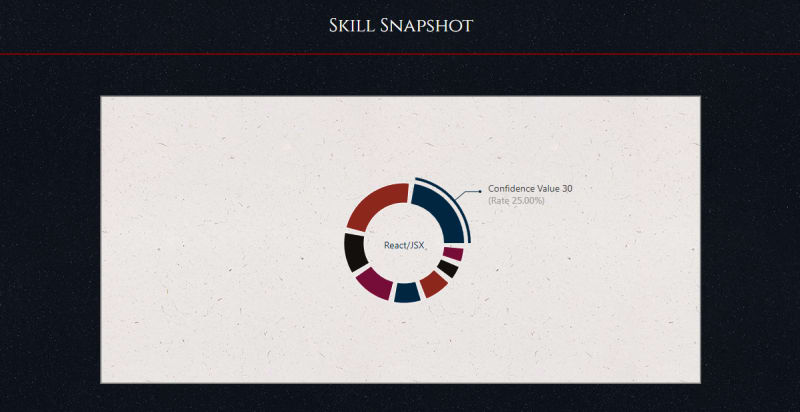
I added in a Donut graph to represent my confidence levels in my top skills so that the landing page of the site would give anybody interested in my skill sets a snapshot of my strengths and weaknesses.
Venturing into the unknown... css media
I had no exposure to using animations or transitions with css and wanted to try something new so I was browsing some other dev.to developers portfolio sites for inspiration. In particular Ali Spittel's site stood out to me. I loved her use of cards to display some samples of work she had done. I always enjoyed the playful nature of the 'about' section on her page with a rotating image and decided to integrate this on my own projects page with the addition of rotating skill icons.
I decided to take this media exploration a step further and ended up including rotating cards on my homepage to reveal the flip of each outlined skill to contain some placeholder text. This works with a hover in browser and with a tap on mobile devices. I had initially seen this technique in a tutorial demonstrating face down poker cards that revealed themselves on mouse hover. The idea interested me so I couldn't resist adding it!
The 'awwwww yes' features
There were some parts of what I had designed that I was oddly proud of and had not tried implementing before. I always struggled with the concept of how to handle with mobile -v- desktop web applications and controlling the content to optimize the user experience. I ended up using some custom divs to hide the display of both the Donut graph and the Carousel when the screen was below a set resolution so as to allow for a beneficial experience on mobile and desktop experiences. While this is not the optimal way to handle this problem, it was something new and creative that I enjoyed implementing.
I had experimenting with using some custom css grayscaling features to allow for hoverable social media icons on the contact page that turned out relatively well but could use refinement at a later date.
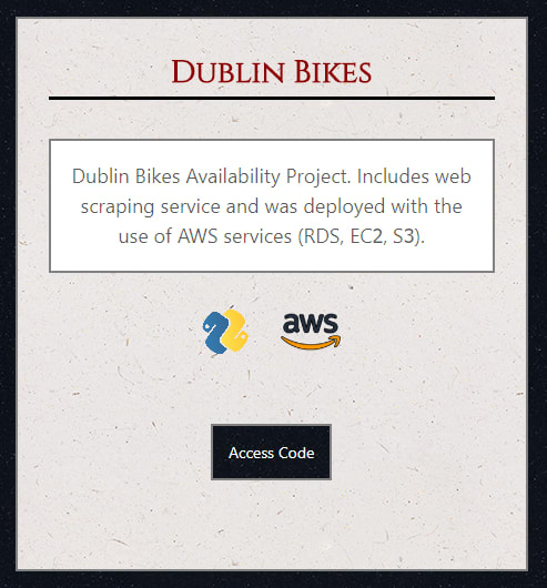
The cards I had setup for demonstrating my projects were a personal highlight, especially seeing the interactivity between having custom buttons, rotating skill icons and clear text being displayed in harmony.
The 'above and beyond' pain points
The following features were an absolute pain for me to implement and still require some fine tuning but I'm glad to have gone through the pain from the ground up.
I set out to use some custom eslinting rules and combined them with some pre-commit library to prevent the ability to commit your code unless it passed the linting parameters. Traditionally eslinting is used with a 'eslintrc' file defining individual rules. I had not previously setup one of these from scratch and ended up causing myself an awful headache when trying to handle the setup of an eslinter alongside the xo library. In the end I managed to get a form of the xo library working with some plugins, however as of yet the code is still not 100% eslinted correctly, however good progress has been made so far to counteract this minor issue.
The 'to be completed' list
A lot of work has gone into the basic outline of the portfolio site to date however there are some essential missing features that will need to be included:
- Circle CI Integration with Protected Master Branch
- Updated landing page card text
- Jest Tests
I have some duplicated custom styling used across multiple components that I plan to consolidate to a single file and allow for importing to prevent duplication of styling code.
Other key additions I would like to add to the site include:
- The integration of Redux
- A switch to using server side rendering with Express to serve the content.
- Integration of canvas elements (perhaps demonstrating some p5.js knowledge)
While these would be a good way to showcase some more of my skills I feel that the static nature of the site makes these additional features redundant for the time being.
Final Thoughts
While the site is a continued work in progress here are a few of my ongoing thoughts on the project
It was fun and interesting to build my own reusable responsive components, this might be something I look at expanding into a reusable component library project.
The media-css modifications were fun, while only adding minor animations and interactivity it's definitely something I'll explore for future webdev work
I'll definitely put more effort into the UX considerations prior to starting the project as the site in its current form has already undergone many design changes during its development. I may consider the use of marvelapp or sketch for future wireframe design
Static site generators such as SquareSpace tend to be much more artistic in their site layouts with full screen landing pages, cleaner colors and more layered elements creating a more visually appealing style. I feel like taking this more heavily design oriented approach for a different project will be a fun challenge moving forward.
While it was fun doing all this in React, I couldn't help but reflect on how much faster and easier it could have been creating something similar in Bootstrap. I even stopped to consider the simpler tool sets available to developers ranging from pre-defined site design services like SquareSpace and WordPress
It was overall a fun experiment that I was glad to start, however the end result is not as clean and crisp as I would like it to be. This is a result from a lack of design planning. That said I learned a lot engaging in it and after only a years exposure to JavaScript the finished product isn't too shaby!
If you have any feedback or suggestions in terms of what might be some useful additions, or how I could benefit from adding Redux to the service be sure to let me know in the comments.
If you have worked on a similar project be sure to share below - I'd love to have a look!
Many thanks for reading.
till next time!

Posted on June 18, 2018
Join Our Newsletter. No Spam, Only the good stuff.
Sign up to receive the latest update from our blog.
Related
November 6, 2024


