danielpdev
Posted on April 6, 2020
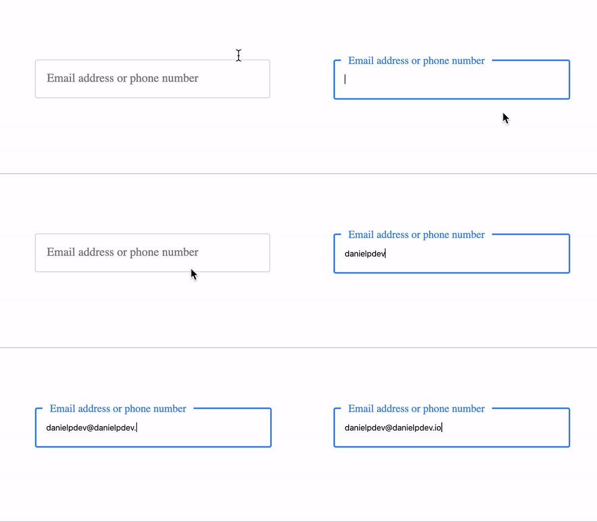
Here you can find the live version
Now let's see how you can build one.
We'll start like always with
HTML
<div class="form-control">
  <input required type="text" name="input" />
  <label>Email address or phone number </label>
  <div class="border-around"></div>
</div>
For our text input we first need to create a container:
<div class="form-control">
...
</div>
In this container we are going to have as first child a text input, a label and then a div which will be used to add that nice bluish border around our input.
<input required type="text" name="input" />
<label>Email address or phone number </label>
<div class="border-around"></div>
We just finished the HTML part and now we need to add some CSS.
CSS
Styling our container:
Here we're just going to add a width, height and also a position: relative; because we will further use position: absolute; to align the border and label as desired.
.form-control {
  position: relative;
  width: 280px;
  height: 50px;
}
Styling text input:
The text input needs to have the same size as the container so we'll use
a width and height of 100%. We need to set border to 0 because we're going to use the div with class border-around as the border for our input.
.form-control input {
  width: 100%;
  border: 0;
  outline: none;
  height: 100%;
  padding: 0 15px;
  transition: 0.4s;
}
Styling the label:
Now we have to use position: absolute; with top set to 0 and flex to center align the label inside our input.
.form-control label {
  position: absolute;
  top: 0;
  display: flex;
  align-items: center;
  padding-left: 15px;
  width: 100%;
  height: 100%;
  transition: 0.2s;
  font-size: 1rem;
  color: gray;
  pointer-events: none;
}
Styling the border
We will have a border of 1px solid rgba(0, 0, 0, 0.2) and border-radius of 3px.
.form-control div.border-around {
  position: absolute;
  border: 1px solid rgba(0, 0, 0, 0.2);
  height: 100%;
  width: 100%;
  padding-right: 25px;
  top: 0;
  pointer-events: none;
  border-radius: 3px;
  transition: 0.2s;
}
Lets now take advantage of the pseudo classes and change some css properties when we interact with our input:
Use pseudo classes to style elements on :focus, :valid and :not(:focus).
input:valid
Because we've set required on text input, input:valid will match only when our text input is valid.
input:focus
When we focus on our input we need to move up the label and also add a color to the border, this two selectors will to the trick:
.form-control input:focus ~ div.border-around.form-control input:focus + label
input:not(:focus)
After we've added some text to our input and clicked somewhere else
we need to change the text color,input:not(:focus) will do the trick.
.form-control input:valid + label {
  top: -0.45rem;
  left: 10px;
  font-size: 0.9rem;
  z-index: 100;
  width: auto;
  height: 0.9rem;
  padding: 0 10px;
  color: rgba(0, 0, 0, 0.3);
}

input:not(:focus) {
  color: rgba(0, 0, 0, 0.5);
}

.form-control input:focus + label {
  top: -0.45rem;
  left: 10px;
  font-size: 0.9rem;
  z-index: 100;
  width: auto;
  height: 0.9rem;
  padding: 0 10px;
  color: #3484f0;
}

.form-control input:focus ~ div.border-around {
  border: 2px solid #3484f0;
}
That's all you need!
Hope you enjoyed and see you next time!

Posted on April 6, 2020
Join Our Newsletter. No Spam, Only the good stuff.
Sign up to receive the latest update from our blog.
Related

November 29, 2024


