Your complete guide to truly responsive images

Dane Stevens
Posted on April 8, 2019
There is a lot that goes into making a website responsive, images are a major factor and can make or break your site. With that out of the way, let's dig in:
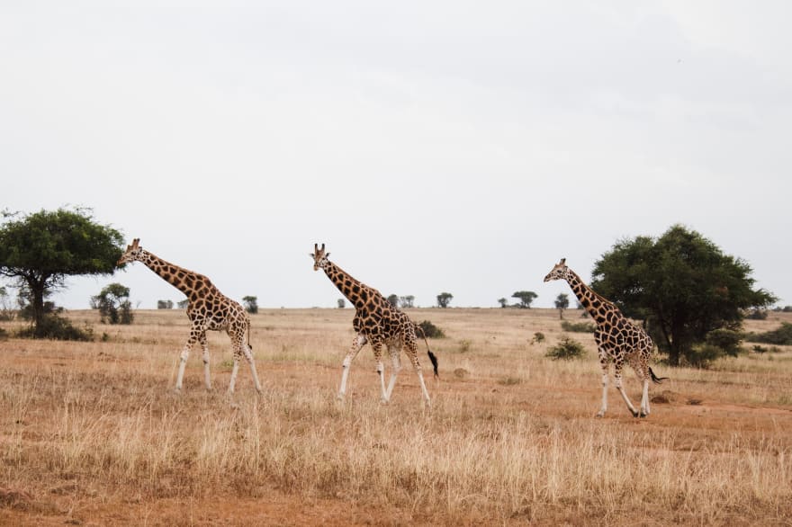
<img src="giraffe.jpg" />
Whoa! That's not quite right, let's fix that.
Percentage width images using CSS
By definition, a responsive site has no fixed width. We can account for this by setting our image width using percentages. A percentage width can be set on the image directly using inline CSS or set globally using a CSS style sheet.
<!-- Inline CSS -->
<img src="giraffe.jpg" style="max-width: 100%;" />
/* Global CSS style sheet */
img {
    max-width: 100%;
}
Our image set to 100% maximum width now looks like this. Feel free to resize your browser window and see the image width change automatically.
Awesome! Our images are now responsive, but let's not get too excited. CSS percentage widths have a major downside: This reading pane has a maximum width of 700 pixels and our image is 3742 pixels wide or 532% larger than what we need. It's also consuming 1.55 MB of bandwidth.
So the image is huge, what's the big deal?
On a standard ADSL internet connection, it is going to take 2 seconds to download that single image.
I'm going to assume you have more than one image on your website. If every image takes 2 seconds to download, your site will be very slow and your search ranking will take a big hit.
How can we fix this problem?
Since we only need an image that is 700 pixels wide, let's pop open Photoshop and resize it.
That's better! Our image is now 700 pixels wide and weighs in at 264 KB with no loss of quality.
What about mobile devices?
Great question! On mobile devices, 700 pixels can be more than double what you need and 264 KB on is still slow on a mobile internet connection.
What if we could display different size images for different size devices?
Now you're thinking!
Different image sizes using the srcset attribute
Let's downsize our original image and save it as three versions of 700 pixels, 480 pixels and 360 pixels. We'll name them as follows:
- giraffe-small.jpg - 360px @ 101 KB
- giraffe-medium.jpg - 480px @ 151 KB
- giraffe-large.jpg - 700px @ 264 KB
We'll use the srcset attribute to tell the browser about our different image sizes. This tells the browser that we have three versions of this image in the sizes 360w, 480w and 700w. The "w" in this case is the same as "px".
<img
    style="max-width: 100%;"
    srcset="giraffe-small.jpg 360w, giraffe-medium.jpg 480w, giraffe-large.jpg 700w"
/>
Some older browsers will ignore the srcset attribute. We can use the src attribute as a fallback for these browsers.
<img
    style="max-width: 100%;"
    srcset="giraffe-small.jpg 360w, giraffe-medium.jpg 480w, giraffe-large.jpg 700w"
    src="giraffe-large.jpg"
/>
Great! Now we are saving bandwidth by delivering different images to different devices.
This goes without saying, but you know what this means right? You'll need to create a minimum of three versions of every image on your site. If you want to support hi-dpi or retina displays, you'll need even more variations. That is an incredible amount of time that none of us have. In addition, if you re-design your site at different breakpoints, you'll need to do this all over again.
At Tueri, we're developers too and recognize that your time is valuable. In the next section, I'll show you how we solved this problem for you.
Real-time image processing with Tueri.io
Tueri.io is a real-time image processing platform. We store, process, and deliver your image perfectly sized to every device.
Here's what you do
<img tueri-src="https://cdn.tueri.io/274877906982/giraffe-family.jpg"/>
<script src="tueri.js"></script>
It's like magic!
Oh, and we also do:
- Low-quality image placeholders
- Image lazy-loading
- Image compression
- Image conversion
Originally published at tueri.io

Posted on April 8, 2019
Join Our Newsletter. No Spam, Only the good stuff.
Sign up to receive the latest update from our blog.


