Exploring data with Jupyter Notebook, Pandas and CrateDB

Carlota Soto
Posted on April 15, 2021

In a previous post, I showed you how to pair CrateDB (an open-source database specialized in machine data) and Jupyter Notebook, an application that allows you to create and share documents containing live code. I also told you how to load two different sample datasets into CrateDB, one recording the position of the ISS and another containing information about taxi trips in NYC.
In this post, I'll play a little bit with the NYC taxi dataset using Pandas and Matplotlib. This will be a simple example, but you can take it from here and explore further what you can do with these tools.
Before continuing, make sure you take it from where we left it, i.e. with Jupyter Notebook running and the NYC taxi dataset loaded into CrateDB.
To start, let's import our libraries. We will be importing pandas and matplotlib. Open a new Jupyter Notebook and run the following code:
import pandas as pd

import matplotlib.pyplot as plt
from matplotlib import rcParams
plt.style.use ('ggplot')
If there's no error, you will see no return.
Now, let's query CrateDB from Jupyter. This is how you can do it:
limit = 1000000
sql_query = """
  SELECT total_amount, trip_distance FROM nyc_taxi_sample
LIMIT 1000000;
""".format(limit)
try:
    df_data = pd.read_sql(
    sql_query, 'crate://localhost:4200')
    display(df_data.head(5))
except Exception as error:
    print(error)
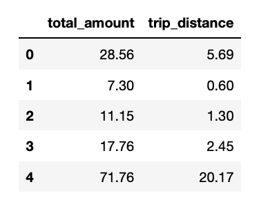
This query asks CrateDB for a table containing the price of each taxi trip and its distance, and with the help of pandas, we're defining a function called df_data with this result. Besides, we're asking to display a table with the first 5 values in our notebook.
If everything goes well, you will see such table showing up:
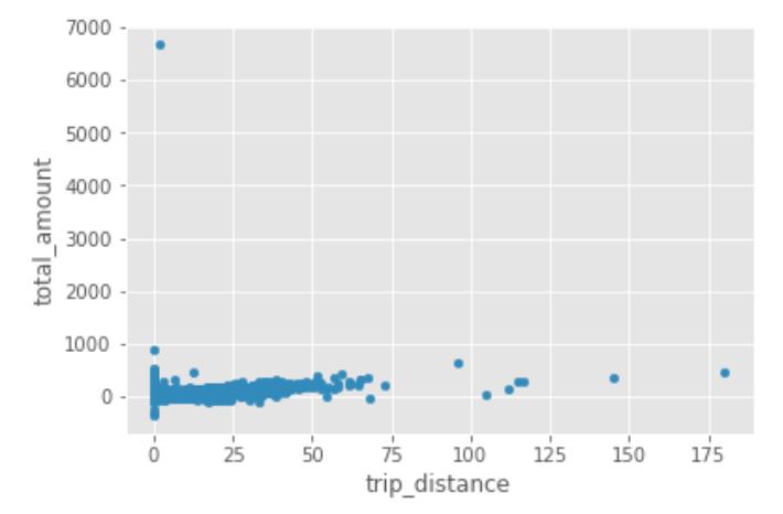
Next, let's see how our data looks like by building our first plot:
df_data.plot.scatter(x='trip_distance',y='total_amount')
plt.show()
After running the command above, a price vs distance plot will display in your notebook:
We notice some interesting things; for example, there are some anomalies, most notably what appears to be negative trip distances. Datasets are rarely perfect... Especially those with millions of data points.
We can change our original query, so it only includes positive values in the return:
limit = 1000000
sql_query = """
  SELECT total_amount, trip_distance FROM nyc_taxi_sample
  WHERE total_amount> '0' AND trip_distance> '0'
LIMIT 1000000;
""".format(limit)
try:
    df_data = pd.read_sql(
    sql_query, 'crate://localhost:4200')
    display(df_data.head(5))
except Exception as error:
    print(error)
Again, if it's successful, you will see a table with the first five data points.
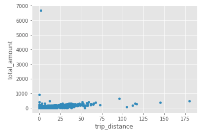
Let's plot the data again:
df_data.plot.scatter(x='trip_distance',y='total_amount')
plt.show()
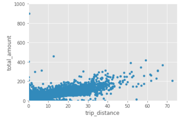
Now, let's zoom in a little, limiting our x axis to 75 and our y axis to 1000. You can do that like this:
df_data.plot.scatter(x='trip_distance',y='total_amount')
plt.xlim([0,75])
plt.ylim([0,1000])
plt.show()
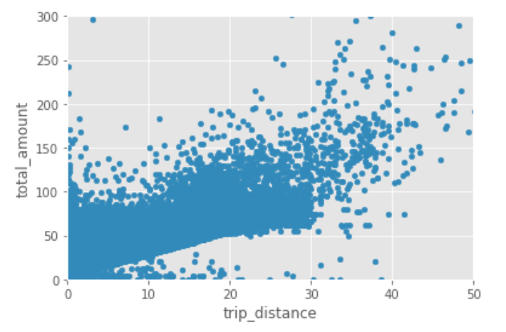
Let's zoom in even more:
df_data.plot.scatter(x='trip_distance',y='total_amount')
plt.xlim([0,50])
plt.ylim([0,300])
plt.show()
Nice!
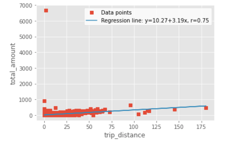
To finish with this little exploration, let's estimate the linear function describing the relationship both variables.
In order to do this, let's use SciPy:
import scipy.stats
slope, intercept, r, p, stderr = scipy.stats.linregress(df_data.trip_distance, df_data.total_amount)
Next, run the command below. It will return you a string with the equation of the regression line and the value of the Pearson correlation coefficient:
line = f'Regression line: y={intercept:.2f}+{slope:.2f}x, r={r:.2f}'
line
Something like this:
'Regression line: y=10.27+3.19x, r=0.75'
To end, if you want to show the regression line in a plot it together with our data, this is how you can do it:
fig, ax = plt.subplots()
ax.plot(df_data.trip_distance, df_data.total_amount, linewidth=0, marker='s', label='Data points')
ax.plot(df_data.trip_distance, intercept + slope * df_data.trip_distance, label=line)
ax.set_xlabel('trip_distance')
ax.set_ylabel('total_amount')
ax.legend(facecolor='white')
plt.show()
Hope this was fun!

Posted on April 15, 2021
Join Our Newsletter. No Spam, Only the good stuff.
Sign up to receive the latest update from our blog.
