Build This Cool PopUp / Modal with React and CSS

Jason Melton
Posted on September 14, 2020

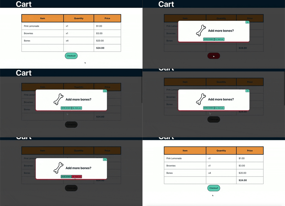
A nicely styled version of an alert(), the modal, the popup. Probably the most annoying yet necessary element of the web.
For this blog, I created a modal using React and CSS. I assume there are millions of ways to do this, and I’d love your feedback if you can suggest improvements.
the code on GitHub
Tutorial
Table of Contents
- Preliminary Junk
- CheckOut Component
- PopUp Component
- The Styles
- Conclusion
Preliminary Junk
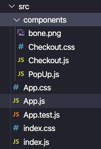
To start, I entered create-react-app into my terminal, deleted the default junk, and set up a file structure like this:
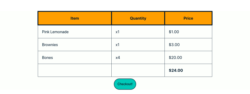
For the sake of the demo, I set up a fake shopping cart page.
The only thing that functions on this screen is the “Checkout!” button. I’m going to skip the code for this, but you can find it in the here.
CheckOut Component
I set up a CheckOut component that has a table displaying the items the user is purchasing and some other stuff for the sake of demoing the popup.
What’s important for the popup functionality are these lines of code:
I set up a useState hook for toggling the popup on and off.
    // controls if popup displays
    const [popUp, setPopUp] = useState(false)
I set up a variable called duringPopUp that will conditionally add the style " during-popup" to the elements it is applied to. This class will darken the background-color of those elements.
    // adds class to darken background color
    const duringPopUp = popUp ? " during-popup" : ""
I apply like this:
<div className={"Checkout" + duringPopUp}>
Finally, I have a line of code that conditionally renders a PopUp component. That component receives setPopUp as props. That way I can toggle PopUp off from within the component.
{popUp && <PopUp setPopUp={setPopUp}/>}
PopUp Component
The PopUp component is set up like this:
import React from 'react';
// styling
import './Checkout.css';
// images
import bone from './bone.png'

const PopUp = props => {
    // function that takes boolean as param to conditionally display popup
    const { setPopUp } = props

    return (
        <div className="PopUp">
            {/* x close window */}
            <button className="popup-x" onClick={()=> setPopUp(false)} >X</button>
            <div className="pu-content-container">
                <img className="pu-img" src={bone} alt="bone" />
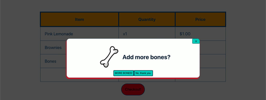
                <h1>Add more bones?</h1>
            </div>
            {/* button controls */}
            <div className="pu-button-container">
                <button onClick={()=> setPopUp(false)}> MORE BONES! </button>
                <button onClick={()=> setPopUp(false)}> No, thank you. </button>
            </div>
        </div>
    );
}

export default PopUp;
The content of PopUp can be whatever you need. I set all the buttons to simply toggle the component off. In reality, if someone wanted more bones, the MORE BONES! button would give them MORE BONES!
The Styles
Again, I’m going to skip most the styles in CheckOut.css file. Most of them set up the fake cart and make the buttons look a little nicer. Here’s what’s important for the popup.
Darken Background Colors in Checkout.js
.during-popup{
    background: linear-gradient(rgba(0, 0, 0, 0.7), rgba(0, 0, 0, 0.7));
}
Remember, this style is added when the popUp state is true. It darkens the background-colors wherever it is applied.
Styles for Elements in PopUp.js
These are the styles for the outer most div in the PopUp container:
.PopUp{
    position: fixed;

    left: 25%;
    top: 30%;

    width: 50%;

    border: 1px solid #011627;
    border-radius: 1em;
    box-shadow: -2px 5px 5px #E71D36;

    background-color: #FDFFFC;

    display: flex;
    flex-direction: column;
    justify-content: space-between;
    align-items: center;

    color: #011627;
}
The important piece is position: fixed;. This will cause the component to render where it is positioned by top and left--no matter where the screen scrolls. Since it is fixed, it will stay in the same position no matter how the screen changes.
Conclusion
Hope this helps you create the most irritating advertisement the web has ever seen. Kidding, of course, but I do hope this helps with your popup design. I’d love some feedback. Comment or hit me up at jason.melton2@gmail.com. Thanks for reading. Best, Jason.

Posted on September 14, 2020
Join Our Newsletter. No Spam, Only the good stuff.
Sign up to receive the latest update from our blog.


