Mimic iOS/XCode StackView in Android Studio Layout Editor

Kevin Le
Posted on November 17, 2018
With recent releases of Android Studio, Constraint Layout has been promoted as the default and preferred layout of Android App. It is described as "a great new way to define complex layouts without the need for nested view hierarchies, thanks to a flexible constraint system". When we create a new Project with an Empty Activity, Android Studio generates a ConstraintLayout at the root level by default. With that, although building UI using XML in Android as in the past is still supported, the Layout Editor is now front and center. This is evidenced as stated on the Android Developer page Build a UI with Layout Editor
Here's an excerpt:
"In the Layout Editor, you can quickly build layouts by dragging UI elements into a visual design editor instead of writing the layout XML by hand. The design editor can preview your layout on different Android devices and versions, and you can dynamically resize the layout to be sure it works well on different screen sizes. The Layout Editor is especially powerful when building a new layout with ConstraintLayout".
As I was trying to implement the following screen on Android as I did in iOS
(which by the way I shared here https://medium.com/@kevinle/build-an-ios-front-end-to-verify-a-numeric-code-using-rxswift-d776418fade6)
In XCode, there's a StackView feature. To use it in this case, we just multi select these 6 TextFields, click on the Embed in Stack button, set the constraints for the StackView and decide how to distribute the children views. The advantages of using StackView is there's no need to specify individual constraints of each child view and all can be from the StoryBoard.
It is debatable whether Android Studio copies this feature from XCode, but regardless, the ConstraintLayout and Layout Editor have now been promoted. So let's see how to do the above example in Android Studio in the same way as in XCode.
1/. Create a new blank layout file, specify ConstraintLayout as the root.
2/. Open the Palette, pick the LinearLayout (horizontal) and drop it in. You will see the LinearLayout takingup the entire window. That's OK for now.
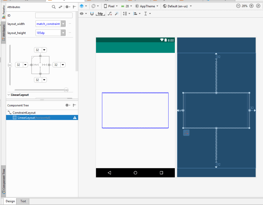
3/. With the LinearLayout selected in the ComponentTree, set the constraints left, right, top, bottom to 32 unit each, layout_width match_constraint, layout_height 185 dp. This layout_height is only temporary.
4/. From the Palette, pick the Number Text and drop inside the LinearLayout.
5/. It will take the entire width of the LinearLayout.
6/. Do it again for the second Number Text. Now each of them is 50% of the width.
7/. Repeat 4 more times. There will be 6 EditTexts equal in size that will occupy the entire width of their parent, the LinearLayout.
8/. In the ComponentTree, click on the LinearLayout, change the layout_height to Wrap_content. You can also use the vertical slider to move the LinearLayout up or down. In my case, I moved it up to 25%. You should have something like the picture below:
9/. Finally, for each EditText, click on the 'View all attributes', set the textSize to 36 sp, the maxLength to 1, check 'gravity->center_vertical' and 'gravity->center_horizontal'
10/. Now run. It will look like the iOS counterpart. But we won't see the cursor auto moves to the next digit. That's the next part.
Conclusion
For developers who have do both Android and iOS, it's beneficial to undergo the same experience while working on both platforms. In the past, iOS' and Android's approaches are orthogonal. But with ConstraintLayout and Layout Editor in Android Studio, it's one step that closes the gap.
If you read my article on the iOS above, you'll see I showed the way to implement is to use RxSwift. For Android, I will show RxJava. That will close the gap even more. Please stay tuned.

Posted on November 17, 2018
Join Our Newsletter. No Spam, Only the good stuff.
Sign up to receive the latest update from our blog.


