CSS text balancing : text-wrap : balance

Chloe Ji
Posted on December 15, 2023
As developers, we often grapple with the unpredictability of headlines — their final size, font, and even the language can be unknown.
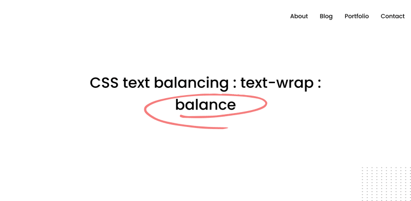
Varies content length can make the final UI feel unbalanced or missing something. Here is what I mean:
CSS code of the headline:
.unbalanced {
  max-inline-size: 50ch;
}
As you can see, the highlighted word in the headline is on its line, which seems odd.
So, how can we achieve an even distribution of text based on its length without the need to manually adjust the size of the element?
The answer is using text-wrap: balance, a new Chrome Canary feature that dynamically balances the text on resize.
By automatically calculating the number of words and dividing them equally between two lines, we can reach a more appealing headline by using:
.balanced {
max-inline-size: 50ch;
text-wrap: balance;
}
(For a more visual example, please check: Live demo of text-wrap: balance)
When used with max-width and min-width, text-wrap: balance ensures that the text remains legible and elegantly laid out regardless of screen size.
For max-depth set:
For min-depth set:
Practical scenarios of using text-wrap: balance
- Page Headline
Without balancing:
With balancing:
.h1,h2,h3,h4,h5,h6 {
  text-wrap: balance;
}
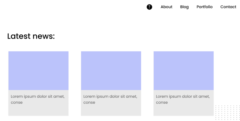
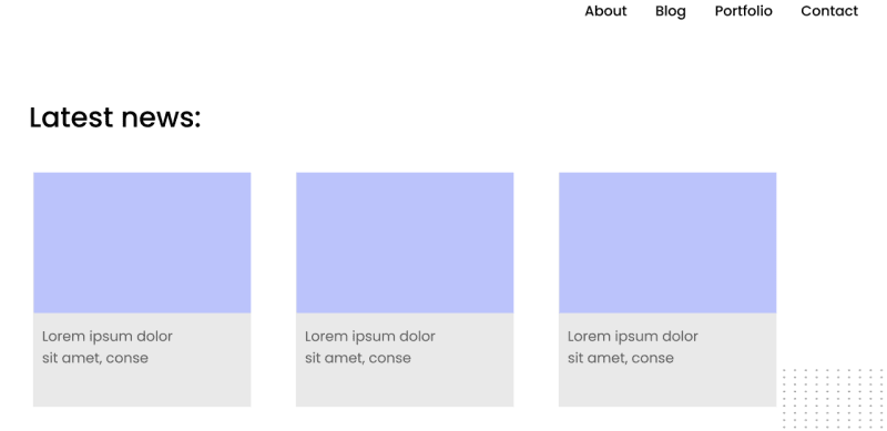
- Card Content
Without balancing:
With balancing:
.card_content {
  text-wrap: balance;
}
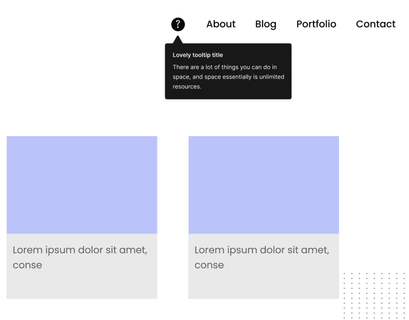
- Tooltip
We often use a tooltip to show critical information to the user. It might be a few words or multiple lines.
Without balancing:
With balancing:
.tip_content p {
  text-wrap: balance;
}
- FAQ
Another example where I see a good potential for text-wrap: balance is in a FAQ list.
Without balancing:
With balancing:
.FAQ_header {
  text-wrap: balance;
}
Limitations
The text-wrap: balance property works within the confines of the set max-width and min-width, providing a visually consistent text block. However, these fixed boundaries can sometimes lead to suboptimal text distribution, especially in containers with much white space or various content lengths.
For example, headings inside a card (or any container with borders or shadows).
The red shadow represents the white space area, which is not appealing in some UI designs.
Potential solutions
- Dynamic whitespace handling
By 'unsetting' the white-space property, remove any specific instructions that might inhibit text wrapping. By doing so, you allow text-wrap: balance to perform optimally,
.balanced {
white-space: unset;
text-wrap: balance;
}
- Element width manipulation
The fit-content property instructs the element to fit its content's width snugly, accommodating the text's balanced form.
.element {
text-wrap: balance;
width: fit-content;
}
This pairing could potentially adjust the element's width based on the balanced text, creating a 'shrink-wrap' effect.
I’m sure these ideas might be replaced with something better, but you got the idea.

Posted on December 15, 2023
Join Our Newsletter. No Spam, Only the good stuff.
Sign up to receive the latest update from our blog.
Related

November 30, 2024


