Paula Marín S
Posted on February 20, 2023
There are different tools that can help to make your app accessible. Today I want to talk to you about axe DevTools.
I use the plugin for Chrome
Axe DevTools delivers unparalleled accuracy in testing page and component accessibility while you code. Our rules engine is based on Web Content Accessibility Guidelines (WCAG). Our browser extension finds 57% of the issues by itself. Use our Intelligent Guided Testing (IGT) to achieve 80% or more of the issues with no additional training required. Axe DevTools brings accessible coding to the next level.
This is a deque tool that I discovered when I assisted to a webinar about accessibility.
Find and fix more accessibility issues during website development with axe DevTools.
The free axe DevTools browser extension is a fast, lightweight, yet powerful testing tool driven by the world’s most trusted accessibility testing engine, axe-core, developed by Deque.
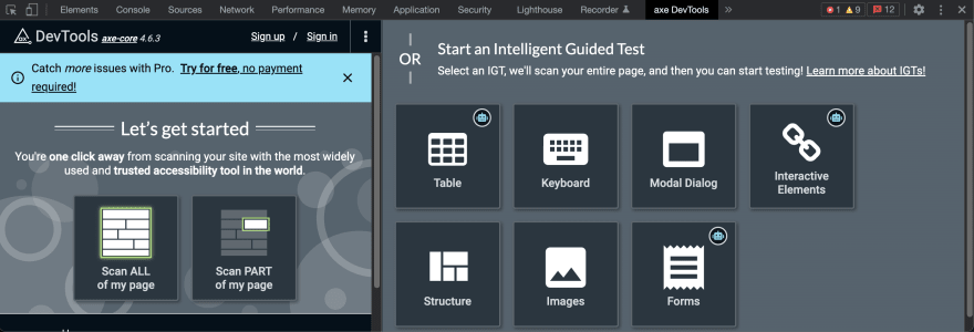
This is how it looks
Some of the functionalities are totally free and some you have to go Pro, these are the paid ones.
★ Intelligent Guided Testing™ (IGT)
Perform more advanced testing without having to become an accessibility expert. Using a simple question and answer format, IGT leverages machine learning to help you quickly find and fix issues that are not detectable by automated testing alone. Adding IGT can get you 8o% coverage or more—while you code.★ Component-level testing
Make your testing more agile by focusing only on the specific parts of a page relevant to your immediate work. Reduce patching and retesting by finding accessibility bugs that could break existing use cases.★ Export, Save and Share
Collaborate across your dev team! With one click, create a customized URL with all issue description information to share with colleagues or your issue tracking software of choice. Save the rest of your team time and effort and help them build inclusive experiences.★ What’s left to test?
After you’ve finished automated and Intelligent Guided Tests, now you can generate and share a “What’s left to test” report, listing what’s left for manual testers. Accessibility experts can pick up exactly where you left off to catch the remaining complex issues.
What I usually do is to scan all the page, for this example I'm going to go to a random page from GAP: https://www.gap.com/browse/product.do?pid=549216022&cid=15207&pcid=8792&vid=1#pdp-page-content
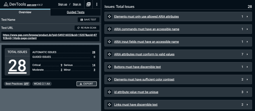
This is what I got
From this I can see that there are 28 issues, from those I see 9 criticall, 14 serious, 2 moderates and 2 minor.
If you click the humber 9 in critical you can filter the lists of issues and only see the critical ones
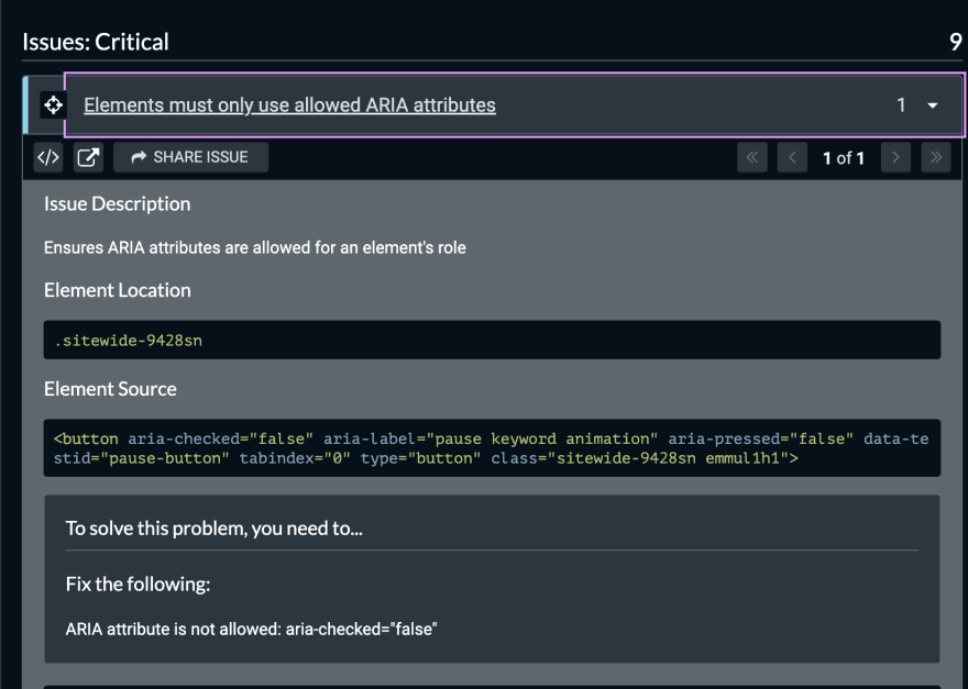
If you click the title of the issue you can see more details about it
With the icon next to the title of the issue (the target?) you can select the element that has the issue
And looking more into detail it also tells you how to fix the issue, in this case we have to fix ARIA attribute is not allowed: aria-checked="false"
Let's see some other examples.
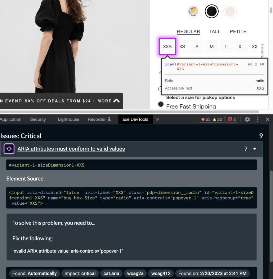
In this case the issue is Invalid ARIA attribute value: aria-controls="popover-1" and also notice that this issue is happening in 7 parts of the code.
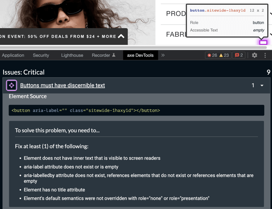
And the last critical issue is a bad one if you ask me.
In this case there is some kind of button but is hidden if the user is using a screen reader app then the user is going to have a really bad time trying to figure out what that button is for since the screen reader won't have any reference or information to give to the user. All of this and more you can see in the section about how to solve the problem.
Let's see some examples about serious issues.
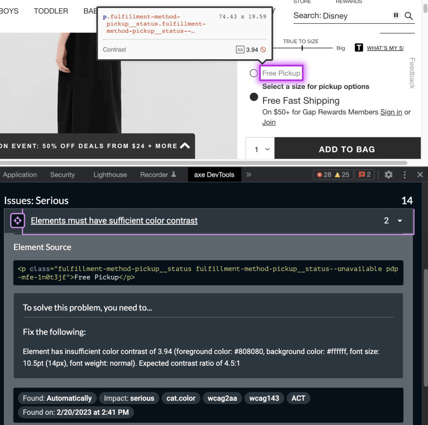
In this next issue you can see that the problem is all about the colors that they chose to use in the design. It should have more contrast so users with visual difficulties can use the site anyway.
The next issue is about how they chose to implement the clickable photos and again it is not taking into account assistive technologies.
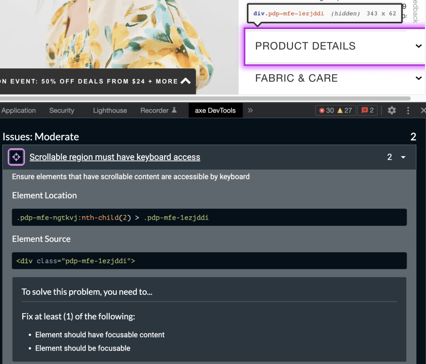
The 2 moderate issues are related to how a user can interact with a scrollable section.
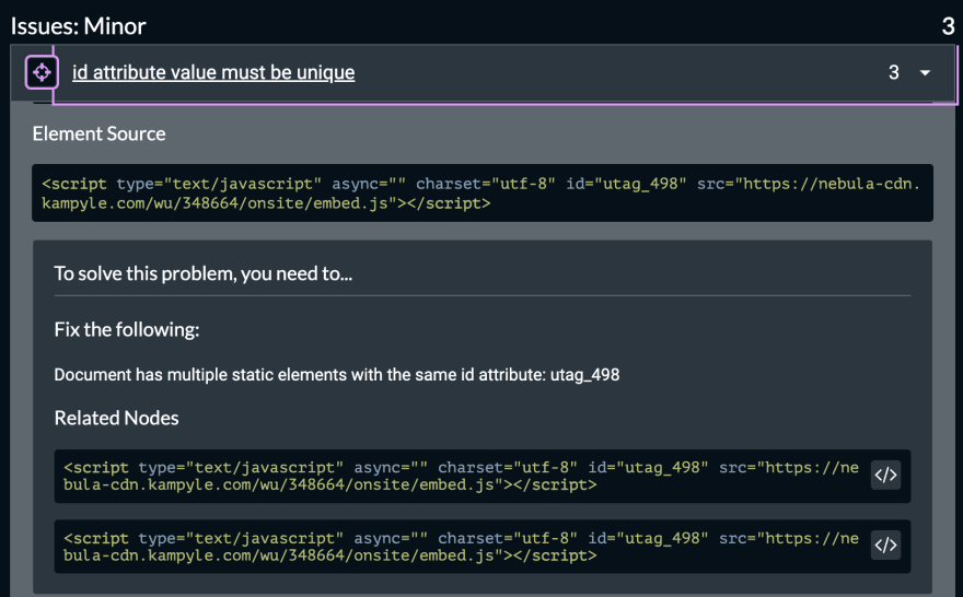
And the 3 minor issues are related to the id of elements in the page.
Another option that sometimes is really useful is the more info button.
This is great because it takes you to the documentations about the issue and this documentation is really complete, I love it.
Finally something that is really useful for me as a developer is the inspect issue button.
This button takes me to the code, which gives me more context on what part of my code has the issue specially in big sites that might be part of different microfontends.
Anyways, this is just an example of what you can do with the free choices that you have and like I said before there is lots more that you can do with the paid version.
That is it for now.
Cheers!

Posted on February 20, 2023
Join Our Newsletter. No Spam, Only the good stuff.
Sign up to receive the latest update from our blog.

