Cassey Lottman
Posted on October 23, 2020
Hello, friends! Perhaps you have already heard an old web accessibility accessibility principle: developers should rely on browser semantics as much as possible.
Maybe you have heard it in the form of The First Rule of ARIA:
If you can use a native HTML element [HTML51] or attribute with the semantics and behavior you require already built in, instead of re-purposing an element and adding an ARIA role, state or property to make it accessible, then do so.
The rules of ARIA generally describe how to make interactive aspects of your site accessible. In this post, we're going to look at how overriding browser styling defaults can also lead you astray, accessibility-wise.
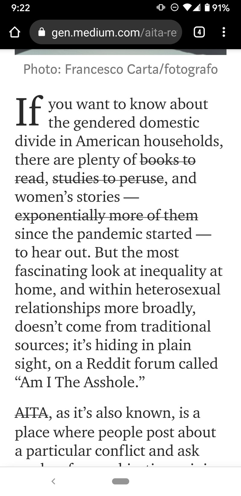
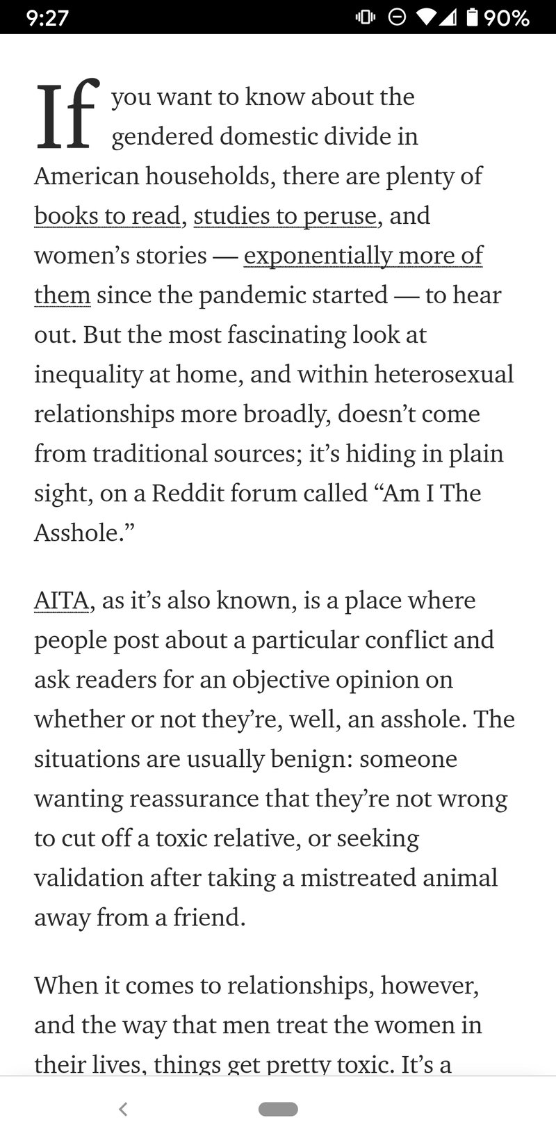
This story begins with me, reading some interesting blog posts on Medium.com, on my phone. I use the browser's built-in text magnification, because even with glasses, vision remains a challenge for me. (Specifically, I use Brave and Chrome on Android, with text magnification of 150%.) I had been noticing that link underlines on Medium posts made the words look as if they were struck out.
(The story ends with me procrastinating a month to write this post, and in the meantime, Medium has actually fixed the issue. If you change your text magnification settings and go looking for it, you won't find it. Took you a while, *cough* six years but good job, Medium! The screenshots for this piece were all collected on October 1st, 2020, and shared in two different slacks where I was trying to parse through the issue with the help of friends.)
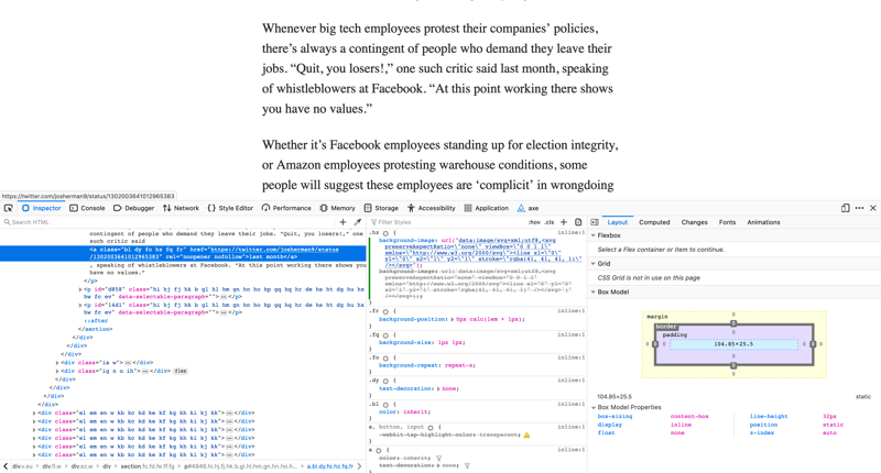
I opened up the same post in a browser to inspect the HTML and CSS, and was surprised: on desktop Firefox, the links were unmarked entirely! Surely someone had noticed this, right? But the misplaced underlines had been happening for me for quite a while on mobile; what was going on?
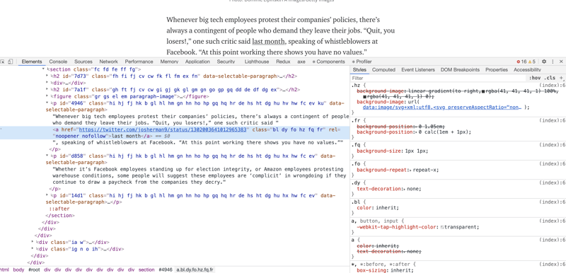
Eventually, with the help of folks in some tech slacks I'm in, I realized others weren't seeing what I was seeing. What?!? Then I remembered I also use vision accommodations in desktop browsers. Specifically, I have a minimum font size set at the browser level, and all sites I visit have to display text no smaller than that font, regardless of what the developers wanted. When I turned that off, the underlines snapped back into their normal places.
Something you might have noticed in the browser tools of those screenshots (or you might not because the screenshot is blurry; sorry, I didn't copy out the HTML and it's gone forever now) is that Medium is doing some funny-business with the underlines. Each of the links has text-decoration: none, and the underline is being provided through a background-image which is an SVG.
Someone in one of the slacks I was documenting my perplexity in pointed me to this post: "Crafting Link Underlines on Medium", posted on Medium's official design blog way back in 2014. In this post, a designer at Medium documented the design team's frustration with browser built-in underlines, and what considerations went in to building "better" underlines. The frustration seems to be that the underlines were a bit bolder than the design team would like; to my non-designer (and admittedly, lower-than-average vision) eyes, a comparison of the previous and new-then underlines look very similar, and the previous ones certainly don't offend me enough that I'd go to much effort to change them. The author went on to document implementations that the team had considered and rejected, and the one they chose: some code that looked suspiciously like what I was seeing in the developer tools of my browser on October 1, 2020.
Here is where I get a little snarky, because I was going down a deep rabbit hole to figure out why these underlines behaved so poorly for me, then was a bit ragey to find it was yet another broken thing resulting from site builders not anticipating & accounting for the assistive technology I use. And then, I opened this post, from Medium, about the exact thing that has been causing this problem for 6 years now, and it started like this:
How hard could it be to draw a horizontal line on the screen?
insert very snarky comment right about here
Another standout line, that many others before me have highlighted, goes like this:
Web design always seemed like this, too: finding convoluted, “dirty” solutions to often simple problems, using a very limited set of tools.
insert mirthless laugh here
To be fair to the Medium design team, they did consider some accessibility issues in the implementation they eventually chose.
Their list of criteria for the final design includes these lines:
We adjust the sizes of fonts for tablets and mobile phones.
We fall back to a default system font for when we decide that our type doesn’t support all the characters in a given language.
Some people zoom in (or zoom out) their browsers.
Some people use uncommon browsers.
People do zoom in & out their browsers, and good site designs should account for that, and not break. But some people, like me, find that browser zoom is not the best solution for reading text better. If you zoom your browser, you might need to adjust the zoom level on every page you visit. Browser zoom also means that ads and the images accompanying posts have also gotten bigger, so you're going to need to scroll more. (In my case, I can typically see images just fine, except for tiny profile images. I really just need the text to be bigger, and when it's already huge, to not get any bigger. One might say... to be always bigger than a minimum size.)
So here we have a case where a design/dev team wanted to customize the styling of a built-in browser affordance. And they did want to ensure the thing they were building would still be accessible. But, they failed to account for one particular way of making the web accessible that users with low vision might use, and made their experience much worse. (It's distracting that many of the words of some posts appear to be crossed out, as in mobile browsers, and it's even more confusing to have links not visually indicated at all, as in desktop Firefox.)
How has Medium fixed the issue? Took out most of their custom background-image stuff, basically. Now they have a class on all their links, adding text-decoration: underline. Wait Cassey, you said that's built-in, why do they need that? Only because when cleaning up their legacy code that did the background-image stuff, they didn't also axe the CSS that did a { text-decoration: none }, which removes that handy browser built-in.
You can read more about link underlines in this post from @aardrian who does not (in a 2016 blog post, with a few updates since then) take for granted, like I do, that link underlines are obviously good and important, and considers a whole host of reasons people like and dislike them, and what is best for accessibility. (Spoiler, they conclude link underlines are best.)

Posted on October 23, 2020
Join Our Newsletter. No Spam, Only the good stuff.
Sign up to receive the latest update from our blog.


