Andreas
Posted on February 27, 2021
There are many different things you can do with the help of CSS Paged Media. I already covered some use cases in this publication, like business cards, book covers, and CVs. Today I want to show you how to create beautiful poker cards. We will design one standard card and a joker card together. All other cards you can make with the same HTML and CSS by just changing the values.
Ace of Spades
Let us start with the ace of spades. As HTML, we create two divs for the front and backside. This will be two pages in the result PDF. Both wrapper divs for the pages contain another div with the actual page content. In the front side div, we directly add the content ‘♠’, the back side div will get a lovely pattern from Hero Patterns, so all we need in HTML is the empty container.
<div class="front">
   <div class="content">♠</div>
</div>
<div class="back">
   <div class="design"></div>
</div>
Now to the more exciting part, the CSS. There are many different sizes for playing cards. In this sample, we will go with 63.5mm x 88.8mm.
To do so in CSS, we need to use the @page rule and define the size. Additionally, I will also define a bleed, crop marks, and margin for the pages. For the HTML body, let us also set padding and margin to zero.
@page{
 size:63.5mm 88.8mm;
 marks:crop;
 bleed:5mm;
 margin:5mm;
}

body{
 padding:0;
 margin:0;
}
I will use WeasyPrint on printcss.live to render the PDF, and if you check the result, we get only one page. So the next thing we need to do is put the front and back div on separate pages by using the named pages.
 The current HTML and CSS Code rendered with WeasyPrint on printcss.live
.front{
 page: front;
}

.back{
 page: back;
}
This way, we defined a named page “front” for the div with the class “front” and an own page for the div with the class “back” too.
If we render the PDF again, we will now see two pages.
 2 Pages, thanks to the named pages CSS property.
Next, let us focus on the pattern on the backside. As mentioned above, I want to use some nice Hero Pattern for this. The pattern we will surround by a border to get the typical playing card look.
.design{
 border:1mm solid rgb(188, 11, 6);
 width:51.5mm;
 height:76.8mm;
 background-color: #fdb9b8;
 background-image: url("data:image/svg+xml,%3Csvg xmlns='http://www.w3.org/2000/svg' width='52' height='52' viewBox='0 0 52 52'%3E%3Cpath fill='%23bc0b06' fill-opacity='0.97' d='M0 17.83V0h17.83a3 3 0 0 1-5.66 2H5.9A5 5 0 0 1 2 5.9v6.27a3 3 0 0 1-2 5.66zm0 18.34a3 3 0 0 1 2 5.66v6.27A5 5 0 0 1 5.9 52h6.27a3 3 0 0 1 5.66 0H0V36.17zM36.17 52a3 3 0 0 1 5.66 0h6.27a5 5 0 0 1 3.9-3.9v-6.27a3 3 0 0 1 0-5.66V52H36.17zM0 31.93v-9.78a5 5 0 0 1 3.8.72l4.43-4.43a3 3 0 1 1 1.42 1.41L5.2 24.28a5 5 0 0 1 0 5.52l4.44 4.43a3 3 0 1 1-1.42 1.42L3.8 31.2a5 5 0 0 1-3.8.72zm52-14.1a3 3 0 0 1 0-5.66V5.9A5 5 0 0 1 48.1 2h-6.27a3 3 0 0 1-5.66-2H52v17.83zm0 14.1a4.97 4.97 0 0 1-1.72-.72l-4.43 4.44a3 3 0 1 1-1.41-1.42l4.43-4.43a5 5 0 0 1 0-5.52l-4.43-4.43a3 3 0 1 1 1.41-1.41l4.43 4.43c.53-.35 1.12-.6 1.72-.72v9.78zM22.15 0h9.78a5 5 0 0 1-.72 3.8l4.44 4.43a3 3 0 1 1-1.42 1.42L29.8 5.2a5 5 0 0 1-5.52 0l-4.43 4.44a3 3 0 1 1-1.41-1.42l4.43-4.43a5 5 0 0 1-.72-3.8zm0 52c.13-.6.37-1.19.72-1.72l-4.43-4.43a3 3 0 1 1 1.41-1.41l4.43 4.43a5 5 0 0 1 5.52 0l4.43-4.43a3 3 0 1 1 1.42 1.41l-4.44 4.43c.36.53.6 1.12.72 1.72h-9.78zm9.75-24a5 5 0 0 1-3.9 3.9v6.27a3 3 0 1 1-2 0V31.9a5 5 0 0 1-3.9-3.9h-6.27a3 3 0 1 1 0-2h6.27a5 5 0 0 1 3.9-3.9v-6.27a3 3 0 1 1 2 0v6.27a5 5 0 0 1 3.9 3.9h6.27a3 3 0 1 1 0 2H31.9z'%3E%3C/path%3E%3C/svg%3E");
}
You may ask yourself now why 51.5mm width and 76.8mm height if the card dimensions are 63.5mm x 88.8mm.
First, we set a margin of 5mm in the @page rule so the card will have white space around the pattern. Also, as you see in the code above, the border around the pattern is 1mm. So the width would be 63.5mm - (5mm * 2) - (1mm *2), which results in 51.5mm. The same calculation for the height leaves us with 76.8mm for the back side pattern.
 The complete back side of the poker card, rendered with WeasyPrint.
Next, let’s look at the front side, we need to have the ♠ in the center. Also, if you look at other playing cards, they have the A for the ace of spades and the ♠ symbol on the top left corner and on the bottom right corner rotated by 180 degree.
To add these elements, we can make use of the page margin boxes. We will use ‘@top-left-corner’ for the ‘A’ and ‘@left-top’ ♠ for the top left corner. Similar to the right bottom corner, here we use ‘@bottom-right-corner’ and ‘@right-top’.
To fit all of that information in the page margin boxes, we need to increase their size. In the @page rule, we defined a margin of 5mm so the boxes have a width of 5mm, which will be too small for our content. Gladly we already defined a named page for the front div. This named page will get its own margin now.
@page front{
 margin:15mm;
}
But that also means that the div with the class ‘content’ needs to be smaller than the back side pattern. The calculation for its size is the same as the one above, just that we have a 15mm instead of 5mm margin now.
The content ♠ should be centered, so let’s use the div height as line-height and set the CSS property ‘text-align’ to ‘center’.
.content{
 border:1mm solid rgb(188, 11, 6);
 color:rgb(188, 11, 6);
 width:31.5mm;
 height:56.8mm;
 line-height:56.8mm;
 text-align:center;
 font-size:96pt;
}
 The result of the current HTML and CSS for the front and back side.
As the last step, the page margin boxes are remaining. Let us start with the top left corner of the card. Within the ‘@page front{}’ definition, you should add the following CSS code.
color:rgb(188, 11, 6);

@top-left-corner{
 line-height:15mm;
 text-align:center;
 font-size:36pt;
 content:"A";
}

@left-top{
 line-height:15mm;
 text-align:center;
 font-size:36pt;
 content:"♠";
}
Both boxes get a line-height of 15mm, the text gets aligned in the center. The ‘A’ and ‘♠’ get the font-size 36pt. Also, the content is set directly via CSS.
 Result with the top left margin boxes filled.
The same code is used for the bottom right card corner, too, just that we need to rotate the boxes by 180 degree.
@bottom-right-corner{
 line-height:15mm;
 text-align:center;
 font-size:36pt;
 content:"A";
 transform:rotate(180deg);
}

@right-top{
 line-height:15mm;
 text-align:center;
 font-size:36pt;
 content:"♠";
 transform:rotate(180deg);
}
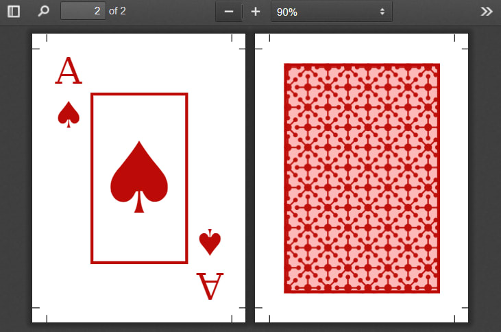
Now you should get a PDF with two pages looking like the following image.
 PDF result with all needed margin boxes filled and styled.
The full code for the ace of spades card is also available in my PrintCSS GitHub repository. The same HTML and CSS is also used to render all the cards on printcss.cards, a website where you can create your own custom poker cards PDF with all 52 cards.
Joker
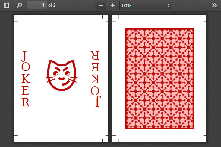
The HTML code for the joker card is 99 percent the same, just the content is different. I chose the 😼 symbol for the joker card.
<div class="front">
   <div class="content">😼</div>
</div>
<div class="back">
   <div class="design"></div>
</div>
The back side CSS is also the same as for all cards, so the same Hero Pattern. We do not need the border for the front side, and, as the symbol is bigger, we need to adjust the font size. As the border of 1mm is missing, the width and height are both 2mm larger.
.content{
 color:rgb(188, 11, 6);
 width:33.5mm;
 height:58.8mm;
 line-height:56.8mm;
 text-align:center;
 font-size:72pt;
}
 Current result of the joker card with the page margin boxes still filled with the ace of spades content.
In the page margin boxes, instead of putting the numbers 2–10, the face cards J, Q, K, or A for the ace plus the symbol of hearts, diamonds, spades, or clubs, we just write ‘Joker’.
As the page margin will still be 15mm, each letter of ‘Joker’ should be in a single line. To do so, the CSS for the boxes needs to be adjusted too.
@left-middle{
 line-height:1;
 text-align:center;
 font-size:26pt;
 overflow-wrap: break-word;
 text-transform: uppercase;
 content:"Joker";
 letter-spacing:1em;
 margin:2mm;
}

@right-middle{
 line-height:1;
 text-align:center;
 font-size:26pt;
 overflow-wrap: break-word;
 text-transform: uppercase;
 content:"Joker";
 letter-spacing:1em;
 transform:rotate(180deg);
 margin:2mm;
}
Again the full code and result PDF is available in my GitHub repository.

Posted on February 27, 2021
Join Our Newsletter. No Spam, Only the good stuff.
Sign up to receive the latest update from our blog.
