Google Summer of Code 2023 with conda-forge

Asmit Malakannawar
Posted on August 26, 2023

The conclusion of Google Summer of Code '23 marks the end of an incredibly remarkable three-month journey. I was a Google Summer of Code student in the year 2022 as well. You can read about the process and experience here.
This time, I had the opportunity to make contributions to conda-forge. I had been working on UI/UX of conda projects for six months before GSoC 2023 began, so I knew conda-forge would be part of GSoC '23. My mentor, Jaime Rodríguez-Guerra, has been a constant source of motivation and an invaluable supporter throughout this project.
This blog serves as a summary of all the tasks I completed during my time in the Google Summer of Code 2023 program.
Modernization of the conda-forge.org website
Around 8 years ago, approximately when the entire conda-forge project started, conda-forge.org was established. However, over this 8-year span, the website has become outdated. One evident issue is its lack of optimization for mobile devices. Additionally, it doesn't adhere to WCAG (Web Content Accessibility Guidelines), rendering it inaccessible to a significant number of users, particularly those with disabilities or those who rely on assistive tools to navigate the web.
The objective of this project was to create a fresh conda-forge.org website that not only aligns with WCAG accessibility standards but also enhances overall performance, all while ensuring an enhanced experience for contributors. This initiative also encompasses the development of a new UI design to complement the improvements.
My work
When I began working on this project, the WCAG guidelines were new to me. I hadn't used them before and didn't realize how important they are for making websites. These guidelines not only follow the law, but they also help people with disabilities use websites easily. Research shows that about 16.67% of the world's population has trouble reading, which makes it hard for them to get information from websites.
The main goal of my project was to make the website easy to use for everyone, and also make it look nice on the outside. This was the challenge I was excited to tackle.
In addition to focusing on accessibility and design, I also had to consider maintainability, since most conda-forge users are not familiar with frameworks like React and Docusaurus.
The Design Work
During the initial weeks of the project, I spent my time researching WCAG guidelines, looking at how different projects handle UI/UX, and coming up with basic color choices for the project's design.
After doing thorough research, I began deciding on the colors to use for the website. Since the old website didn't have a design system, I had the freedom to create a new one from scratch.
Now, considering the project's name is conda-forge, which relates to fire, sparks, and a bright atmosphere, I started playing with shades of red and orange. Working with orange was quite challenging as it's not easy to get right for everyone and can cause accessibility issues. I initially tried combining red and orange gradients, which looked cool, but it made the project appear too dark.
After several discussions and exchanges of ideas with both the team and my mentor, we ultimately settled on using a gradient that blended light pink and orange. This choice lent the website a livelier and more vibrant appearance.
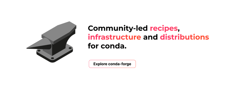
In this stage, I also came up with about 10 different concepts for the landing page. My main goal was to make it straightforward and not overly fancy. To do this, I took inspiration from design systems used by various companies.
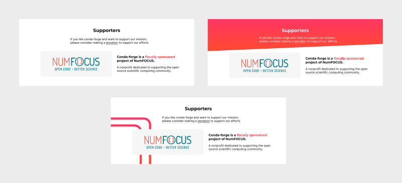
Just like I designed the homepage, I also worked on other parts of the website like the About, Contributing, and Supporters sections. I created various versions for each section. After several meetings and conversations, we settled on the final designs for all the sections that would look great on the website.
The Coding Work
With the design settled, it was time to start implementing the website. A basic site template was already available in the organization's repository. For this project, we used the Docusaurus framework.
We made sure the design was accessible, but when it came to writing code, ensuring accessibility was a different challenge. We need to remember and use basic HTML rules and features for this.
To start coding, I created a new repository and progressively added the code each week. Throughout the process, I sought feedback from my mentor and the organization's accessibility team at various stages.
Repository Link: conda_forge_website
Website Link: https://condaforge.netlify.app/
Future Plans
The landing page has been finished, but there are still a few pages left to work on, such as the donate us page, contact page, and reorganizing the documentation. Additionally, we haven't yet built a dashboard for conda-forge. Since I played a role in designing the design system, I plan to assist in creating the dashboard and other pages too. Because I've been involved in this project for around 3 months, it feels like a personal project to me as well. To ensure the project continues to thrive, I aim to introduce new features, oversee the contribution process, help newcomers understand the new system, and ensure that it remains functional and compliant as it grows.
Special Thanks
I thoroughly enjoyed working together with the conda-forge team and the Quansight team (which oversees open-source projects), during GSoC '23. I want to extend my gratitude to my mentor, Jaime Rodríguez-Guerra for his consistent guidance throughout the project. Mentors like him assist students in developing both personally and professionally. I'm excited about continuing my involvement in the conda-forge community and assisting new contributors as they become part of it.

Posted on August 26, 2023
Join Our Newsletter. No Spam, Only the good stuff.
Sign up to receive the latest update from our blog.


