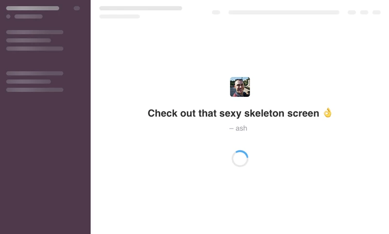
The benefits of ☠️ skeleton screens / content placeholders and how to make them

Ash Connolly
Posted on September 27, 2021

What are they?
Skeleton screens are a way of communicating to the user that content is loading. They go by many names: content placeholders, interface previews, skeleton patterns, to name a few. It’s likely you’ll have seen them before, as they’re used by some big companies like Slack, Facebook and Medium.
Facebook skeleton screen (credit to css-tricks):
They aren’t exactly a new thing, Luke Wroblewski introduced the concept during the development of his Polar app (now acquired by Google) all the way back in 2013. They're now seeing more widespread adoption and for good reason.
Why use them?
When content is loading, either on page load or after an interaction, it's important to communicate this to the user in an appropriate way. Skeleton screens give us the opportunity to indicate the type of content that's loading, which helps increase the perceived performance of our interface:
"Perceived performance is a measure of how fast something feels to the user. The idea is that users are more patient and will think of a system as faster if they know what's going on and can anticipate content before it's actually there. It's a lot about managing expectations and keeping the user informed."
— Max Böck
It also gives a much smoother transition when the skeleton screen is removed and the content is shown.
What about good old progress indicators?
We could use a progress indicator (like a spinner) to show this. However, after years of use, users are all too familiar and frustrated with progress indicators:
"With the introduction of these progress indicators, we had made people watch the clock. As a result, time went slower and so did our app."
— Luke Wroblewski,
It's also quite a jarring experience to see a small progress indicator replaced by a large chunk of content.
Creating the skeleton screens
When animating web elements, it's important to prioritise performance. The last thing you want is for your skeleton screens to cause unnecessary load on your device, slowing down your webpage and creating a janky experience for the user.
I had three simple requirements when creating them to ensure high performance and flexibility in use:
- Have as few animating elements as possible
- Only use GPU-based animations, like
translate - Use modifiers classes to affect the height and repetition of elements so that these skeleton screens are customisable
To have as few animating elements as possible, there’s a small bit of visual trickery going on. We only have one element animating, then we overlay white lines to make it appear as if there are many elements being animated. In the example below the overlay can be toggled on and off:
To reduce the markup, the overlays are created using linear gradients. This ensures that they will repeat endlessly, regardless of the height of the component. This means if we want a skeleton screen to have more repetition, for example showing eight lines instead of four, we can simply change its height using a modifier class:
This makes the components scalable and flexible without the need for extra, repetitive DOM elements.
More skeleton screens for more scenarios
As mentioned earlier, skeleton screens should indicate the type of content that's loading. This means we’ll likely need several skeleton screens to represent the various types of content:
I won’t dive into the code, but it can all be seen in the codepen above. It utilises several SCSS variables and mixins to make customising it as easy as possible.
A final performance check
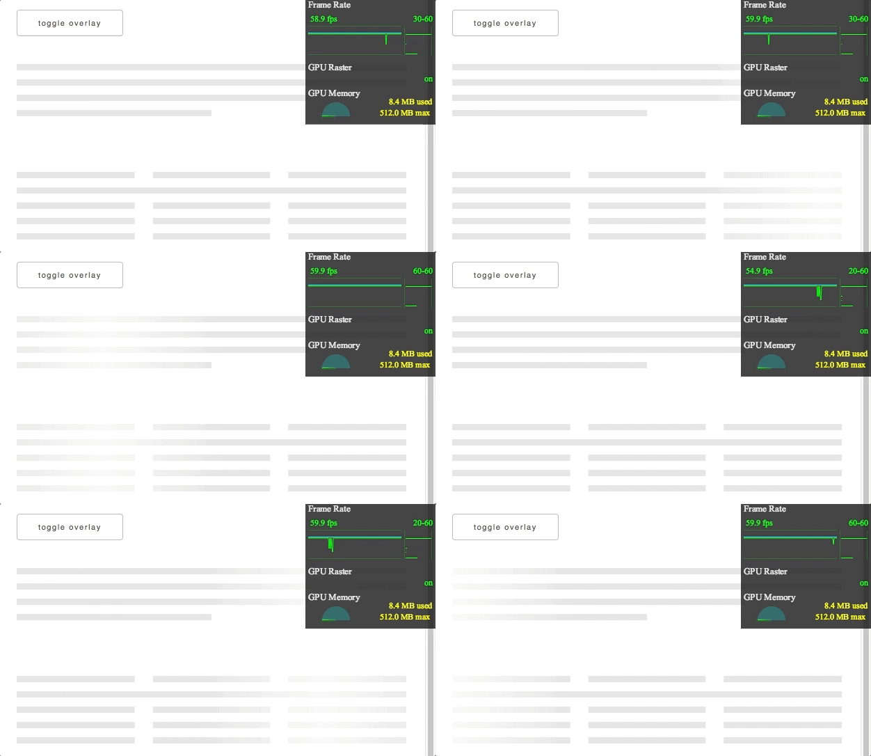
It’s a good idea to check the skeleton screens are as performant as can be to ensure the best user experience. Thankfully Chrome Developer Tools makes this ver easy with its frame-rate meter found in Render Settings (click here for instructions).
As you can see, our frame rate is a fairly consistent 60fps. This means our skeleton screens are performing well and not negatively impacting the page.
And there we have it. We now have in place lightweight, performant, and flexible skeleton screens to help create a better user experience.
If you like React, Next.js and front end development, feel free to follow me and say hi on twitter.com/_AshConnolly! 👋 😃
Stunning cover photo by Lukasz Szmigiel on Unsplash!

Posted on September 27, 2021
Join Our Newsletter. No Spam, Only the good stuff.
Sign up to receive the latest update from our blog.
Related

September 27, 2021


