Anthony Fung
Posted on March 13, 2024

Last week, we looked at how we can use different images to change the appearances of icons in our Web apps. This approach gives us more flexibility. It also allows us to be very specific about in how various states look. However, it introduces a downside. By having more images, we increase the overall workload in creating and maintaining them in our projects.
Changing colours within an SVG is relatively simple. As we can reference elements in an image (both individually and collectively), we can specify and modify their colours using CSS – something we can’t do with bitmap images. However, we can leverage powerful CSS filters to do something similar.
In this article, we’ll look how we can create a button with an icon showing a grey arrow; this arrow will turn blue when the mouse cursor moves over it.
Adding Colour
Let’s take our previous use case as an example: we have a button in our app that shows an arrow pointing leftwards. Ordinarily, we want it to be grey. But when the mouse moves over it, we want it to become blue.
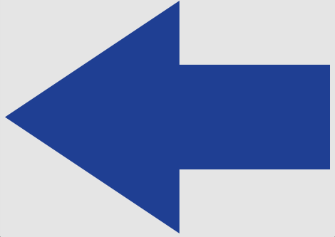
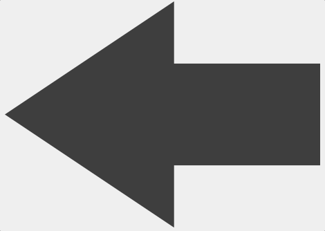
When solving this problem with multiple images, we used two images – one grey, one blue. With CSS filters, we can cut this down to just one. By taking advantage of the grayscale filter, we can desaturate (i.e. remove colour intensity from) any image. This means we can convert our blue arrow (Image 1) into a grey one (Image 2) dynamically at run time with the following CSS:
filter: grayscale(100%);
Image 2: The blue arrow shown in Image 1 with a 100% grayscale filter applied
We’ve passed in a value of 100%. If we wanted to make the effect more subtle, we can tweak this value accordingly. In any case, we can achieve the hover effect with the following code:
<!doctype html>
<html lang="en-US">

<head>
  <title>Image Demo</title>
  <link rel="stylesheet" href="styles.css">
</head>

<body>
  <button>
    <img>
  </button>
</body>

</html>
button {
  filter: grayscale(100%);

  img {
    content:url(../Images/arrow-dark.png);
  }

  &:hover {
    filter: grayscale(0%);
  }
}
In the preceding code, we’re always using a dark blue image of an arrow. In the normal state, we apply a grayscale filter to remove its colour. But in the hover state, we effectively disable it by applying a value of 0%.
Summary
When creating hover effects, an alternative to using multiple images is to leverage the browser's CSS filters. These let you manipulate images in real time, allowing you to keep the number of files required to a minimum.
The grayscale filter lets you desaturate (or remove colour intensity from) an image. When you use this, you can have a greyscale icon or image burst into full colour when certain events happen; an example might be when the mouse pointer moves over it. Its simple syntax lets you specify how strongly to apply it, leaving you in full control of how your images look.
Thanks for reading!
This article is from my newsletter. If you found it useful, please consider subscribing. You’ll get more articles like this delivered straight to your inbox (once per week), plus bonus developer tips too!

Posted on March 13, 2024
Join Our Newsletter. No Spam, Only the good stuff.
Sign up to receive the latest update from our blog.


