Home Assistant - Lovelace introduction: Step 3

André Hatlo-Johansen
Posted on March 28, 2022

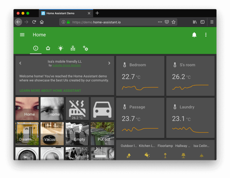
Home Assistant recently came out with their updated UI January 2019.
A ui called Lovelace it has now become their default ui interface. Taking a new approach for building user interfaces for Home Assistant.
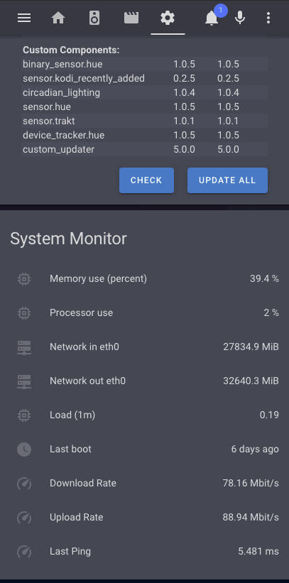
Note! I had to cut this project short because of the timeframe for my new job, but here is a quick overview over my custom Lovelace UI which i was able to put together.
A dynamic UI with a whole new set of features:
- 24 card grid.
- A UI editor.
- Faster!
- And fully customizable
- Cards have a list of attributes and options which can alter how your data is presented.
- Themes!
- Entity overriding privileges (name and icon).
- Custom cards built from the HA community.
This is whats so fun about this new platform is that the community is blooming. Make HA work for you!
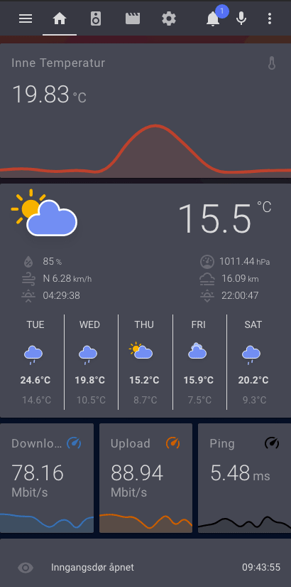
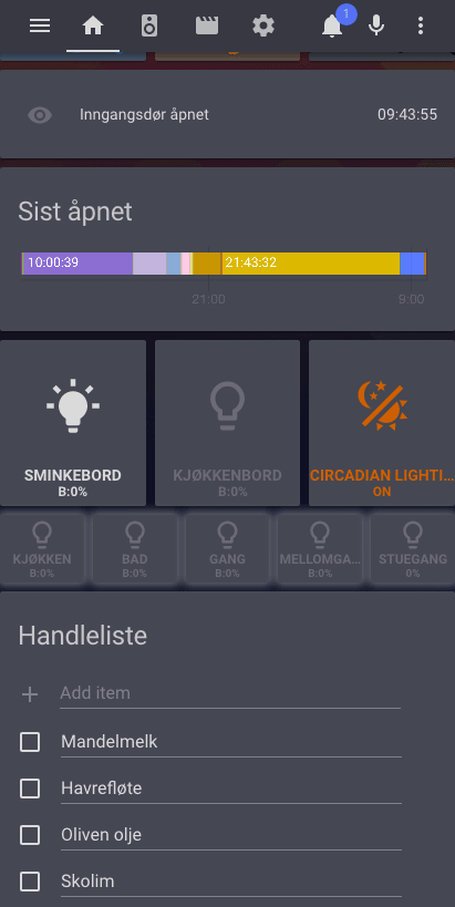
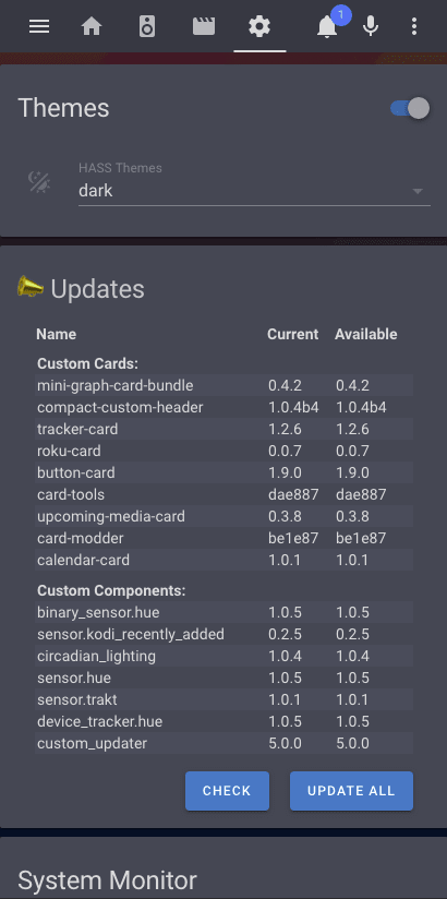
Take a look at my UI in mobile view:
💖 💪 🙅 🚩

André Hatlo-Johansen
Posted on March 28, 2022
Join Our Newsletter. No Spam, Only the good stuff.
Sign up to receive the latest update from our blog.
