The use of 'margin: auto' on flex children and 'position: relative, absolute, fixed'

anderu
Posted on December 29, 2023
- We can position a child item in the container with the use of
.parent-element {
    display: flex;
    justify-content: center;
    align-items: center;
}

// Another option
.parent-element {
    display: flex;
}

.child-element{
    margin: auto;
}
- But the use of
marginon flex children element can done more than just center the item, you can refer to the image below to check where you can position your item:
Position
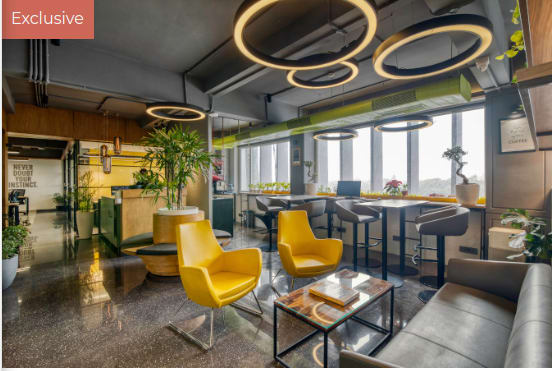
absoluteandrelativeis useful when you want to allocation an element in the parent elementAs example show on the image above, to make the 'Exclusive' word locate at the top left, we can code as below
.parent-element {
    position: relative;
}

.child-element {
    position: absolute;
    top: 0;
    left: 0;
}
- If we did not use the
position: relativeon parent-element the the 'Exclusive' word will allocate on the top left of the window. There aretop,right,bottom,leftmethod to use to position theabsoluteelement around the parent-element.
- If we want to position an element on a fixed location in the window like the chat button on the picture above even we scroll up and down then we can use
.element {
    position: fixed;
    bottom: 0;
    right: 0;
}
- This code will 'fixed' the element on the bottom right of the window all the time.
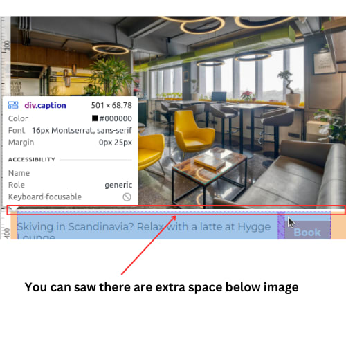
- Fun Fact: There are extra space below the image because Images created with
imgtag by default has display: inline property. To fix this, simply code
.image {
  display: block;
}
This is today sharing, please feel free to share your thoughts, ideas, or corrections if I have presented any inaccurate information.
Eat, sleep, code, repeat!
Andrew Tan
💖 💪 🙅 🚩

anderu
Posted on December 29, 2023
Join Our Newsletter. No Spam, Only the good stuff.
Sign up to receive the latest update from our blog.
Related

webdev The Music Artist homepage is coming soon. Does anyone have any suggestions to make?
November 7, 2024


