Alfie Darko
Posted on April 15, 2020

(Originally posted on my website: alfiedarko.co.uk)
As a front-end developer and a maker of products, I’ve switched my focus from learning for learning’s sake to picking up things which improve the end-user experience. Especially since making things other people experience is a big part of web development.
It’s only right we make web accessibility a priority.
What is Accessibility?
The aim of accessibility on the web is to make your web app usable by everyone. Or as much of our audience as possible. That means for people with disabilities, people who are not on the same type of internet speed as you, and people with slower computers than you etc.
It’s easy to forget not all your users have the brand new specced out i9 Macbook Pro with fibre-optic broadband, nice nimble fingers and 20/20 eyesight.
**a11y aka accessibility**
Why is it Important?
Because making our digital products usable by our audiences should be on our priority list.
Our generation will most probably live longer than any generation previous and will be using the internet well into our old age. This means that we are more likely to experience health issues like vision and motor function deterioration.
These are also things any one of us could experience temporarily today by breaking your arm, or temporary vision loss through medicine or an accident etc.
Instead of looking at A11y as something for the ‘other’ people, we should look at it as something we could potentially need one day.
Accessibility is good for all of us.
There are millions of under-served users ready to be catered to. W
Let’s look at some stat’s that show a11y is not a fringe issue.
10% of all adult Americans have some degree of vision loss.- AFB
60% of those who have hearing loss are either in the workforce or in an educational setting. — HLAA
Almost 30% disabled people with dexterity problems — Family Resources Survey ‘15
There is a long list of accessibility considerations but as this is just an intro to get people thinking about the issue, I’ll just talk a little about dexterity and visual-based ones & some small wins you can do in your day to day work to help others.
Alternate Input Devices
When it comes to alternate input devices and WCAG 2.1 compliance, developers should:
- Be sure all elements of the website are accessible via a keyboard
- Be sure there are no time limits incorporated into the website.
I’ll talk about keyboard and screen reader users but do note there are many other input devices.
Screen-readers
What is a screen reader? It is software that helps users with visual impairments use a computer. Usually, a desktop or browser application that reads out what the mouse or keyboard is currently focused on so the user can navigate accordingly.
Almost all OS’s have one inbuilt but they can be downloaded from the net. On Mac’s, the default one is called voice-over & on Windows, it’s called Narrator.
Although usually for people with visual impairments, it can also be used by people with dexterity issues and reading issues. It’s quite versatile.
Have a play around with them in your spare time to see how some users navigate the web. Being able to empathise with these type of users will help you create better experiences for all.
Keyboard-only users
Often conflated with screen-reader users. Although they may navigate in much the same way, keyboard-only users may have full vision & have the dexterity or other physical barriers that stop them using a traditional mouse. They could also be users who have simply broken their mouse but still need a way to navigate the web.
As developers, there are quite a few things we can do to help both types of users. Here is a non-exhaustive list of quick wins!
ALT Tags!
An easy win. Add ALT tags to images & videos that contain a description of what that content is. This allows screen-readers to interpret images for the end-user. Great for memes and images that add context to text.
If the image adds no value to the user, it is ok to omit this or have an empty alt tag instead ie. alt=""
Semantic HTML
One of the best things you can do is learn and use proper html5. I feel like a lot of the accessibility tips in regards to coding is to alleviate wrongful HTML markup. Using Semantic HTML5 elements instead of using <div> for everything can aid in creating accessible web experiences. These are elements with screen-reader accessibility support baked into them i.e. <main>, <article>, <nav>, <aside> etc. It also helps code-readability as a side-win.
Using Correct HTML
We can also try and use the correct elements for things like buttons etc.
Good:
 <button> Click Here </button>

Not as good:
<div> Click Here </div>
Although we can add the correct a11y behaviour by doing something like
<div
  role="button"
  tabindex="0"
  onClick="handleCommand()"
  onKeyDown="handleCommand()"
>
  Click Here
</div>
This is way more verbose & its almost reinventing the wheel (although there may be some fringe reasons to not use the standard <button> element in specific circumstances…)
Doing small things like using <p> (for paragraphs of text) instead of just using<div> for everything can improve your code. Things like emphasising text with <strong> along with CSS visual changes will help the screen-reader illustrate these via audio to the screen-reader user.
Headers
Many people didn’t know that it’s technically incorrect markup to have unordered headers. For example…
Good:
    <h1> Title </h1>
    <h2> Sub-Title <h2>
    <h3> Name of Writer <h3>

Bad:
    <h2> Title </h2>
    <h4> Sub-Title </h4>
    <h1> Name Of Writer </h1>
Titles should use the h1-h5 rank in order from starting with h1 as the highest rank of importance.
Wrongfully, many developers use them for stylistic reasons & not the way it was intended. This causes screen readers to jump orders thus reading our text incorrectly.
This innocent mistake creates a disorienting and confusing user experience for those who use screen-readers
If your headers are correctly applied, screen readers can easily skip through irrelevant content creating a much-improved user experience. If not, you waste your user’s limited time and may cause them to stop using your product /service.
A better idea would be to just use the header elements to order content and use CSS to style and size the headers as you need
Focus Control
This is so someone can see where the focus is element-wise when a user is using a keyboard to navigate your site. The default browser one may not be visible enough for many people.
I often lose track of the focus on certain sites so I appreciate when this is done right! It’s just good UX (User Experience).
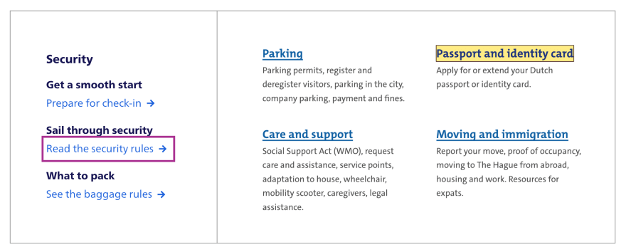
Different visible styles of focus
Tab Indexes
This is an HTML attribute that can help set the order in which content is tabbed.
We can use this to add important elements that the user should be allowed to tab through.
We should expect elements like links, forms, inputs and buttons to be tab-able by default due to the inbuilt HTML attributes.
<div tabindex="0">
    Tab-able due to tab-index.
</div>

<div>
    Not tab-able due to no tab-index.
</div>
Skip Links
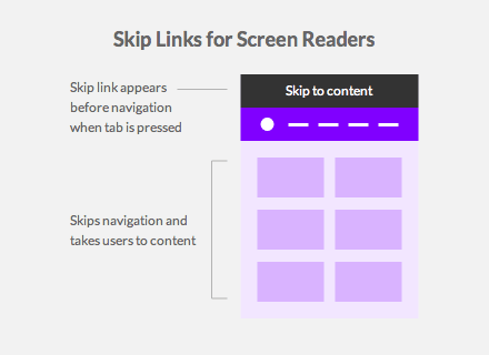
These are links that help people who are using the keyboard, skip the navigation menu and get straight to the content.
You may have never seen them visually as many choose to hide them or have them off the visible screen via CSS.
Conveniently, they are only accessible via the keyboard and saves keyboard-only & screen-reader users lots of time by giving them access to the main content with as few clicks as possible.
A visual representation of Skip Links for Screen Readers
ARIA
Accessible Rich Internet Applications (ARIA) is a set of attributes that define ways to make web content and web applications (especially those developed with JavaScript) more accessible to people with disabilities. — MDN
There are some HTML attributes we can use to make screen-reader users have much better web experiences.
I will just cover 4 of the most basic ones which are useful in your day-to-day.
ARIA Label (aria-label=” “)
<div aria-label='User Information Panel'>
 ...
</div>
A sentence or string that illustrates the current element. This is basically what a screen reader will read out to the user when the element is in focus. You can use this in cases where text that labels an element is not immediately visible on the screen for one reason or another.
It could also be used to give more context to a screen-reader user.
[https://developers.google.com/web/fundamentals/accessibility](https://developers.google.com/web/fundamentals/accessibility/semantics-aria/imgs/aria-label.jpg)
ARIA Role (role=” “)
Adding a role to your element or components can change how a screen-reader interacts with the specified element. for eg. adding the role of a button to a div, can make a screenreader interact with that component like a button.
<div role='button' type='submit'>submit</button>
Although not ideal, in times where we are dealing with components made out of all div’s elements for one reason or another, it’s handy to know that we have these tools at hand
Several different types of ARIA roles
ARIA Labelled By (aria-labelledby=” “)
<h1 id="list-header">
  Shopping List
</h1>
<ul id="list-group" aria-labelledby="list-header">
  <li> Toilet Roll </li>
  <li> Hand Sanitizer </li>
  <li> Pasta </li>
</ul>
This property simply indicates the id of an element that contains a string that labels our element.
ARIA Live Regions (aria-live=” “)
<div aria-live='assertive'>
  <div>
    <p>
      Some dynamic content that changes frequently
    </p>
  <div>
</div>
This attribute tells the screen reader that there is dynamic content within the elements on the page that may get updated frequently. It doesn’t have to be the immediate element either!
This is quite useful if you have a section that gets updated visually & its important info that the user needs to know!
There are 2 values this can take either polite or assertive. What do they mean? Polite will wait after a few seconds of idle activity to update the screen-reader user of the content updates, and assertive will interrupt and read the updated section straight away.
If there is an area with constant information updates, it should probably be marked as a live region.
Think of a live messenger app for an example. As the participants send messages, the new messages on the screen should probably be accessible to the screen-reader to be read out to the user.
There are many more ARIA attributes you can check out here. I’ve just mentioned a few that I use often that you can implement straight away in your day to day work!
Tools for a11y
I’ve included some links to some tools you can check out that will help you create more accessible web experiences.
- https://wave.webaim.org/ (Wave Web Accessibility URL Scanner)
- https://www.deque.com/axe/ (web accessibility browser plugin for dev teams)
- https://wearecolorblind.com/resources/colorblindly-colorblindness-simulator/ (Colorblindly to simulate colour blind vision)
- https://wave.webaim.org/extension/ (WAVE browser extensions)
- https://github.com/pa11y/pa11y-ci (A11Y centric build runner for your CI)
- https://tenon.io (Accessibility as a service)
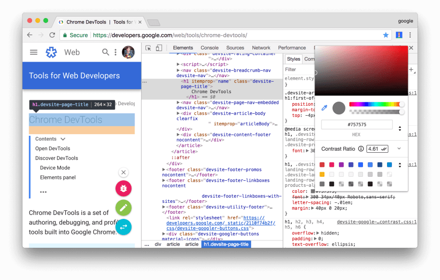
In Chrome Dev Tools, you can check the contrast ratio of different elements to maximize colour accessibility
The topic is way deeper than this article could ever cover without it becoming a book.
Hopefully, you have been enlightened into the basics of accessibility with scope to delve deeper into the parts you feel you want to know more about.
Further Reading
Alfie Darko's Blogs about Web Development
yarn add MDN: Accessibility
Web Accessibility in the UK — True Facts [infographic]
Accessibility Statistics
What the Stats Say About Accessibility

Posted on April 15, 2020
Join Our Newsletter. No Spam, Only the good stuff.
Sign up to receive the latest update from our blog.


