Artful Design for Aspiring Developers

Andrew Koenig-Bautista
Posted on March 7, 2020
As a programmer in the midst of honing my skills, when I write code my first priority is writing code that works. I ask myself questions along these lines: does this code provide the user experience that I’ve been asked to deliver? Are there areas where user interaction could break this code? Does my program get the user from point A to point B? To sum it all up; is this code functional?
At this stage in my career, it is normal to have this mindset. My focus is function over form. However, as I progress and my abilities continue to grow, my goal is to shift to a mindset that melds form and function. The melding of these two areas of focus is something that Stanford professor Ge Wang calls “Artful Design”.
In his book of the same title, Wang lays out principles of Artful Design and breaks down how and why they matter when creating products centered around user experience. I’m going to cover a few of his principles that stood out to me and how they have shaped my approach to programming.
1. Invite the Senses
Let’s say you stumble on the fountain of youth this weekend. Eternal life, forever young, the whole kit and caboodle. Apart from the obvious health benefits, you’ve basically won the lottery. It’s time to bottle up this magic and sell it to the masses at a premium. However, in your rush to be the next Jeff Bezos, you hire the cheapest designer you can find. You think to yourself, designing a water bottle can’t be that hard, right? You okay the design without even looking at it and give the all-clear for mass production. And when you walk into 7–11 to see your baby on the shelf, you see this:
You can kiss your billionaire status goodbye, ladies and gents. This product does not invite the senses. If it doesn’t catch the eye, it’s certainly not going to catch any dollars (or clicks, in our case). Even the greatest products can fail as a result of poor aesthetic design. In applying artful design to front end web development, here are some questions to consider:
Visually, is my site interesting, or pleasing to look at?
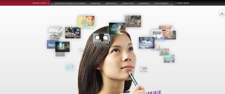
We’ve all seen ugly websites. Most of us have had the displeasure of trying to navigate ugly websites as well (if you’ve ever tried to defer jury duty over the internet, you know what I mean). Landing pages especially should create a sense of calm. Users should think to themselves “This makes sense. I know what this site is for. Looking at this site does not make me want to scream”.
Does your site invoke a desire to explore?
It can be tempting to lean toward providing the user with many, many, many options, buttons, links, etc. but too many options usually result in an exhausting user experience. For example:
As programmers, we can and should create intrigue without overwhelming. Users should think “I wonder what else I can do? The presentation of this site inspires curiosity, I want to know more!”
2. Pragmatics: “It’s Gotta Read!”
Does my code lead to an intuitive user experience? Most users are not programmers. Most people do not look at a site and think “Wow, this is some slick HTML, very impressive”. Our programs should be as simple, straightforward and easy to understand as possible. This requires us as programmers to know our audience. What background experience and expectations does that audience bring to the table? (for example, the term “football” can mean two different sports depending on your audience)
“It’s kinda like telling a joke -you don’t get to explain it afterward!”
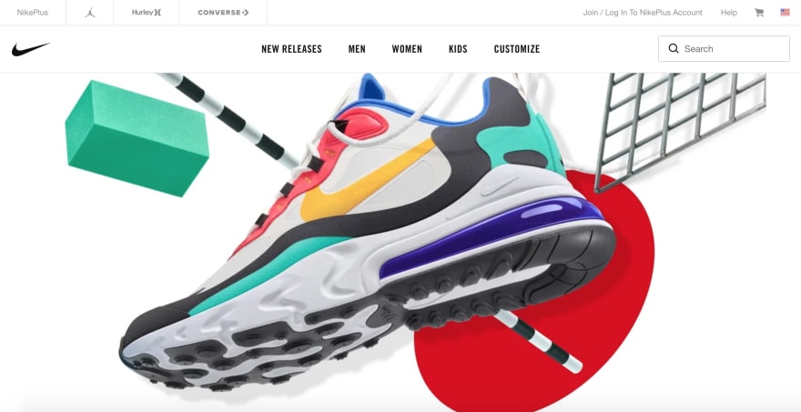
To some degree, a site designed to be intuitive is a site that is predictable. Predictable, in this instance, does not mean boring. A predictable site is one in which users have the comfort to think “Hm, just from looking at this page, if I click/type/scroll here, I think x will probably happen”
nike.com
3. Useful and Beautiful
Value the user. At times, and especially under a time crunch, it can be easy to forget that we are not coding programs to meet deliverables and be used by robots, the programs we code will be used by humans, and “design is the art of humanizing technology”. This is where we confront the gap between design that is a means to an end vs. design that is an end in itself.
For example, some people may play sports or create art or write code as a means to an end (make the NFL, achieve fame, become rich) and there’s nothing wrong with that, but for some, these activities are ends in themselves. When we code in a way that values the user, we can strive to create products that are a means to an end and ends in themselves.
“Design is the radical synthesis of means and ends into a third type of thing -both useful and beautiful”
Form and Function
As human beings, it is almost impossible to separate our functional use of a product from our experience of the form of that product. Human beings value superfluous, unnecessary, and even useless things. We don’t need color, style, or comfort, and yet we want and even expect these concepts to be a part of the products we use and the experiences we pay for. They appeal to our inherent playfulness, delight, and curiosity. With the right mindset, our code can do the same. We can move on from the battle of function vs. form to the more human combination of form and function.
*principles and quotes credited to Ge Wang and his book “Artful Design”

Posted on March 7, 2020
Join Our Newsletter. No Spam, Only the good stuff.
Sign up to receive the latest update from our blog.
Related

November 30, 2024


