Loading web pages fast on a $20 feature phone

Addy Osmani
Posted on December 17, 2019

Tip: Building a fast, core foundation for your site gives everyone a good experience; whether they're on a low-cost feature phone or the latest high-end smart phone.
Introduction
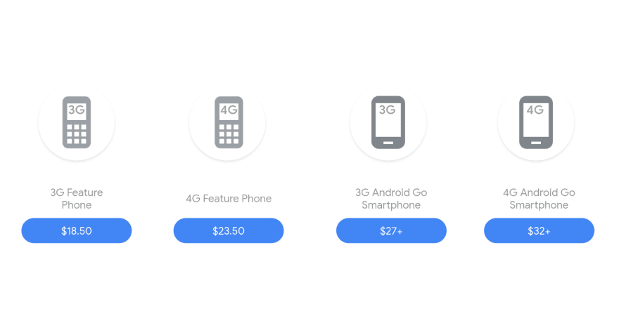
Feature phones are affordable (under $20-25), low-end devices enabling 100s of millions of users in developing countries to leverage the web. Think of them as a light version of a smart phone.
Being low-cost, feature phones tend to have slower CPUs (think 6x slower than a high-end smart phone), low RAM (e.g 256MB-512MB, typically under 4GB), low storage (4G) and often don't have a touchscreen. Instead they use a keypad or D-Pad for navigation. Something like this:
These devices can't handle rich JavaScript & media experiences as well as high-end smart phones so special care must be taken with payloads you send down.
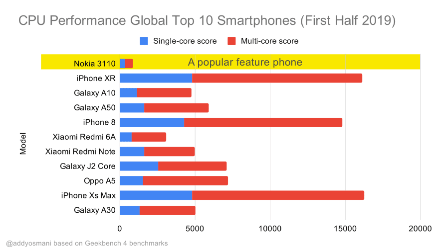
Above, we can see Geekbench CPU performance benchmarks for the highest selling smart phones globally in 2019. We can also see (highlighted) the performance of a popular feature phone - the Nokia 3110. JavaScript stresses single-core performance (remember it's inherently more single-threaded than the rest of the Web Platform) and is CPU bound. This means keeping device characteristics in mind when thinking about developing countries is important.
This post attempts to address these pain points so we can build sites that are usable by everyone, regardless of how fast their device is.
Background
You may or may not remember that feature phones were popular until the mid 2000s, before the arrival of smart phones. Small in size with a key-pad instead of a touchscreen, they had pretty basic features e.g calling, texting and simple text-focused web browsing. After the arrival of smart phones, these phones became less prevalent in developed countries.
In developing countries, not everyone can afford a smart phone and an unlimited data-plan on a 4G network. This market has been captured by smart feature phones which combine the hardware and price of a basic phone with some of the functionality found in smart phones.
The smart feature phone market has grown considerably since 2017 and it is expected that 400 million feature phones will be sold globally in 2019.
The growth of feature phones has been powered by Nokia’s revival of its old favourites like the 3110 and 8110 (which Paul Kinlan has a handy debugging guide for). In India, Reliance Jio feature phones provide a cheap, but modern option for accessing the web on the go. Jio have propelled the growth of KaiOS - a Linux-based operating system for feature phones.
This growth in the feature phone market created a need for sites that can run efficiently but there are a few constraints we should probably be aware of.
Above are Google Images Lite and Facebook mBasic, which both load quickly on feature phones, with minimal reliance on client-side script. Proxx being a game does rely on script, but relies on aggressive code-splitting to load fast.
Feature phone constraints
Users in developing countries are restricted by 3 factors:
- Few low cost, high quality devices
- Unavailability of high quality networks
- Affordable mobile data
Keep these constraints in mind when adopting a feature phone mindset:
- Hardware: Feature phones usually run on a slow (1.1 GHz) single or dual core CPU and less than 512 MB RAM. Compare this to an iPhone XS with a Hexa-core CPU and 4 GB RAM for some perspective on what this constraint implies.
- Data: Data plans are getting cheaper, but are still heavily capped in regions where feature phones will be popular. Avoid large network payloads as much as possible to ensure your pages load fast and aren't costly users money.
- Limited screen size: The screen size of a feature phone is typically much smaller than that of a smart phone. It’s in the range of 2.4” and can accommodate only a limited number of interactions. Consider focusing on loading resources needed for in-viewport content as quick as possible.
- No Touch: In the absence of touch, each function, action button or link on the screen needs to be easily accessible from the keypad. You don't want to create too many shortcuts.
- Keypads: Keypads on feature phones are nothing like the QWERTY keyboards we are used to. They have around 15 buttons where the same button needs to be pressed repeatedly for some characters. Hence, UX should minimize the need for typing.
Even in Japan, limited data plans can impact user experience on the web:
Development Guidelines
The following tips can help deliver a fast experience for websites on feature phones. In general, don't make the user wait for anything they didn't ask for. Where possible, keep JavaScript download and execution times low.
Set performance budgets for your initial payloads
Every byte of your page goes through many bottlenecks along the way. These include slow/flaky networks, slow CPUs and the only guaranteed way to improve performance is set budgets and do less.
Performance budgets are an agreed upon set of limits your team follow to ensure good performance. They are constraints for metrics that you commit not to exceed. Defining a budget for quantifiable metrics before development starts helps ensure teams remain within these standards as new features are developed.
Examples of resource metrics that can be budgeted could be JavaScript bundle size, image bytes or number of HTTP requests. User timing budgets could be set for user-experience metrics like First Contentful Paint, Largest Contentful Paint or First Input Delay. Thresholds can be defined for each of these metrics based on the target audience.
Budgets can be set for initial application logic, vendor/commons bundles and so on. Budget can be enforced in a build process, via Lighthouse (LightWallet) and in continuous integration.
PRPL-30 - a JavaScript budget for feature phones
The Chrome team has recommended the PRPL pattern for granularly serving code to quickly get apps interactive on low-end devices on a slow network. PRPL encourages preloading the smallest amount of script to get a page useful then leverages lazy-loading and (optionally) Service Workers to precache these bundles for future navigations.
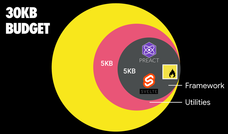
PRPL-50 took this idea further by setting a 50KB budget for your initial resources. As feature phones are even more CPU-constrained, we need to set an even tighter limit on our JavaScript. I might suggest a PRPL-30 (30KB gzipped + minified initial bundle) if targeting a feature phone.
Under these settings, the first byte from a good edge-caching server after SSL negotiation will usually be around 2s. This leaves us with 3 seconds to get the initial route's payload downloaded, rendered, and ready for user input on the screen. For JavaScript-centric experiences, this means your total initial bundle size for your page or route should be < 30KB minified and gzipped.
Wait. A 30KB initial bundle? That's ridiculous. I can't even fit React and my app code in there!. When building for really constrained devices, you're going to have to make difficult trade-offs in the name of user-experience. For example, you can use React for feature phones if you either (1) limit use of React to the server - a totally fair option or (2) keep your chunks for application logic very, very small and aggressively lazy-load. A (3) would be opting for a solution like Preact, but we'll discuss these trade-offs more later.
An example of an application that works under this 30KB budget is Proxx which has a 25 KB initial size and a Time to Interaction (TTI) of less than 5 seconds. Our perf budgets calculator may be helpful as you’re planning out your own target metrics.
A recommended size for lazy-loaded routes is also less than 35 KB. Route "chunks" between 30 KB and 35 KB would still be large enough to be considered for parallel processing via V8's script streaming.
Be Frugal with JavaScript
tl;dr If you can, opt for static rendering or server rendering with as minimal reliance on script as possible. If client-side or hybrid rendering is a must, only send script a route needs, in as few round trips as possible. Consider techniques like progressive rehydration.
JS is the #1 bottleneck on feature phones
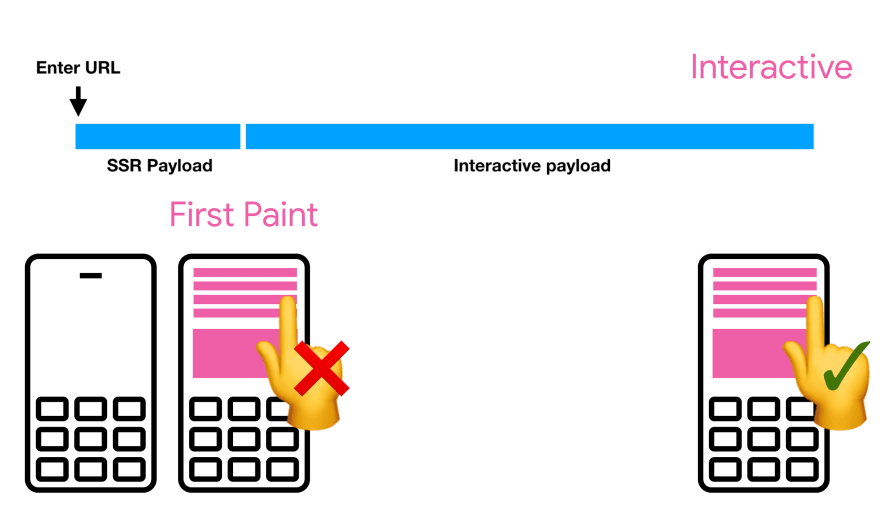
When building interactive experiences for feature phones, be aware that JavaScript is likely your biggest bottleneck. This is important as how you choose to render your pages can delay how soon users can actually use them, even with a D-Pad. If you choose to server-render or static render your pages, ensure interactive payloads are as small as possible.
JavaScript has two key costs: download and execution time. A slow network (e.g effective connection of 3G) can delay how quickly JavaScript gets over the wire while a slow CPU means it can take longer for scripts to execute. Below we can visualize the differences in CPU processing speeds for a popular JavaScript-heavy site - notice it can take 6x times longer for a low-end device compared to a high-end one:
CPU performance comparison between different smart phones
If a page relies heavily on large JS bundles for rendering or interactivity, this can translate to users waiting anywhere between 30-60s before they can even use your UI on a feature phone. Thus to minimize the download and processing time required by JavaScript, developers need to use it frugally and load only the JavaScript for routes and components that may be required by the users, as and when they would need it.
Keep interactive payloads lean
- As much as possible, lazy-load routes, components and resources that are offscreen or not critical for above-the-fold content.
- Use code-splitting to break up JavaScript so you only serve what users need on the initial route. This would result in faster page load time as amount of script to be downloaded and executed is reduced.
- Remove unused code from JavaScript bundles to keep them as lean as possible. This would require you to analyse your bundle and detect the libraries which are not being used at all or not required and may be replaced by custom ones. Libraries which are not required during the initial load may also be lazy loaded.
- Consider differential loading so that modern JS will be served to modern browsers, avoiding over-transpilation and excessive polyfilling. Reducing how much legacy code is shipped to modern browsers can help improve page load performance.
- If JS is critical for rendering & getting the initial UX interactive, preload those scripts. Preloading the script as shown below tells the browser that it is important and should be fetched as soon as possible.
<link rel="preload" as="script" href="critical.js">
Choose your stack wisely
While third party libraries help to speed up development and easily achieve complex tasks, they can also be heavy and should be used with care when developing for feature phones. The following guidance can help to optimally incorporate external dependencies:
- As feature phones are very resource constrained, avoid or limit using a JavaScript framework if possible - it's all about giving yourself as much headroom as possible for your application logic. In a situation where JavaScript use should be limited in order to keep the page small and performant, a JavaScript framework would add a lot of overhead. If building with React, consider limiting use to server-rendering or swap it for Preact and Preact compat at build time to shave around 30KB off your bundle. Svelte, lit-html and vanilla JavaScript are all good options for light bundles.
- Keep third party dependencies as small as possible to ensure that the size of initial page bundles is within budget- see tools like bundlephobia.com which highlight library costs well. Sanity check your bundles to ensure you’re using lean libraries (E.g. date-fns or luxon instead of Moment.js and its large locale defaults).
- Be very cautious when using Redux and inline Redux stores for managing application state. The redux state often inlined in HTML to “hydrate” a page can often bloat up the size of your responses.
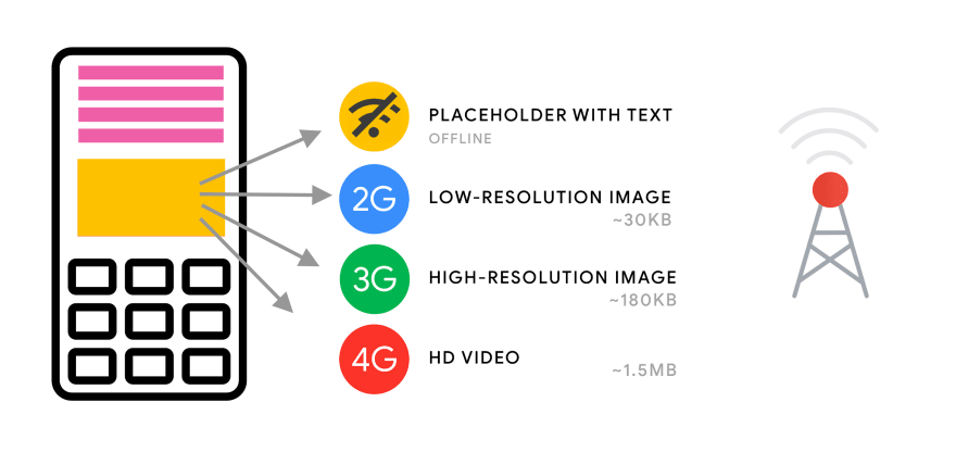
Adapt to avoid loading heavy resources on slow connections
Tip: You may be interested in adaptive loading - improving web performance on low-end devices for more on this topic.
Adaptive Loading is a technique which “adapts” resources being served to a user based on their effective connection type (ECT) - available to supported browsers via the Network Information API. Adaptive serving allows sites to ensure users on slow connections can get “a” version of the experience, even if at a lower-fidelity.
console.log(navigator.connection.effectiveType); // 3G
Note: Even on "fast" 4G, a user can experience slow network speeds as you may have experienced on coffee-shop or conference WiFi.
A concrete example where adaptive serving could be used is in a product item component. A user on a slow connection may only be served a compressed version of the product image, while a user on a faster connection may load a high-quality image and enhancements requiring more JavaScript - like the ability to zoom into the product image or view a carousel of different product image perspectives.
With feature phones a slow connection may not necessarily be the biggest obstacle. Slow CPU and low memory are more likely to affect the users experience even when they are on a decent 4G connection. Although we don’t yet have access to CPU reporting, Client Hints provide approximates for Device Memory, Viewport-width, Device Pixel Ratio, network information and other signals which could be used to craft a more granular serving strategy.
Be respectful of users data plans with the Save-Data header
Chrome for Android has a feature called Lite Mode (Data Saver), allowing data-conscious users to opt-in to the browser automatically optimizing resources to improve how quickly pages load. Optimizations include more heavily compressing images, deferring non-critical resources or server-rendering previews of the page. More on Chrome’s efforts can be found in our Lite Pages blog post.
When users enable a data-saving mode (like Lite Mode) in supported browsers, it will append the Save-Data request header to all HTTP and HTTPS requests. Application developers can check if this hint is enabled in JavaScript to deliver an optimized experience to users who have Lite Mode on (e.g conditionally turning off heavy features). The following snippet of code can be used to check for this:
if ("connection" in navigator) {
  if (navigator.connection.saveData === true) {
    // Implement data saving operations here.
  }
}
Note: Although your feature phone may support Chrome, this does not guarantee that Lite Mode (Data Saver) is available. It is best to treat availability of this feature as speculative.
Offload costly app logic and state handling to Web Workers
Tip: Do read Techniques to make a web app load fast, even on a feature phone by Surma. It's excellent.
Besides running JavaScript, the browser’s main thread has other responsibilities like page layout, painting pixels on the screen, and tracking user interactions. Long-running, complex JavaScript, could end up blocking these other tasks.
Web Workers allow JavaScript code to run in the “background” without blocking the main thread. They should be used to keep the main thread free from costly JavaScript overhead such as complex app logic or state management services. The main thread and the worker thread communicate using the postMessage() function and onmessage handler. The postMessage function allows the sender to send a single parameter which can be any value or object. Libraries like Comlink reduce the friction for using workers in your apps.
Surma's case study with and without worker threads for Proxx is a great read - it was observed that without worker threads the app was frozen for 6.6 seconds on a Nokia 2 (1GB RAM/1.3 GHz quad-core processor). With worker threads however the response time was 48ms for the same action/event. Thus If you have CPU intensive logic, it's worth measuring whether moving this to a worker thread is worthwhile for your use-case.
Optimize Images
Images often consume a lot of data. They also take time to decode, especially on lower-end devices, which is a good reason it’s important to ensure images are correctly sized and compressed when being delivered to a feature phone.
- Compress images using a tool like Imagemin to generate images which are smaller in size without a perceivable effect on quality.
- Replace animated GIF’s with videos which load much faster. Even then, really consider how much you need heavy multimedia on low-end devices.
- Lazy load images if possible but ensure JavaScript required for this is not too heavy. The new native
loadingattribute can help here. - Serve responsive images with correct dimensions by creating multiple versions of images and serving the most appropriate for the user’s viewport
- Serve images with the correct dimensions for the screen. Loading low-fidelity, low resolution images on low-end devices can ensure that images are decoded faster.
Detecting screen-size
Many current smart feature phones have a QVGA screen size in which the resolution is 320px horizontally by 240px vertically (320 x 240). If you need to detect screen size on page load (e.g to toggle certain features on/off or use adaptive loading), you could use a snippet like the following:
const isFeaturePhone = Math.min(screen.width, screen.height) <= 240;
This is similar to the approach Proxx uses.
Emulate a feature phone in Chrome DevTools
If building for a feature phone, it's highly recommended to pick up a cheap handset for real-world testing.
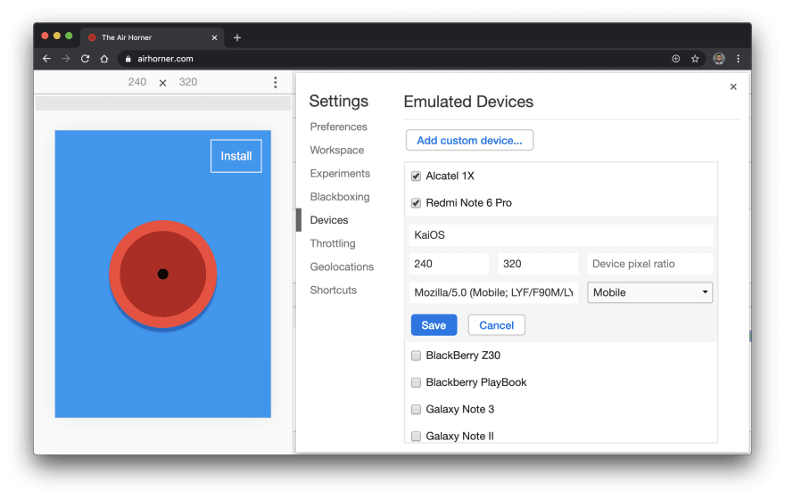
If you'd like to emulate a feature phone (e.g a Reliance Jio KaiOS device) in Chrome DevTools, here's how:
- Open Chrome DevTools
- Toggle the Device Toolbar
- Device dropdown > Edit ... > Add a custom device
- Name: KaiOS (or customize as needed)
- Width: 240, Height: 320
- UA:
Mozilla/5.0 (Mobile; LYF/F90M/LYF-F90M-000-02-23-181217; Android; rv:48.0) Gecko/48.0 Firefox/48.0 KAIOS/2.5 YouTube/1.66.51.J - Save
- (Optionally) customize CPU throttling as needed, however note that this can never be as accurate as testing on a real-device.
Conclusion
It's possible to deliver a delightful experience to all users, regardless of where they are. This does require extra care as not all mobile hardware is equal.
The more affordable a phone handset is, the higher the chance it may contain a slow CPU. Given JavaScript performance depends on download and execution time, do think about how you're delivering your experience.
While this matters for smart phones, it matters even more for feature phones.

Posted on December 17, 2019
Join Our Newsletter. No Spam, Only the good stuff.
Sign up to receive the latest update from our blog.

