Navigating Bootstrap Component: A Comprehensive View

Umar Awobajo
Posted on March 26, 2024
Bootstrap, developed by Twitter, is an open-source front-end framework that simplifies the process of designing and developing websites. It provides a collection of pre-designed HTML, CSS, and JavaScript components, allowing developers to build responsive and aesthetically pleasing web pages efficiently.
The fact that Bootstrap saves time is its main advantage; it is also easy to use, even for beginners, and to customize, allowing developers to create responsive and aesthetically pleasing web pages.
The main purpose of this article is to explain the various components of Bootstrap, exploring their functionalities, customization options, and best practices, even for a complete beginner, to enhance your web development skills, so let's dive into it.
What Are Bootstrap Components?
Bootstrap components are ready-made HTML, CSS, and Javascript code that act as building blocks for web development, which can be reused over and over again easily without the stress of rewriting the code.
With the use of Bootstrap’s Grid system, developers have been able to easily create responsive web pages across all device sizes, promoting an optimal user experience.
Core Bootstrap Components
- Navigation Bar
The Bootstrap Navigation Bar serves as a critical element for user navigation. It offers features like responsive design, drop-down menus, and brand logos. Customization options include styling, positioning, and color schemes, providing developers with the flexibility to align the navigation bar with the overall website theme.
<nav class="navbar navbar-expand-lg navbar-light bg-light">
  <a class="navbar-brand" href="#">Navbar</a>
  <button class="navbar-toggler" type="button" data-toggle="collapse" data-target="#navbarSupportedContent" aria-controls="navbarSupportedContent" aria-expanded="false" aria-label="Toggle navigation">
    <span class="navbar-toggler-icon"></span>
  </button>


  <div class="collapse navbar-collapse" id="navbarSupportedContent">
    <ul class="navbar-nav mr-auto">
      <li class="nav-item active">
        <a class="nav-link" href="#">Home <span class="sr-only">(current)</span></a>
      </li>
      <li class="nav-item">
        <a class="nav-link" href="#">Link</a>
      </li>
      <li class="nav-item dropdown">
        <a class="nav-link dropdown-toggle" href="#" id="navbarDropdown" role="button" data-toggle="dropdown" aria-haspopup="true" aria-expanded="false">
          Dropdown
        </a>
        <div class="dropdown-menu" aria-labelledby="navbarDropdown">
          <a class="dropdown-item" href="#">Action</a>
          <a class="dropdown-item" href="#">Another action</a>
          <div class="dropdown-divider"></div>
          <a class="dropdown-item" href="#">Something else here</a>
        </div>
      </li>
      <li class="nav-item">
        <a class="nav-link disabled" href="#">Disabled</a>
      </li>
    </ul>
    <form class="form-inline my-2 my-lg-0">
      <input class="form-control mr-sm-2" type="search" placeholder="Search" aria-label="Search">
      <button class="btn btn-outline-success my-2 my-sm-0" type="submit">Search</button>
    </form>
  </div>
</nav>
Your output should look like this:
- Grid System
The Bootstrap Grid system is a twelve-column system that uses a series of rows, columns, and containers to layout and align content. This grid system plays a very important role in making a webpage fully responsive in different sizes of devices
<div class="container">
  <div class="row">
    <div class="col-sm-12 col-md-6">
      One of three columns
    </div>
    <div class="col-sm-12 col-md-6">
      One of three columns
    </div>
    <div class="col-sm">
      One of three columns
    </div>
  </div>
</div>
In this code snippet, we utilize Bootstrap's grid system to structure a container with two columns. The “col-md-6” class indicates that each column should occupy half of the available width on half-sized screens and larger. Here, the inclusion of “col-sm-12” ensures that each column takes up the full width on small screens, providing a single-column layout. As the screen size increases to medium and beyond, the columns transition into a two-column layout, showcasing the responsive nature of Bootstrap's grid system. The results should look like this:
- Typography
Bootstrap allows for easy customization of fonts and styles, including predefined typography classes that enhance the readability and visual appeal of text.
<p class="lead">
  This is a lead paragraph with an increased font size
</p>
<small class="text-muted">With faded secondary text</small>
<p class="h1">h1. Bootstrap heading</p>
<p class="h2">h2. Bootstrap heading</p>
<p class="h3">h3. Bootstrap heading</p>
<p class="h4">h4. Bootstrap heading</p>
<p class="h5">h5. Bootstrap heading</p>
<p class="h6">h6. Bootstrap heading</p>
So can you guess what the code snippet below will give you?
<h3>
  Fancy display heading
  <small class="text-muted">With faded secondary text</small>
</h3>
UI Element in Bootstrap
- Buttons
Bootstrap buttons offer various button styles to suit different design needs. Let's take an example of some bootstrap button.
<button type="button" class="btn btn-primary">Primary</button>
<button type="button" class="btn btn-secondary">Secondary</button>
<button type="button" class="btn btn-success">Success</button>
<button type="button" class="btn btn-danger">Danger</button>
<button type="button" class="btn btn-warning">Warning</button>
<button type="button" class="btn btn-info">Info</button>
<button type="button" class="btn btn-light">Light</button>
<button type="button" class="btn btn-dark">Dark</button>
<button type="button" class="btn btn-link">Link</button>
- Forms
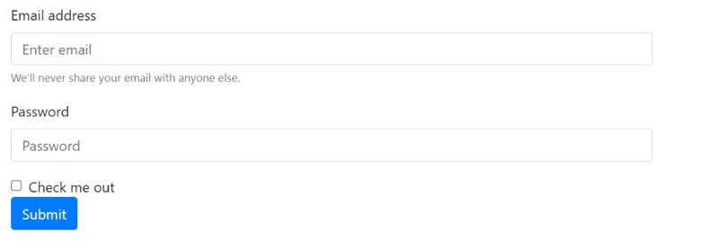
Bootstrap simplifies the creation of responsive forms with predefined styles and classes, in addition to this bootstrap also validates forms. Let's see what a basic bootstrap form with validation should look like:
<form>
  <div class="form-group">
    <label for="exampleInputEmail1">Email address</label>
    <input type="email" class="form-control" id="exampleInputEmail1" aria-describedby="emailHelp" placeholder="Enter email">
    <small id="emailHelp" class="form-text text-muted">We'll never share your email with anyone else.</small>
  </div>
  <div class="form-group">
    <label for="exampleInputPassword1">Password</label>
    <input type="password" class="form-control" id="exampleInputPassword1" placeholder="Password">
  </div>
  <div class="form-check">
    <input type="checkbox" class="form-check-input" id="exampleCheck1">
    <label class="form-check-label" for="exampleCheck1">Check me out</label>
  </div>
  <button type="submit" class="btn btn-primary">Submit</button>
</form>
Your result should look like this:
- Cards
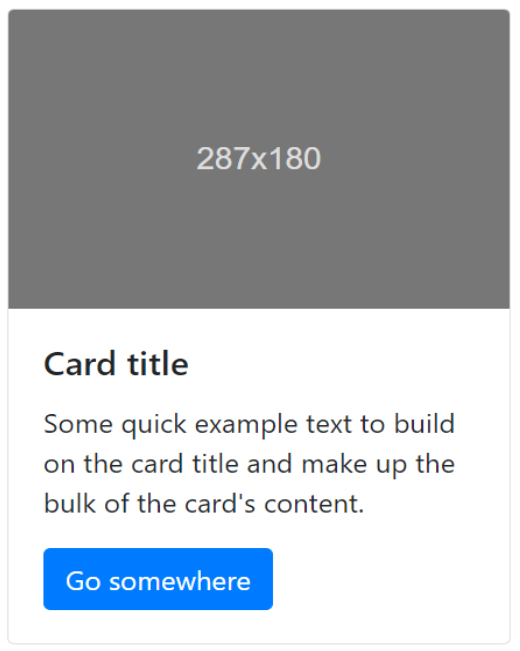
A card is a container that presents some content, but Bootstrap takes it further by providing a neat and organized way of presenting content. A typical bootstrap card contains a header, body, and footer for additional details. Let's take an example
<div class="card" style="width: 18rem;">
  <img class="card-img-top" src="..." alt="Card image cap">
  <div class="card-body">
    <h5 class="card-title">Card title</h5>
    <p class="card-text">Some quick example text to build on the card title and make up the bulk of the card's content.</p>
    <a href="#" class="btn btn-primary">Go somewhere</a>
  </div>
</div>
Your result should look like this:
Advance Bootstrap Component
- Modals
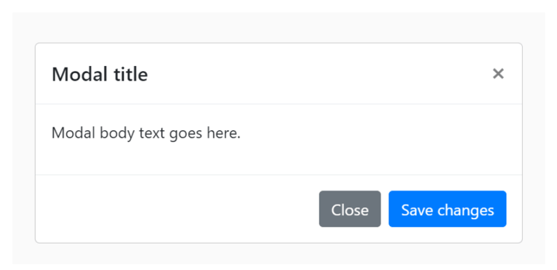
Modals are pop-ups that are mainly used to capture users' input. Bootstrap provides a sleek way to bring creativity into pop-ups with animations, sizes, and other features
<div class="modal" tabindex="-1" role="dialog">
<div class="modal-dialog" role="document">
<div class="modal-content">
<div class="modal-header">
<h5 class="modal-title">Modal title</h5>
<button type="button" class="close" data-dismiss="modal" aria-label="Close">
<span aria-hidden="true">×</span>
</button>
</div>
<div class="modal-body">
<p>Modal body text goes here.</p>
</div>
<div class="modal-footer">
<button type="button" class="btn btn-primary">Save changes</button>
<button type="button" class="btn btn-secondary" data-dismiss="modal">Close</button>
</div>
</div>
</div>
</div>
Your result should look like this:
- Carousel
Bootstrap Carousel is one of the most used Bootstrap advanced components. Carousel is excellent for showcasing a series of images or content in an interactive way. Bootstrap allows customization of carousel behavior, including autoplay and pause on hover:
<div id="carouselExampleSlidesOnly" class="carousel slide" data-ride="carousel">
  <div class="carousel-inner">
    <div class="carousel-item active">
      <img class="d-block w-100" src="..." alt="First slide">
    </div>
    <div class="carousel-item">
      <img class="d-block w-100" src="..." alt="Second slide">
    </div>
    <div class="carousel-item">
      <img class="d-block w-100" src="..." alt="Third slide">
    </div>
  </div>
</div>
Bootstrap Utilities
- Color And Background
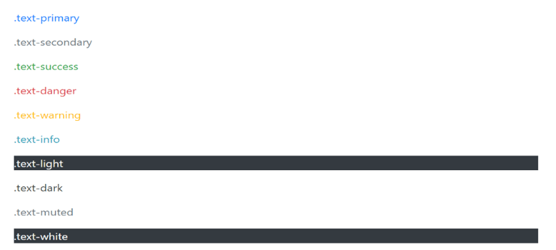
Bootstrap provides color classes for easy styling of buttons, borders, backgrounds, and so on. Let's see some examples
<p class="text-primary">.text-primary</p>
<p class="text-secondary">.text-secondary</p>
<p class="text-success">.text-success</p>
<p class="text-danger">.text-danger</p>
<p class="text-warning">.text-warning</p>
<p class="text-info">.text-info</p>
<p class="text-light bg-dark">.text-light</p>
<p class="text-dark">.text-dark</p>
<p class="text-muted">.text-muted</p>
<p class="text-white bg-dark">.text-white</p>
Your result should look like this:

Here, the text-primary class sets the text color to the primary theme color, and the bg-success text-white class combination sets a success color background with white text.
- Spacing
Spacing is important for a clean and organized design. Bootstrap offers easy spacing utilities to manage margins and padding.
<div class="mb-3">  This has a bottom margin of 3 units.  </div>
<div class="p-4">This has padding on all sides and a size of 4 units.</div>
Here, the mb-3 class adds a bottom margin of 3 units, and the p-4 class provides padding on all sides with a size of 4 units.
Best Practices And Tips
- Accessibility And Consideration
Bootstrap is designed with accessibility in mind, but developers should still be mindful of content structure and provide alternative text for images. For instance:
<img src="accessible-image.jpg" alt="Accessible Image Description">
- Cross-browser capability
Always include descriptive alt text for images to ensure a positive user experience for those with disabilities
- Performance Optimization
Bootstrap offers a lot of features, and including unnecessary components can impact performance. Optimize by only including the Bootstrap components your project requires. Additionally, consider minifying and compressing CSS and JavaScript files.
Conclusion
In summary, Bootstrap is a valuable tool for contemporary web developers, offering an extensive library of components and tools to simplify the design process. Developers can produce a responsive, aesthetically pleasing, and easily navigable website by comprehending the fundamental, user interface elements, advanced features, and utilities.

Posted on March 26, 2024
Join Our Newsletter. No Spam, Only the good stuff.
Sign up to receive the latest update from our blog.


